A couple of weeks ago, we saw Hangouts version 4.0 leak for Android as a completely revamped application in terms of user experience. We still haven’t seen the update arrive on our favorite mobile platform, but it did hit iOS this afternoon. Actually, v4.0 that looks almost identical to that Android leak showed up on our iPhone 6, giving us all sorts of hope that the Android version isn’t far behind.
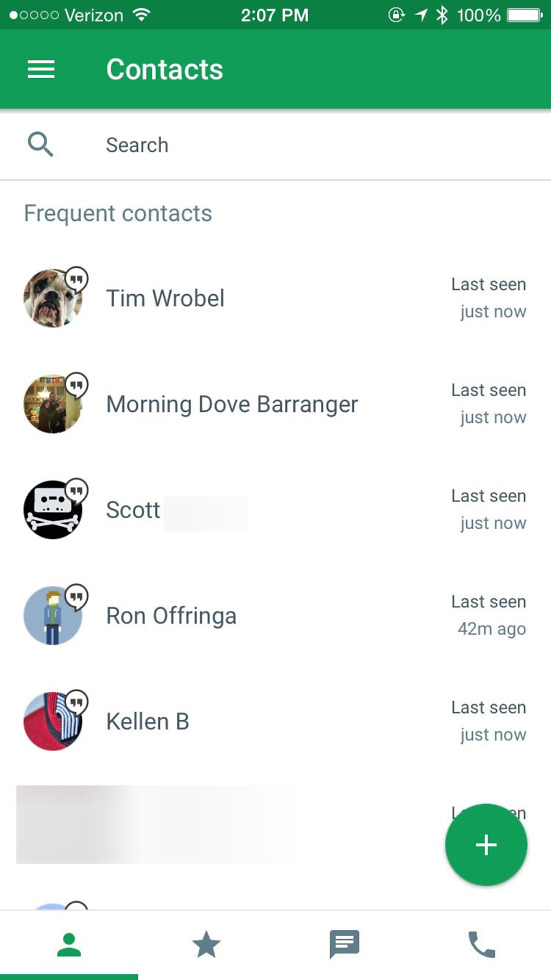
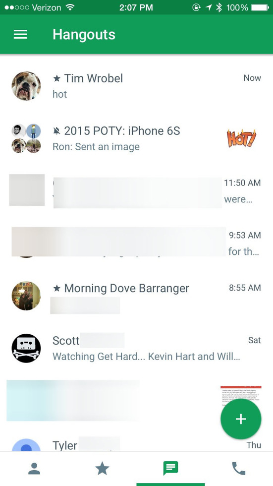
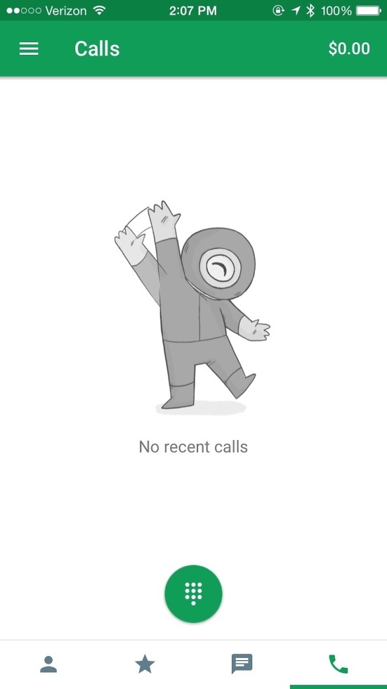
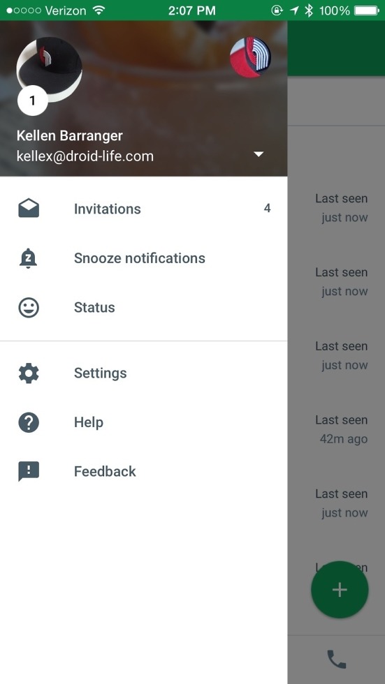
Below, you will see a series of screenshots from the application that should look quite familiar if you saw that v4.0 leak for Android.
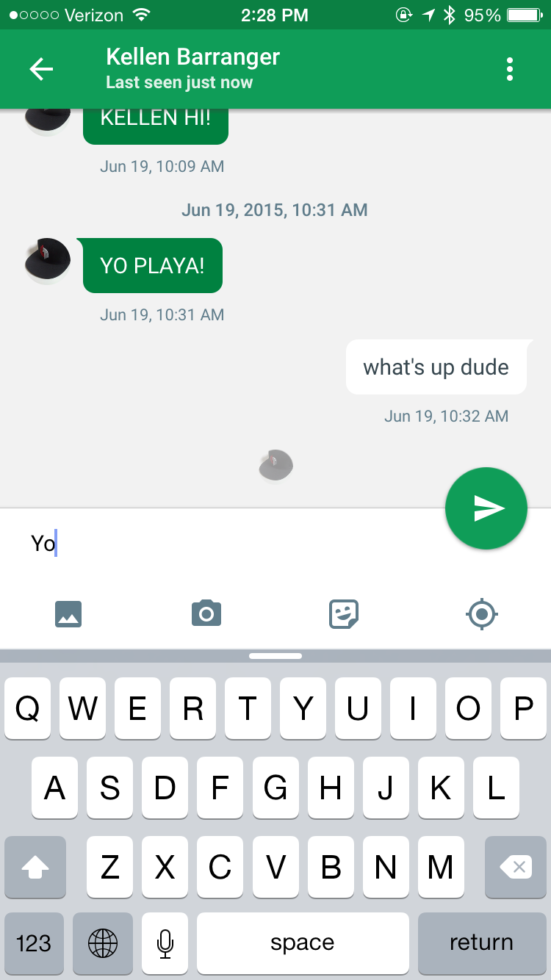
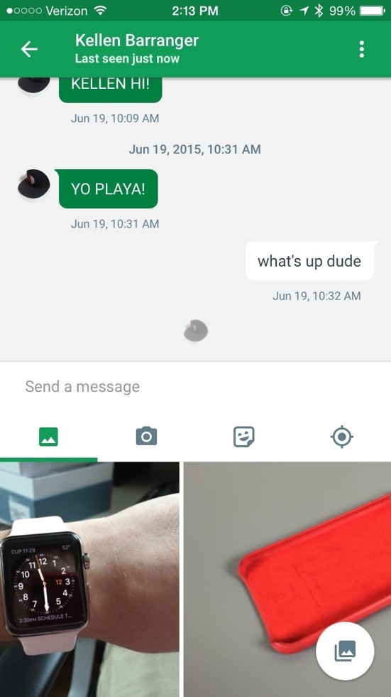
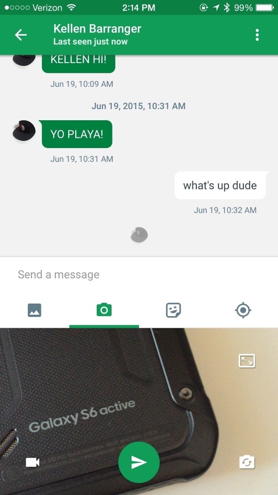
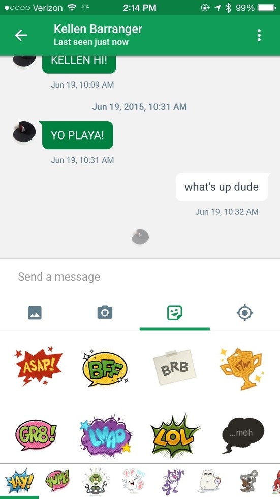
First, the conversation experience is quite similar. You have a bottom row of icon shortcuts for image attachments, launching the camera, stickers, and location sharing. Also, as you type a message, the send button appears almost like a floating action button, splitting the input box and conversation.
When navigating the app, we do have some differences, most notably in the number of columns. On v4.0 for Android, we saw almost everything buried in a slideout navigation drawer, whereas on the iOS version, you have four shortcuts for Contacts, Favorites, Hangouts, and Calls. This likely differs because this is an iOS design guideline.
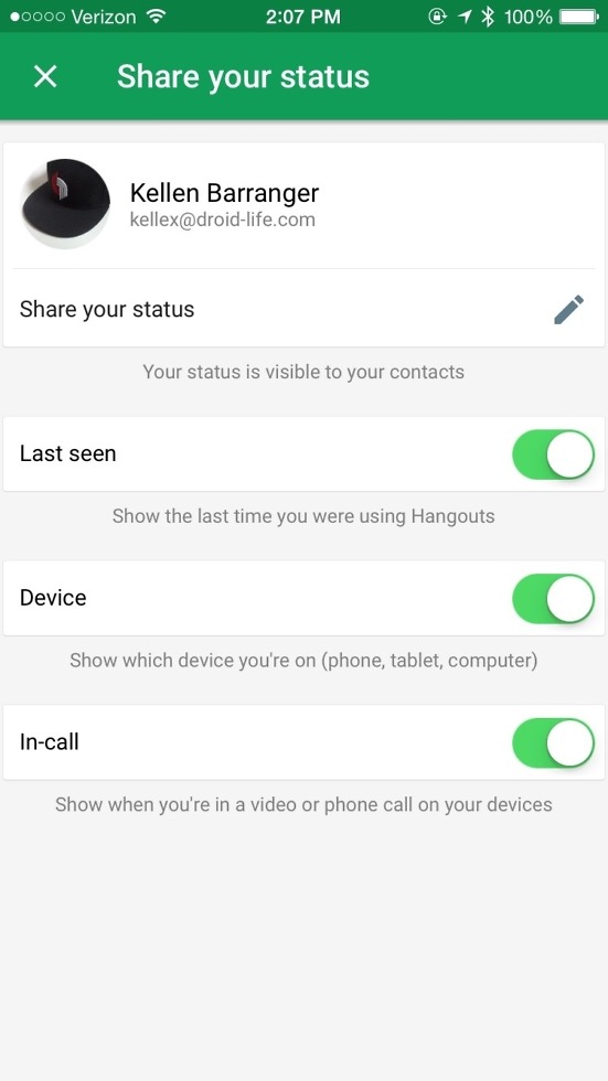
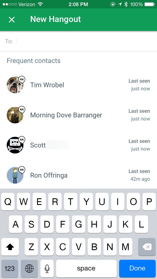
We are seeing an option for setting your status (which is supposed to come in v4.0 for Android), plus there is a FAB throughout the app for starting a new conversations. Punching that FAB doesn’t give you the options like we expect on the Android version, but it’s still there, for whenever you’d like to start something new and then choose from contacts.
Maybe #updatewednesday will bring us this bundle of joy?
Update: Two Googlers on the Hangouts team posted to Google+ about the update, but would only say that it’s either “coming soon” or “in the works.”


Collapse Show Comments144 Comments