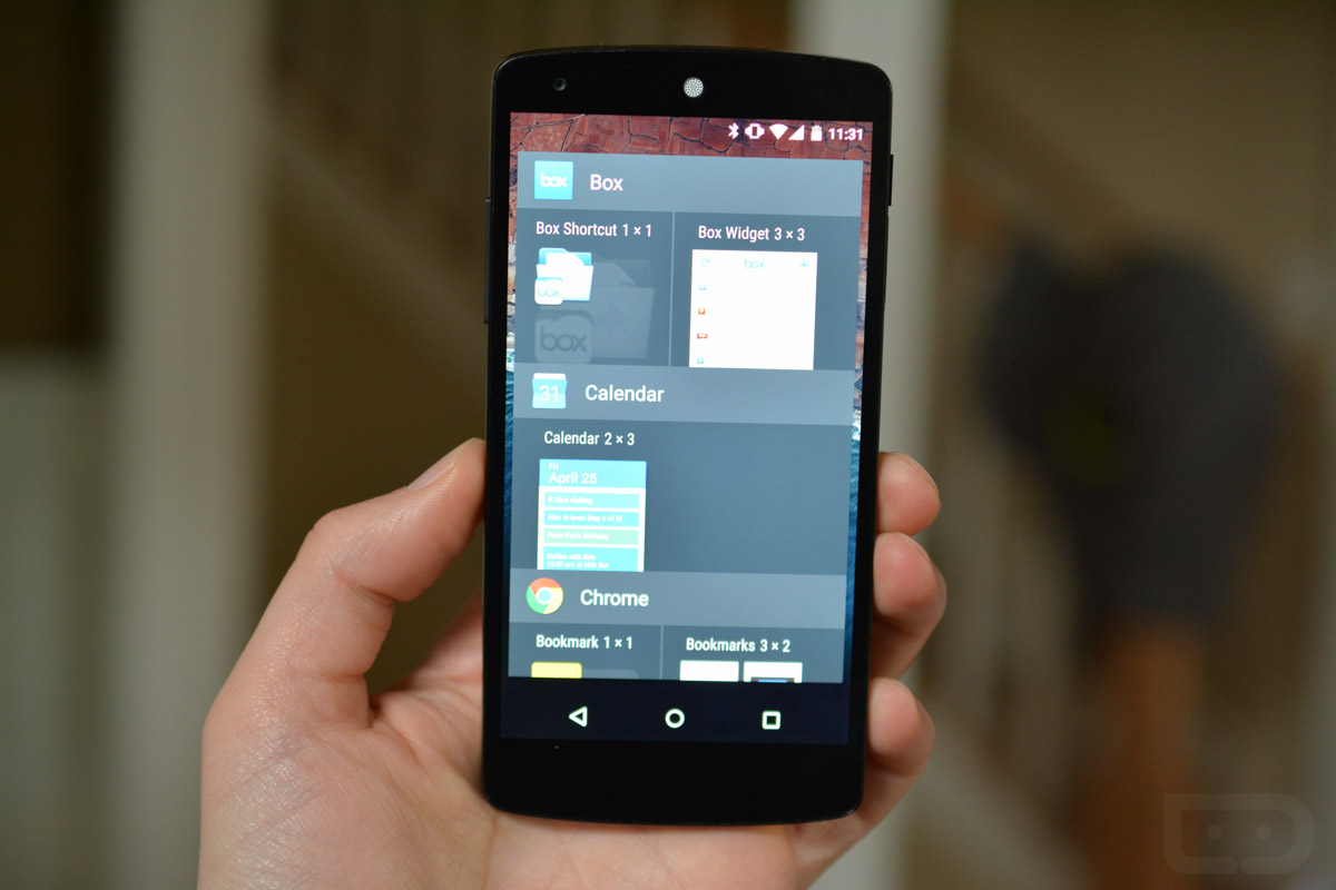
If you flash the Android M developer preview images (our tour!) on the Nexus 5, 6, or 9, one of the first things you will undoubtedly notice is the new app drawer. With a change in direction of how it scrolls, you might be thrown off at first, but trust me, it’s not as bad as others have made it out to be. Along with that new app drawer, we are also getting a greatly improved widget picker that makes it much easier to find the widget you intended to find.
Let’s start first with the app drawer, because well, it scrolls vertically and that is a pretty drastic change from the horizontal scroll you have enjoyed since Ice Cream Sandwich. So, yes, when you pop open the app drawer from the white circle on the home screen, you get a pretty white animation into a drawer that will no longer look all that familiar. It scrolls vertically, showcases alphabetical grouping of apps (with letter indicators), a search bar, and the four most-recently used app shortcuts. As you scroll, the letter indicators knock one-another out of the way and Google tries to smartly combine letters with few app choices into others so that your drawer doesn’t look completely empty and awkward. It even uses an endless scroll instead of a paginated approach, so one flick can get you from the top of your drawer to the bottom.
[responsive_vid]
Is the new app drawer ridiculously bad? No. Is it a change from what you are used to? Yep! At first tour, I can admit that I was quite thrown off. But now that I have spent the weekend with it, I am already mostly used to it and no longer get frustrated when opening it. While I would still prefer a horizontal scroll, a vertical scroll won’t kill me. Plus, if I start to amass a couple of hundred or so apps in my app drawer, searching, faster scrolling, and categorization might come in handy. If you think about it, outside of the change in direction, this app drawer as greatly improved over the Lollipop release on numerous levels.
Outside of the new app drawer, you will find a new widget picker that (as you may have guessed) scrolls vertically too. Along with the vertical scroll, the entire UI has been revamped to make it easier to find the widget you want to find. There are app indicators (with app icons) separating widgets, letting you know exactly which widgets each app is for. In the previous widget pickers, you had big boxes that showed previews of apps set above tiny little identifiers. Finding widgets was a pain in the ass, if I’m being honest. Now, it’s super easy to do. Google is also now grouping together widgets on a per-app basis in side-scrolling rows.
Overall, I would say that the app drawer and widget picker in Android M have been greatly improved, you just may have to get used to a change in direction.
Be sure to checkout all of our Android M feature highlights!


Collapse Show Comments75 Comments