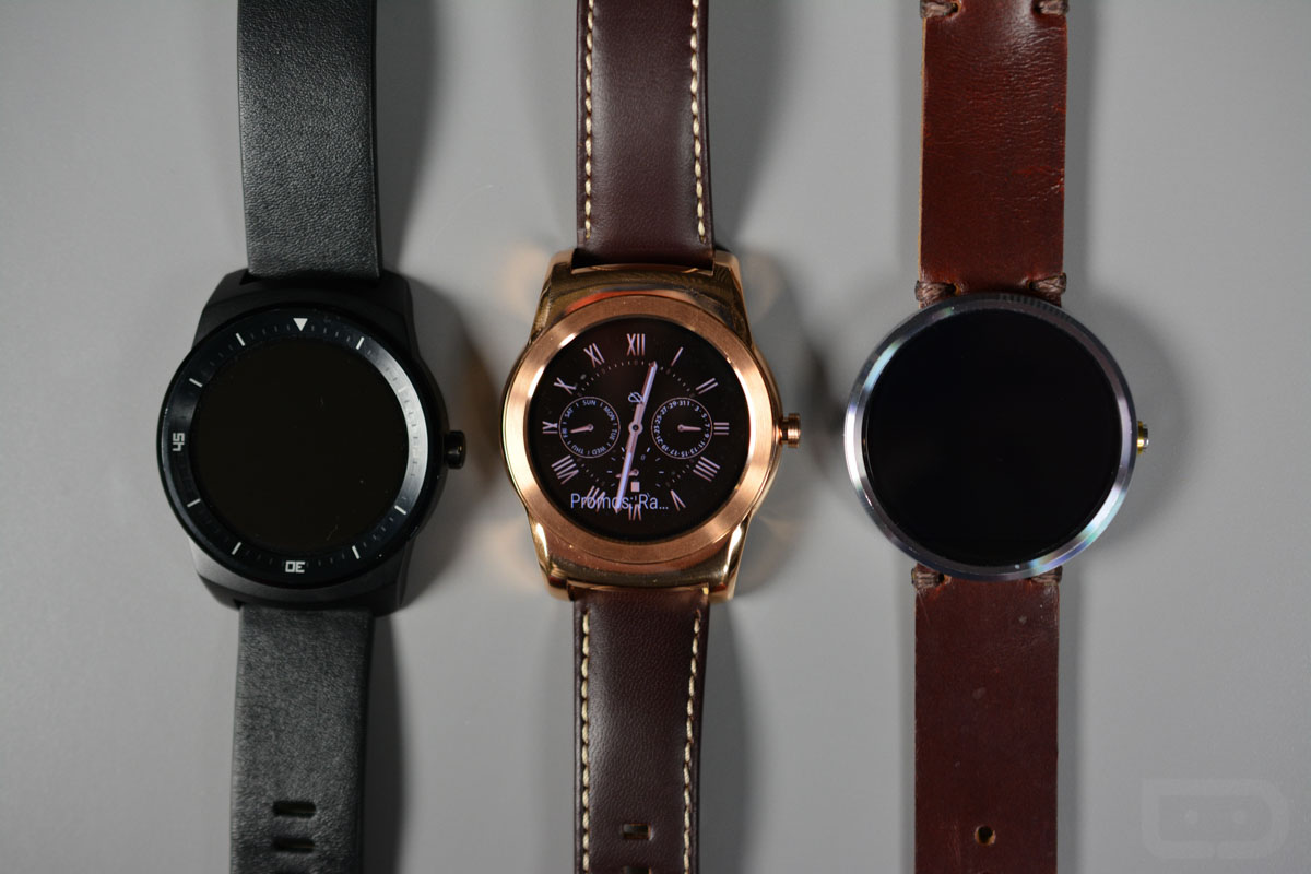
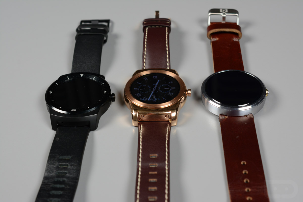
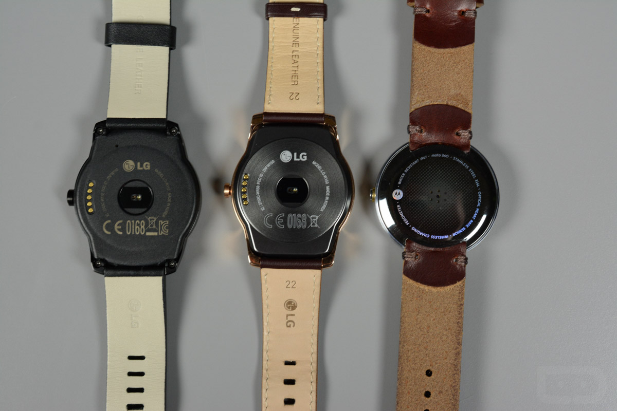
It has been a minute since we last reviewed an Android Wear device. That’s not because there haven’t been decent options introduced since we finished off with the Moto 360, it’s just that there isn’t much to talk about between any of them. They all have to adhere to Google’s standards in the same way, all basically have the same set of specs and features, and are all supposed to run the same version of Android Wear (for the most part).
Sure, you get a square display here and a round one there, or GPS in this one and not in that one, but the experience is all pretty much identical. They perform the same because they all use the same RAM and processor, and their batteries all last about as long as the next because they are basically the same size. If you have seen a review of one Android Wear watch, you know exactly how the next one is going to go. If you are considering one, you really just need to decide if you need a smartwatch in your life and if you like the look of any of them. Seriously, that’s the state of Android Wear.
With that said, we decided to review the LG Watch Urbane because it’s trying to be different. The Watch Urbane wants to be premium and worthy of its arguably high $350 price tag. LG put things like coated stainless steel and a fully-round display on it. They included a genuine leather watch band and a marketing campaign targeting the business elite. They even managed to convince Google to give it the newest version of Android Wear weeks before everyone else, likely as a selling point.
So because of all of that, we spent the last week with it on wrist and wanted to share some final thoughts. This is our LG Watch Urbane review.
[responsive_vid]
The Good
- Display: The 1.3-inch P-OLED display on this watch is pretty great, easily the best in a smartwatch to date. Colors pop, viewing angles are solid, and LG even lets some color shine through with the display semi-asleep, in always-on mode. This is the best implementation of always-on yet, which is important, because your watch then looks like a real watch at all times.
- Battery life: For me, battery life on the Watch Urbane is like every other Android Wear watch – it’s just fine. It won’t last you a week on a single charge, but with moderate usage, it could go up to two days, or at least a full 18-24 hours with heavy use.
- Android 5.1: The best part about the Watch Urbane, outside of the display, has to be Android 5.1. With new features like WiFi connectivity, easy access to apps, individual card swiping, and wrist flicking navigation, Android Wear is really becoming a polished watch platform. Unfortunately for the Watch Urbane, the update is coming to other Android Wear watches shortly, so it’s not really a selling point.
- Performance: Thanks to its Qualcomm Snapdragon processor, this watch performs without many hiccups, breezes in and out of apps, and shouldn’t hold you back from getting the things done you need to get done on a wearable. I did run into the occasional force close of Android Wear as a system, but that’s likely just a software bug that will be fixed before long.
The Not-so-Good
- Design: Obviously, design opinion is going to differ greatly from one person to the next, but to me, this watch isn’t a looker in a good way. It’s big, shiny, and somewhat cheap looking. While the Watch Urbane wants to evoke a sense of luxury, it just comes up short in both rose gold and silver options. From a combination of the really uncomfortable leather band (with contrast stitching from the 90s) to the glossy coating on the watch itself, it’s all just a bit cheesy. I can’t think of another way to put it. The Moto 360 and G Watch R are much better, more subtle, classy looking watches.
- Fit: When I first put on the Watch Urbane, I thought, “Wow, this is smaller than the G Watch R!” But as I put them on wrist time and time again over the last few days, I realized that they are actually about the same size, except that the Watch Urbane looks bigger and more awkward on my wrist. Because of its wide base, it never really seems to fit properly, and instead shows huge gaps between watch body and watch band. Depending on the angle, it looks like a really bad oversized knock-off or Diesel watch that used to be in style years ago. If you compare it to the Moto 360, you will know what I mean, as the Moto 360 was designed to lay flat on everyone’s wrist, whether they are small or large. And it’s those subtle details in design like that that make this something I wouldn’t wear on a daily basis.
- Price: At $349, I wouldn’t recommend that anyone buy this watch over the Moto 360 or G Watch R. Both of those watches are cheaper, better looking, fit better on wrist, and perform just as good. The Moto 360 has seen recent drops to around $180, with the G Watch R dropping to as low as $249. Both are much better values, but also much better looking watches.
The Verdict
In the end, the Watch Urbane wouldn’t even be in my top three list of Android Wear watches to consider. It’s big, not designed well for a human wrist, doesn’t feature anything spectacular over other watches, is uncomfortable to wear, and is more expensive than all of the rest by at least $50. At this point, you would be better off with LG’s other watch, the G Watch R, Motorola’s Moto 360, or waiting for whatever it is that Motorola brings next.


Collapse Show Comments75 Comments