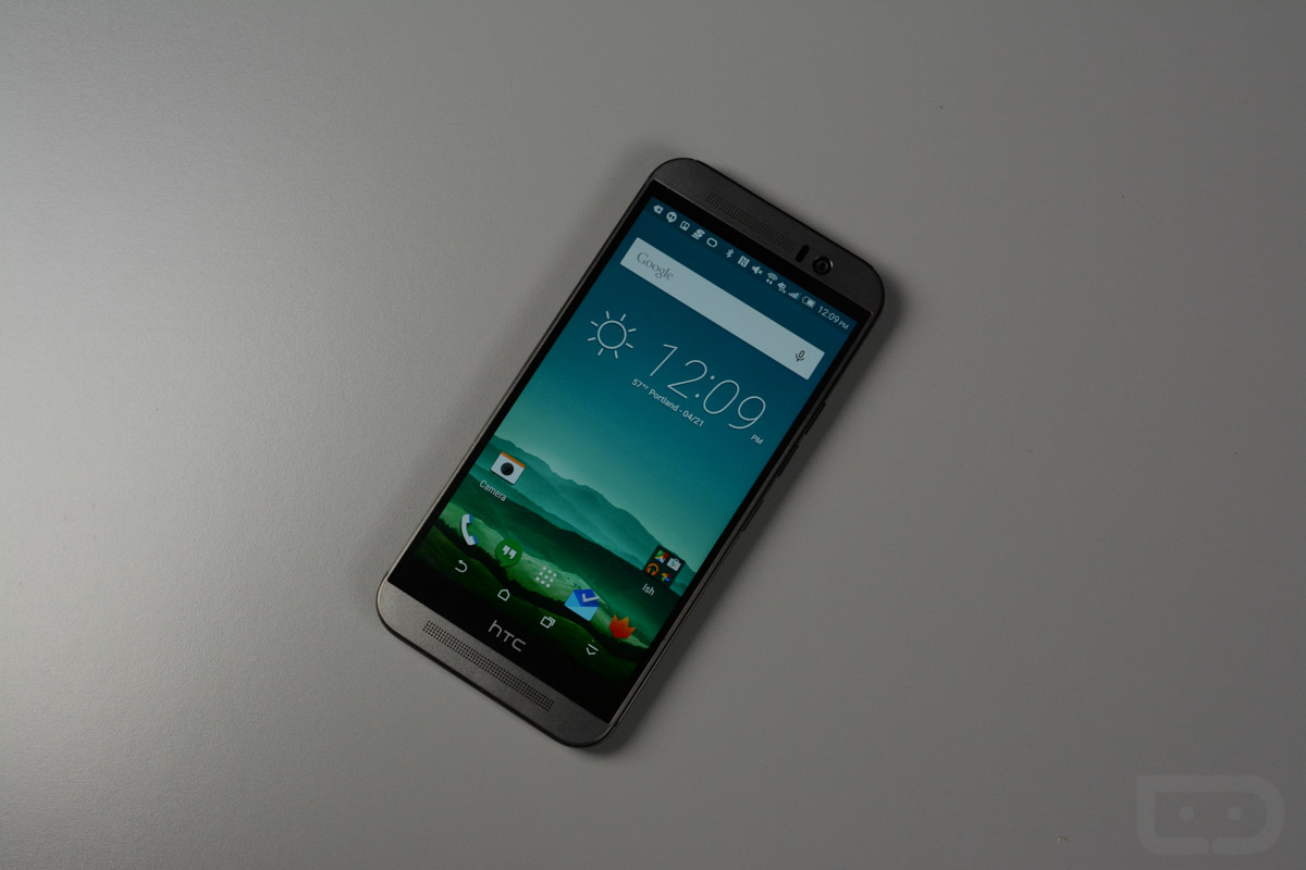
After using the HTC One M9 on and off for the last month, I think it’s probably time that we talk about some thoughts on it in an official review-like capacity. With our Galaxy S6 and S6 Edge reviews out of the way, I have had some more time to get the One M9 back in my hand and jot those down.
But before we get into the nitty gritty, let us first recap HTC’s newest flagship. The One M9 is HTC’s third attempt at this whole all-metal design thing that they think is a major selling point. It’s also their third attempt at getting a camera right, selling us on why we need BoomSound in our lives, and why you should actually buy into this phone and HTC’s ecosystem, since most of you haven’t been. They played it safe with the One M9 for the most part, tweaked some things here and there as they saw fit, and now get to see if it all can compete with a revived Samsung.
Here we go, this is our HTC One M9 review.
The Good
BoomSound
The one shining light that remains an important part of the HTC One experience after three years is without a doubt BoomSound. The dual front-facing speaker setup on all three One devices has been a game changer that others in the industry have had to adopt to keep up. Front speakers make sense. You look at the front of your device when consuming media, so your speakers should face forward and blast audio in your face, not out the back. It’s a brilliant idea, and HTC is still doing external speakers better than anyone.
With the One M9, HTC partnered with Dolby to offer a 5.1 surround sound effect that sounds great for a phone. There is no other phone doing an audio experience like the HTC One, other than the other two HTC One phones. Sounds are deep, clear, and balanced no matter what you are watching or listening to.
If you own the HTC One M9, you no longer need any of those cheap Bluetooth speakers that you picked up in a daily deal on Groupon. The One M9 likely outshines them all.
Availability
HTC learned the hard way when it released the One M7 without Verizon at the party. By not having your phone available from the biggest carrier in the US, you certainly aren’t setting yourself up for success. Thankfully, last year and this year, HTC managed to get everyone on board, which means you can grab the One M9 at your favorite carrier without having to wait. The phone became available on April 10 and is actually available from the big four – Verizon, AT&T, T-Mobile, and Sprint. It also comes in a couple of colors, gunmetal grey and silver with gold, so you aren’t lacking in options here.
Performance
As we approached the One M9’s release, and more and more handsets found their way into the hands of fans and reviewers, a mini controversy brewed over the phone’s processor of choice, the Snapdragon 810. Early benchmarks that pushed the phone’s performance showed the phone approaching dangerous heat levels triggered by the 810. HTC promised and delivered an update that would address the overheating, but many were skeptical that the update would really just throttle the processor down a notch to hide its flaws, which would in turn mean sub-par performance under heavy load.
In my time with the HTC One M9, I haven’t noticed any performance issues, even with the phone heavily governed. In fact, this is one of the smoothest Android experiences I have seen. The phone wakes quickly, menus and app drawers load instantly, the touch-response is as good as it gets, apps load and respond quickly, and in the small amount of games that I have played, I never once saw a hiccup or stutter. The phone does still get quite hot when gaming or charging, but not at those dangerous levels.
There is always the chance that if you were to completely hammer on this phone – running benchmark after benchmark, or playing the most intense of games – that it would get uncomfortably hot. From my testing, it took a lot of work in order to get it outside of feeling just “warm.”
Uh Oh Protection
HTC’s Uh OH Protection is pretty damn cool. Within the first 12 months of owning the One M9, HTC will replace your phone free of charge if you manage to crack the screen, cause water damage to your phone, or switch carriers. If you don’t need a replacement within the first 12 months, then they will give you $100 to use towards a new HTC One.
Think about that. If you drop your phone on the ground and crack it or in the toilet and it dies from water damage, HTC will send you a new one for free within the first 12 months of ownership. To sweeten the deal, they will even swap out your One M9 for a new one should you decide to jump between carriers. No one else is doing this and we wish that they would.
Oh, and this all comes at no cost.
SD Card Slot
The HTC One M9 comes with 32GB of storage out of the box, but it does have a slot for a micro SD card that could give you another 128GB. That’s awesome, especially since HTC really only offers 32GB models of the phone here in the US. For many, 32GB is just not enough, so we appreciate the fact that they are allowing you to increase storage on your own at your own price. As you all know, Samsung is no longer including SD card slots because they want to drastically improve their margins by charging you $100 each from jumps to 64GB and 128GB. It’s a dirty tactic that Apple has made famous. Thank you, HTC, for not stooping to that level.
Somewhere-in-the-Middle
Specs
The overall package here with the HTC One M9 would have looked great in 2014. Since we are in 2015, it looks OK. We have a 5-inch 1080p LCD display, 3GB RAM, 32GB internal storage with an SD card slot for expansion, 20.7MP rear camera, 4 “UltraPixel” front camera, 2,840mAh battery, BoomSound speakers, and that previously mentioned Snapdragon 810 processor. It lacks anything special that pushes the industry forward, meaning there isn’t waterproofing or wireless charging or a special payment system or optical image stabilization in the camera or an ultra-thin body or a fingerprint sensor. On paper, especially when you factor in the controversial Snapdragon 810, you have a phone that was high-end a year ago, but really isn’t any longer.
Display
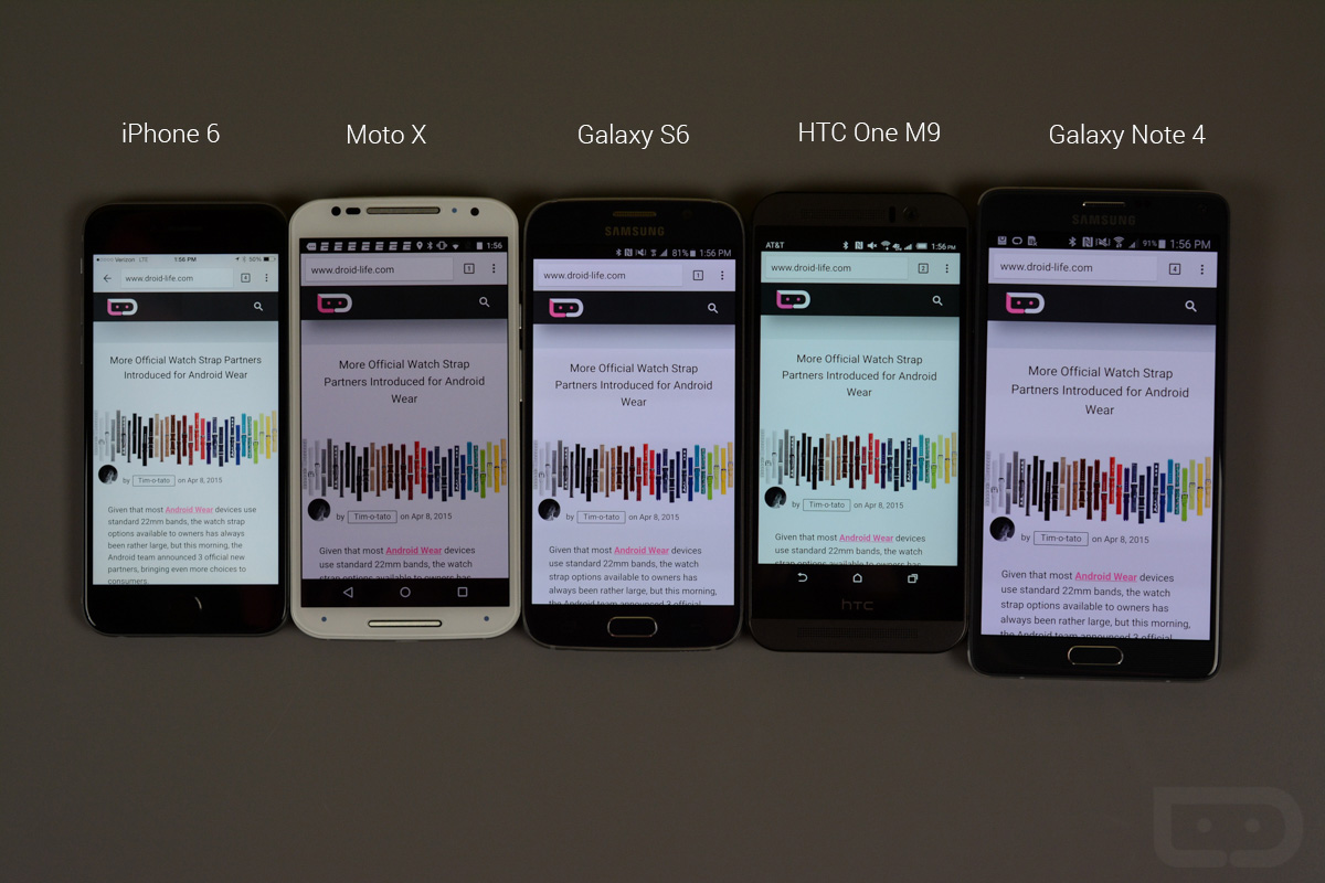
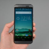
The 5-inch FHD LCD display used in the One M9 is average at best. While I tend to love the 5-inch size, it’s the quality here that is lacking. It feels odd saying that, since I always felt like HTC really brought us the best LCDs on the planet with each new phone. For whatever reason, this phone seems to have taken a major step backwards in this department.
For one, colors on the One M9 are way too cool, with greens and blues dominating almost anything you look at. I certainly prefer cooler display color temperatures over warmer, yellowish tones, but this phone leaves you thinking the world is under water if you use it for long periods of time.
The viewing angles are also quite terrible, which you can see from the pictures here of the phone compared to phones like the Galaxy S6 and Note 4. It does get quite bright at the high-end and shows clean whites, but fails to get dark enough during those moments in dim light where you don’t want a room to be lit up.
The display isn’t the worst you will find, trust me on that, but it’s not even close to being one of the best.
Macros for fun.
Sense 7
For an Android skin, HTC’s Sense 7 isn’t a bad one. Performance on HTC’s phones has always been good, which means their skin is optimized, something that can’t always be said about competitors, namely LG and Samsung. With Sense 7, you get HTC’s Sense 6 with the ability to add a 4th navigation button and a media sharing gesture. That’s it. I’m telling you I walked through Sense 6 on my M8 and it can do every single thing that the M9 can do, except those two things. In other words, Sense 7 really isn’t all that new, but that’s not the worst thing ever.
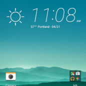
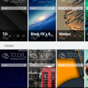
For one, you have themes now, so you can really customize the look of your phone. From the icons to the wallpapers to the accent colors throughout the UI, the M9 lets you design a phone skin to your liking (you can do this all on the M8 now too). HTC’s gesture controls from the lock screen are also pretty awesome, especially with the terrible button setup they added to the M9’s right side (more on that in a bit). Being able to swipe up, left, or right to get into specific areas of the phone is very handy. HTC adopted Google’s notification handling on the lock screen, which is greatly appreciated. Their gallery app is quite good, as is their calendar, and Blinkfeed remains a decent choice for quick news reading without having to install a 3rd party app.
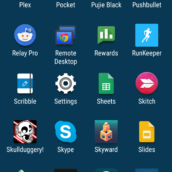
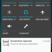
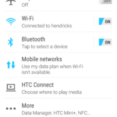
The app drawer still scrolls vertically, which drives me nuts, but may not for someone used to HTC’s way of thinking. The quick settings toggles are skinned terribly, but they are customizable and offer plenty of options depending on your needs. I really wish they would include a brightness slider in there, as Google intended with Lollipop. For whatever reason, though, it’s just a button that changes brightness levels with each press. The keyboard is a nightmare for the most part, but thankfully, this is Android and you can choose another. Home screen settings are also now separated into a couple of pages, making something as simple as moving a home screen an almost impossible task.
And that’s always been my biggest complaint with HTC and Sense, it’s that they change things, but can’t ever justify why they did so. They tend to break simple actions by making them more complex than they need to be and I can’t ever figure out why, or what it was they saw with their way of doing it that they thought made it better. Sense performs mostly flawlessly, but it’s figuring out what the hell HTC was thinking that makes it often quite frustrating to use.
The Not-so-Good
Design, Size, Weight, Buttons, Etc.
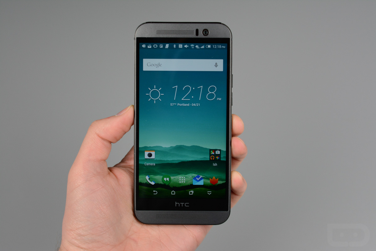
Last year, I called the HTC One M8 “smartphone luxury,” thanks to its fluid, unibody design that brought one hell of a premium experience. This year, I would call the HTC One M9 “tired,” “boring,” “stale,” and “safe.” This is a tired design on a line of phones that once stood for almost everything we wanted in a phone. Today, it feels dated, looks dated, and comes with new flaws and issues that weren’t asked for while other areas that needed change are left unaddressed. The HTC One M9 still brings a similar silhouette to the One M7 and M8, along with that premium, all-metal body. Unfortunately, HTC started tweaking things from last year to this year, leaving us with a phone that is now awkward to control, feels cheaper and sharper in hand, and overall, looks like a mix-matched knock-off.
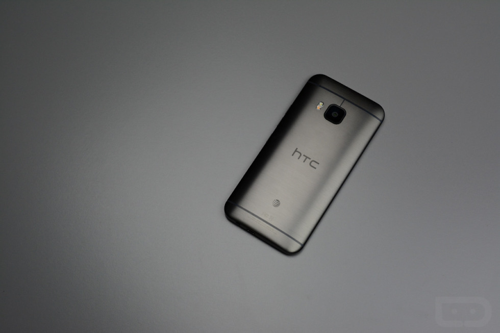
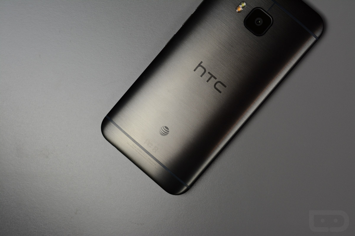
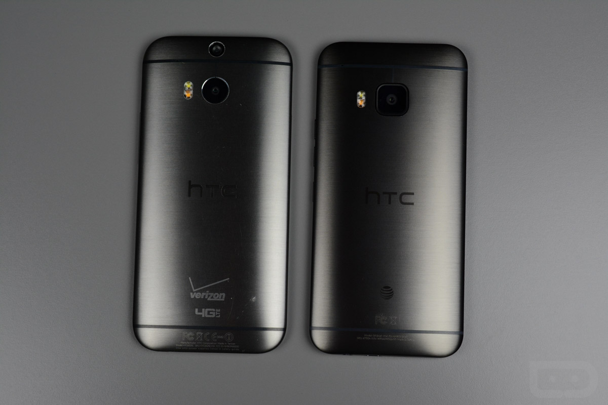
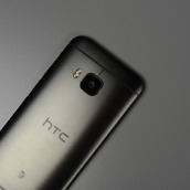
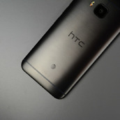
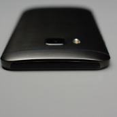
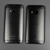
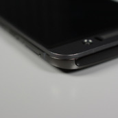
Design – I really don’t even know where to begin with this phone, so I’ll just be blunt and and say that it’s all pretty bad in the design category. Sure, this phone looks like the One M8 and M7 for the most part, both of which were well-designed phones, but there are all of these little tweaks that ruin a good thing. For one, it looks like HTC screwed up in manufacturing this phone. If you look at the One M8 next to the One M9, you will see the One M8’s almost perfect unibody design, where the back casing flows up all the way from the rear to the edge of the front’s display. On the M9, HTC produced a back case that appears as if it doesn’t fit properly and stops half-way up the side of the phone, creating a ridge that adds a sharpness I didn’t need. Couple that edge with different textures from the front to the sides and back of the phone and you have a phone that doesn’t really have an identity. The front metal panel looks like a blotted, matte metal, whereas the sides and back look like brushed metal with a gross glossy coating painted over top. They don’t fit together at all.
On the back, you have a camera housing that looks like a iPhone app icon, which is apparently supposed to match the phone’s rounded corners. It sort of does, except the camera is housed in a cheap piece of black plastic that is flanked by an embedded flash surrounded by perfect half-circles. There is no continuity anywhere in this phone.
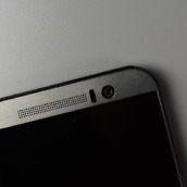
And of course, HTC and its “HTC black bar” are back again this year. They will tell you time and time again that this phone needs that black area to hide or house important pieces of the phone, but we all know that’s code for “We didn’t want to spend the money to re-do the phone’s entire design even if it is a major eye-sore and flaw.” HTC did manage to shrink the phone’s height a bit by decreasing the space of the “black bar,” but they needed to get rid of it altogether. If HTC could remove that area, they would be killing off a half-inch of unused space that would make this phone incredible to hold.
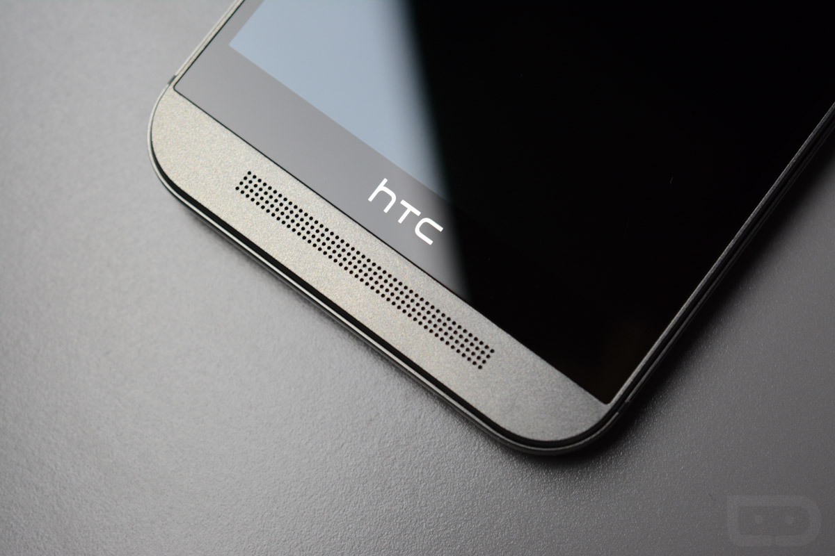
BoomSound Grills – As I already mentioned, I’m all for BoomSound. What I’m tired of seeing, are the two massive speaker grills on the front of HTC’s phone that are supposed to remind me of BoomSound. We get it, you put big speakers in your phone that sound great. But why can’t we evolve to the Nexus 9 design, which also has BoomSound, only in a much sleeker, more modern package that buries the speakers near the edges of the device?
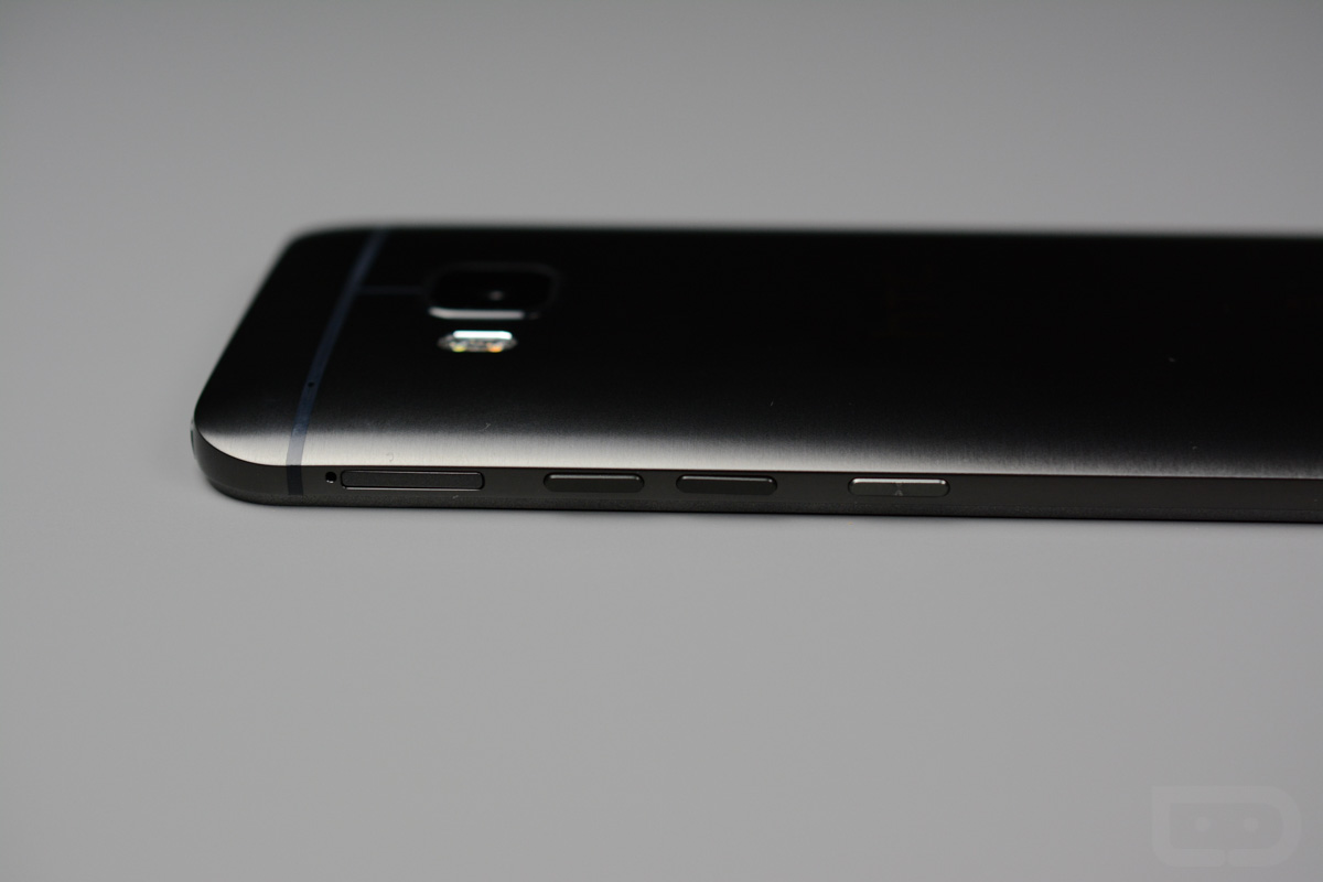
Buttons – Oh boy, the buttons. HTC moved the power button on the M9 to its right side, away from the top-of-the-phone spot it took up in the M7 and M8. That’s a good thing! Unfortunately, they managed to screw up the volume situation in doing so and made the whole button experience a confusing mess. On the One M9, HTC broke up a standard Volume rocker by separating Volume Up and Down into two buttons that sit directly above the new power button. You can’t tell these buttons apart, ever. I’ve been using the phone off and on for a month now and still to this day have to look at the phone before pressing one to make sure my thumb is in the right place. HTC did add some texture to the power button to try and set it apart, but the texture is so light it doesn’t help at all. Thankfully, HTC still includes off-screen gestures to get the phone unlocked or alive when the phone is idle, so you don’t need to hit the button as often. Good luck finding power to turn the display back off, though. I could go on for another hour about how ridiculously awful this button setup is, including how the thumb button is so poorly placed that you press it every time you pick up the phone, whether you wanted to or not, but I’ll stop and move on. Ugh.
Size and Usability – The One M9 and Galaxy S6 are almost identical in terms of height and width, which might surprise you. They are, however, quite different when it comes to thickness and weight. I’ll get to weight in a moment, but the M9 is almost 3mm thicker than the S6. That’s not necessarily a bad thing, but the combination of its weight, height, awkward button placements, HTC black bar, and on-screen buttons, leads to an in-hand experience that asks for way too much movement. You constantly have to shift this phone up or down in your hand in order to reach the notification area, volume/power buttons, and on-screen keys. It’s actually quite infuriating to use. And again, this phone is almost the same height and width as the Galaxy S6, which is a dream to use in hand and rarely requires the shimmy.
Weight – All-metal phones can be both good and bad. On one hand, they tend to look nice. They also tend to feel high-end in hand and help justify in your mind the price you paid, since they are made with quality materials. On the other, they can be incredibly heavy, which the One M9 is at 157g. The Galaxy S6 weighs just 138g. There is a noticeable difference in the two when held next to one another. We knocked the M8 for being too heavy last year and are going to knock the M9 for it as well. This is a phone that is heavy enough that you can feel in your pants pocket as you walk around. I personally, want a phone that doesn’t feel like extra baggage on my body.
As you can tell, I’m not at all a fan of the design of this phone. I liked the M7 and M8 for the most part, but HTC seems to have either given up here or gone the inexpensive route. Parts don’t match, buttons weren’t thought out correctly, textures and colors are all over the place, and it weighs as much as a small tank. This phone isn’t fun to use or look at.
Camera
After two years of feedback on its “UltraPixel” cameras, HTC finally gave in and went with more traditional 20MP camera (without optical image stabilization) in the One M9. Out of all the complaining I just did about the phone’s odd casing and textures, the “black bar” or its weight, most of that could have been forgotten about or dealt with if HTC had used a world-class smartphone camera. Unfortunately, they haven’t. In fact, I would take the UltraPixel gimmick over this new 20MP shooter almost any day.
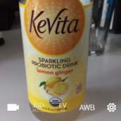
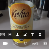
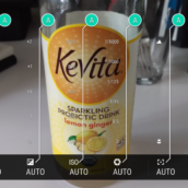
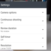
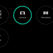
As always, before we get to the samples, here is a look at HTC’s camera UI. I would argue that it is one of the better UIs, with controls in easy-to-reach places, full manual settings, the ability to create your own preset shooting modes, shortcuts for things like ISO adjustment, etc. For the most part, I really like HTC’s camera software – I always have.
Once you push aside the software, that’s where things start to get depressing. Now, please note that I am using the AT&T model of the One M9 and have been for weeks. Up until today, the phone was waiting on a camera update that was pushed to international variants of the phone weeks ago. The update is supposed to improve the camera experience, so that essentially forced me to re-shoot images and analyze them for this review in a shortened amount of time. While I would love to have spent another week or so getting more image samples, I’m fairly confident that the images I’ve captured will show you what to expect. In fact, things haven’t really changed all that much from before the update.
In the photos I’ve taken while using the One M9, you’ll notice one thing almost immediately – the fine details are missing and images almost always come out over-processed with a lot of noise. In decent lighting, you can take OK photos. Actually, the phone shoots nice macros when you aren’t in a dark situation, macros that you would be willing to share (check out the flower below). But should you open up to a bigger scene, whether that be of a landscape or room, the camera just doesn’t seem to be able to produce. It blows out anything near a light source, is beyond finicky with touch-to-focus, turns fine lines into furry looking strings, and struggles mightily with moving objects.
The camera itself is slow to focus, often times slow to shoot, and doesn’t load all that quickly either. HTC tried to speed up the camera launching time by including a Volume-Down button press with the phone in landscape, but it rarely works.
Again, this is a pretty major downgrade in camera, even from last year’s One M8. While the One M8 only shot 4MP photos, it was still quite capable of taking decent photos, was awesome in low light, and was insanely fast.
If there is one positive to the camera setup on the M9, it would be the front facing camera, which utilizes all of HTC’s leftover 4 “UltraPixel” sensors. The front camera is great in low light situations and very fast, which means your club selfies will look amazing.
HTC had one thing to really nail over last year’s phone and couldn’t do it. What exactly were they doing for the past 12 months?
Full resolution: 1 | 2 | 3 | 4 | 5 | 6 | 7 | 8 | 9 | 10
Battery Life
The HTC One M9’s battery weighs in at 2,840mAh, which is almost a full 300mAh larger than the Galaxy S6, and also only has a 5-inch 1080p display to power. With that in mind, I can’t help but admit that I am disappointed in the fact that I’m getting slightly-worse 10-12 hour battery life on this phone as I am the Galaxy S6. How can this phone, with its supposedly efficient Snapdragon 810, 1080p display, and arguably larger than average battery size, not outlast Samsung’s new flagship that has a smaller battery and QHD display? I don’t know why, but in my testing, it has been pretty poor (and that’s considering a not-so-amazing AT&T connection), which really means that the One M9’s battery is below average for today’s standards.
No Wireless Charging, Fingerprint Sensor, Removable Battery, or Waterproofing
HTC has never really been into the whole wireless charging, battery removing, or waterproofing thing with the One series. I wouldn’t necessarily call these missing pieces “deal breakers,” but there are those out there who need these things to be included. I can live without them, for the most part, especially since this phone should support Qualcomm’s Quick Charge 2.0. I say “should” because this phone has been hit or miss with my Quick Charge 2.0 adapters. Some just won’t even charge this phone at all, while others do.
Wireless charging would have been nice to have, especially since Samsung found a way to support both of the wireless charging standards in the Galaxy S6, but that could be a difficult task to ask of HTC with all this metal, for all we know. The removable battery, well, most phones don’t have them these days. As for the waterproofing, few phones have this as well. The lack of a fingerprint sensor is odd, though, since HTC has already announced the One M9+, which is a superior phone in almost every category, with a fingerprint sensor. Again, this stuff isn’t what I would base a purchase decision on, but I know how much it means to some of you and it would have been nice to see at least some of it included. These are value adds that HTC completely whiffed on.
Introduction of the One M9+
Less than a month after HTC introduced the One M9 as their world flagship, they introduced a second phone called the One M9+ for China that beats the original in almost every category. The M9+ has a QHD display, similar camera setup but with a Duo sensor tacked on for fun (it’s also round!), and a fingerprint sensor. Why was all of this stuff left out of the regular M9? And why on Earth does HTC think it’s OK to introduce this upgraded phone so closely to the One M9 that everyone just bought? Talk about insulting.
Video
Unboxing
[responsive_vid vid_url=”mKx9CYFZH0Q”]
Galaxy S6 vs. One M9
[responsive_vid vid_url=”HE_SeMDY_hM”]
Gallery
The Verdict
So yeah, you probably don’t want this phone. It’s heavy, awkward to use, has a pretty poorly put together design, an unimpressive display and camera, less-than-average battery life, and doesn’t include any sort of game-changing or lust-worthy features that other smartphones don’t already have. HTC played it safe and still managed to screw up. Think about that for a minute.
If you love HTC and their all-metal designs, go buy last year’s One M8. It’s a better phone in almost every single category, yet you can buy one for $1 on-contract or under $300 without one.






Collapse Show Comments188 Comments