To me, the Galaxy S6 Edge represents a risk Samsung was willing to take when it comes to design. It’s something different. And even though it is different, it’s not completely unorthodox when I really think about it, and at times, is quite nice to have. I have been asked what viewing content is like on the rounded display, and to the shock of a few, I actually really enjoy it. While the Galaxy S6 Edge does not feature as much “usefulness” as say, the Note Edge does, it still offers a few things that regular Galaxy S6 owners don’t have access to.
In the video below, I go over the differences that make up the two, but be aware right now, it’s not all that much. Samsung does not include a ton of options or features for the rounded display, but of the few that are included, I could see them being somewhat beneficial at some point or another to someone out there.
The first two are People Edge and Edge Lighting. These were the main features that Samsung showcased when they unveiled this particular phone. When People Edge is enabled, you can pull out a drawer from the side of the display, accessing a list of up to 5 favorite contacts on your phone. Each contact is assigned a color. Think of it like quick contact access. From here, you can text or call this chosen contact. If you have a close group of buddies or a significant other you contact a lot throughout the day, this will come in handy.
Now, this pairs with Edge Lighting. Depending on which color you have assigned to any given contact, when they call you, and your phone is face down on a flat surface, the selected side of the display will illuminate in that chosen color. With this, you can know exactly which one of your top 5 favorite people in the world is trying to get a hold of you.
The other features included are Information Stream and Night Clock. Night Clock is pretty self explanatory, but just in case you can’t figure it out, the side of your display will illuminate a clock which you can view during the wee hours of the night, meaning you won’t need to turn on your bright display to see the time. It’s not all that special, and frankly, I won’t be using it at all during the time I am using the Galaxy S6 Edge.
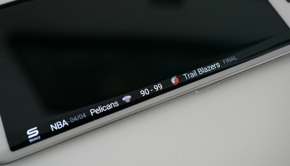
Lastly, there is Information Stream. This is the feature that comes directly from the Note Edge. With this enabled, and your screen turned off, you can rub on the side of the display, which will then show you stock tickers, missed notifications, Twitter happenings and more. All of its capabilities are explained in detail in the video below.
Now, as for their exact usefulness, I wish I could be more positive, but I do see them being a tad bit useless at times. To me, the rounded edges are not deep enough to really offer all that much. For example, the Note Edge’s side acts a separate display, allowing for more usability. The Galaxy S6 Edge features a single display, which just so happens to dip over the edges. While it looks incredibly good to me, the features Samsung baked in to take advantage of this design don’t make the $100 bump in price all that worth it. But I will leave that part up to you to decide.
Check out the video, then share your thoughts below. As a bonus, feel free to throw in your ideas for how Samsung could have possibly better taken advantage of this dual-rounded design.
[responsive_vid]


Collapse Show Comments91 Comments