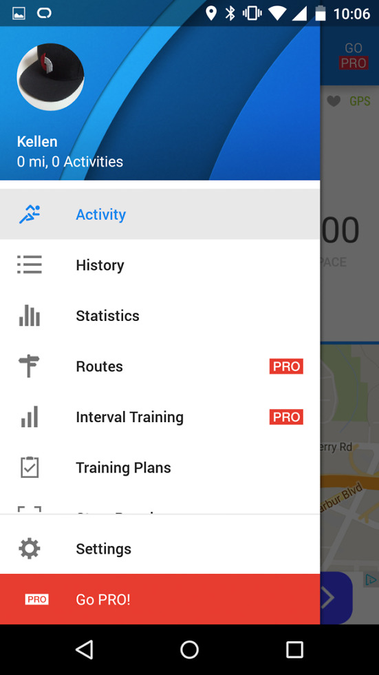
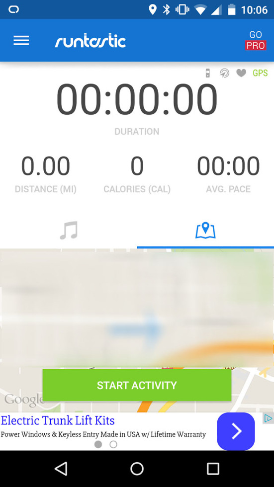
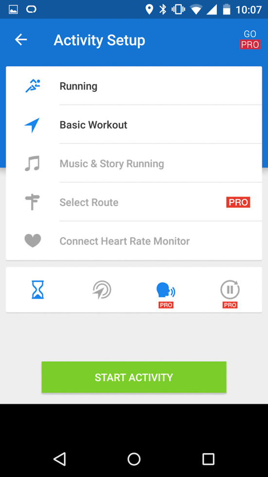
2015, like we predicated months ago, is going to be the year of “INSERT APP received a major, super, awesome, blowout, overhaul, update, makeover to Material Design! #materiyolo!” We, as a team, grew sick of writing up each and every single attempt by developers to update to Google’s latest design language, something you may have noticed. Most apps, if we are being honest, aren’t getting it right. But some, like Runtastic which received an update today, is worth a mention and feature.
For those not familiar, Runtastic is by all means one of the most popular running apps available. It tracks runs by GPS, lets you customize routes, play music with runs, provides statistics on history of runs, gives you training plans, and includes coaching (pro version). The crew behind it also have another dozen or so workout-related apps, but this is their bread and butter.
In today’s update, we find panels that actually appear to be layers on top of other layers, moving parts the slide in and out of compartments, and ripples reminding you that you are physically touching objects. This is one of those updates to an app that encourages you to download it just so that you can play with it. Well done, Runtastic team, well done.
If you aren’t yet tracking your runs with an app like Runtastic, now would be a fantastic time to start. I personally use Runkeeper, but its UI is pretty terrible when compared to this. Might be time for a switch.


Collapse Show Comments12 Comments