Sonos, the Hi-Fi speaker company whose systems turn your house into a multi-room multimedia mecca, and whose products have also led to recent copycat products from most of the biggest electronics manufacturers in the world (that would be Samsung, LG, and a bunch of speaker knock-off companies), released version 5.3 of its Sonos Controller app in public beta today. Now, normally we wouldn’t care enough about the beta release of most apps to generate an entire write-up, but this is a very important update that all Sonos users will surely appreciate.
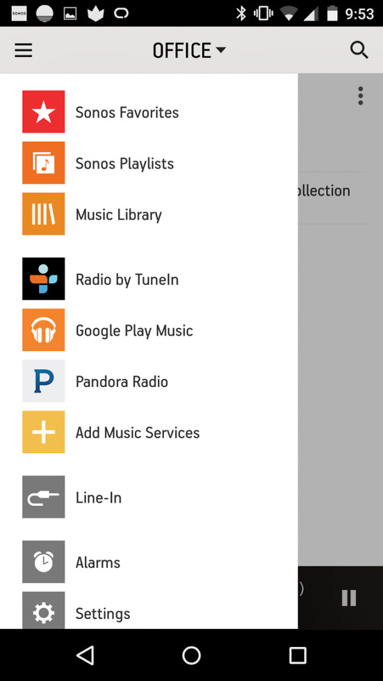
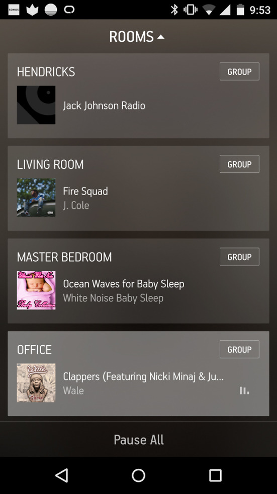
The app turns what has consistently been one of the worst designed apps I have ever used into one of the best. You can finally quickly switch between Sonos components or rooms with a top dropdown menu that is accessible from anywhere in the app. Your now playing screen can be dismissed with a swipe down that brings you into your list of music. And finally, all of your music services, settings, and other options are available in a slideout navigation menu tucked into the left side of the app, like all other well-designed modern apps.
As a Sonos user, I can’t stress enough how much of an improvement this app is. The old app made using such a fantastic system and massive pain in the rear. In this new app, that I have had the pleasure of using for a couple of weeks now, you can jump around from speaker to speaker and music service to music service to adjust groupings or songs or volumes so much more efficiently.
If you own a Sonos, you will want to grab this beta update immediately. To download the latest 5.3 beta, head over to Sonos’ site.
Here is the full list of changes:
- A faster way to manage all the rooms in your home: Effortlessly move your music around your home with a more accessible rooms menu, now available by tapping the top of any screen in the Sonos app.
- Improvements to the tablet app: New dedicated screens for what’s playing and music discovery on iOS and Android tablets makes toggling between screens more intuitive.
- Quickly switch between screens: Using your phone, swipe down from the now playing screen to go back to browse your music. Then swipe from left to right to show all your music sources.
- Want to hear that verse again? The track progression bar is back in your now playing screen, just below the album art. Drag it to whatever point in the song you want to play.
- Easier to mix it up: With Crossfade, blending your tracks is simple from within the info menu, now more prominently placed alongside the sleep timer. From the now playing screen, press the info button to access.


Collapse Show Comments15 Comments