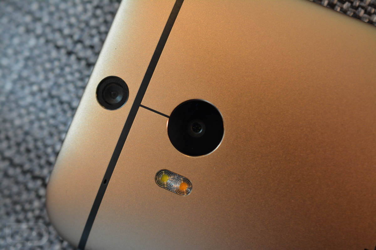
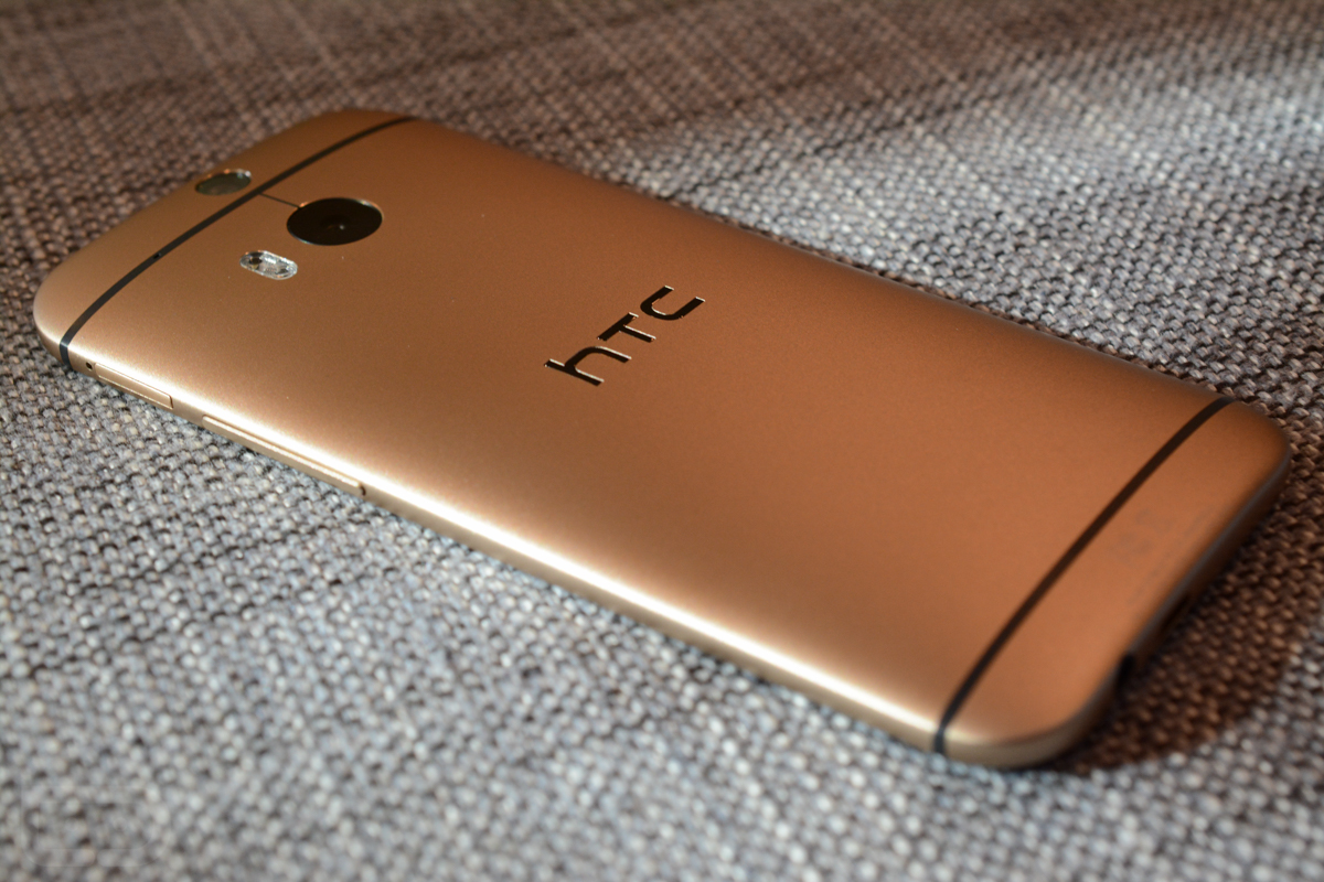
The new flagship device for 2015 from HTC is weeks away from its unveiling. At this point, we aren’t sure if it will be called the One (M9) or “Hima” or something else, but we are pretty sure that we caught a glimpse of the updated model today. Early reports (and those images) suggest that this phone will look incredibly similar to last year’s One (M8), only with updated specs inside to make it a modern day powerhouse. You could argue to either side that sticking with the same design is either bad or good for HTC, but I would say that we tend to be somewhere in the middle, leaning towards “good” – it could potentially be a really good move. What I mean is that we loved the look and premium feel of last year’s phone, so sticking with it makes sense. It’s just that there were some glaring issues with the phone that kept it off of our chart for Android phone of the year.
Since we are so close to a reveal and we have seen what may be our first looks at the device, we thought it was time to talk about how HTC can improve upon last year’s model to make a phone that few Android OEMs will know how to compete with. HTC was so close last year (and the year before), they just needed to ditch the camera gimmickry and focus on some of the smaller details.
Here are 5 ways this new HTC flagship can be the phone of the year.
Stick to a similar formula, just tweak it.
As the images from this morning show, HTC may stick to a similar formula this year with their new One (or whatever it will be called). I actually don’t mind that move. Not only was last year’s phone ultra-premium and ticked off almost all of the must-have boxes, bringing back a similar design continues to let fans and future fans of HTC devices easily associate a premium aesthetic with the brand. Their brand has taken a major hit over the last couple of years, but by bringing back familiarity year in and year out, HTC could eventually find that success again in the high-end arena.
But also, as I mentioned in the opening, HTC almost created the perfect smartphone last year. Why change it up drastically this year? All the phone really needs are a few tweaks (which I’m about to discuss) and HTC has done it – made the perfect phone.
Camera gimmicks be gone.
When HTC introduced the original One (M7) with its 4MP camera that the company dubbed “UltraPixel” technology, we sort of gave them a pass. They were trying to push bigger pixels that capture more light and are better in low-light situations instead of worrying about MegaPixel count. The idea made a little sense, except for the fact that pictures only came out with a meager 4MP resolution, meaning they were only good for sharing on Facebook or Instagram, not editing or printing or zooming into or doing anything serious with. For many people, 4MP is probably good enough, but when the only camera with you 24-7 is the one on your smartphone, you might want it to be a bit more flexible than just a glorified social network sharer. Think about it – phones now have QHD displays and the displays in your house will soon become 4K.
And then HTC gave us the One (M8) a year later and we assumed we would get a real camera or at least a 8MP “UltraPixel” camera. Nope. We got the same gimmicky 4MP shooter, but with a gimmicky Duo sensor set above it to capture depth information that could be bokeh’d after the fact. I can’t even begin to describe the disappointment that this camera pushed upon us.
So this year, all signs point to a 20.7MP Sony sensor that ditches the UltraPixel and Duo garbage and should just shoot good pictures. HTC knows what they are doing with optics, I think we can all admit that. Look at their camera app and camera performances over the years – they are always our favorites. They just needed to get out of their own way the last two years, instead of trying to reinvent smartphone cameras with marketing terms.
We obviously don’t know how good the 20.7MP sensor on the new device will be until we use it, but the thought of HTC’s premium built phones with a real camera inside makes us giddy.
Add some texture to this slippery beast.
Metal phones are all the rage these days, whether you like it or not. Thanks to Apple pushing the limits with premium design, everyone else wants to do the same, which means metal is where the design world has gone. HTC was one of the first to put as much metal in a phone as is humanly possible with the One (M7), even making it somewhat of a signature for their premium brand of phones. The One (M8) had an even more metal-y body than the (M7), and the new One (M9) will likely have something similar.
Unfortunately, metal has one major issue that may be difficult to overcome – it’s beyond slippery. Both the One (M7) and (M8) were two of the slipperiest devices I have ever used. The slipperiness still bugs me to this day, each time I pick them up. If your hand isn’t coated in moisture as you grab them, be prepared to feel the slippage. And because of their oddly tall designs, you have to constantly adjust your grip on the phone when using one hand, which of course is a major problem with something this slick.
Now, I don’t know how HTC can improve the grip on the new One, but this is a problem that needs to be addressed. I’m certainly not the only person who thinks their phones are too slippery. Either, add some additional texture or remove whatever coating is over the metal and replace it with something else.
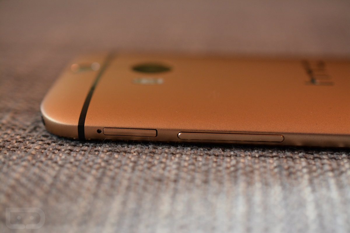
Power button should always be on the side.
HTC was one of the last manufacturers to stick with a power button placed on the top of the phone’s body; they did it with both the One (M7) and (M8). All signs are pointing to that changing with the new One (their Desire EYE has a side button), but we have to point out how important this move is. Because of how tall, slippery, and awkward the One body can be to hold, a side power button removes some extra needed adjustments, which could in turn mean less chance for a drop and broken device. It’s also super convenient, since your phone is there already anyway.
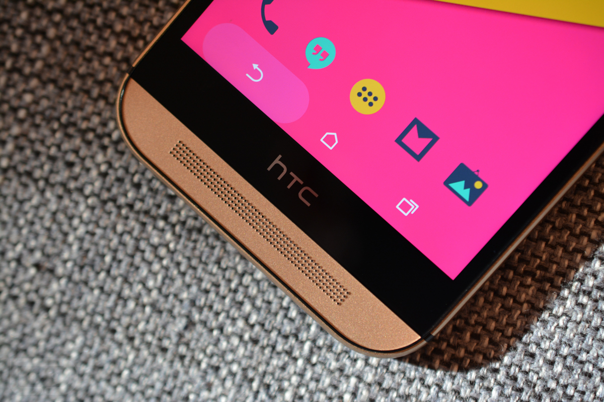
The HTC black bar needs to go.
If there was one complaint we saw time and time again last year as the One (M8) leaked left and right, it was over the fact that the device sported a massive black bar that housed an HTC logo. HTC, of course, claimed after launch that the black bar hid important “circuitry” and was there for a reason, but most remain unconvinced that there isn’t a way to get rid of this section altogether to shrink the phone’s height.
Part of the problem with last year’s One (M8) is how tall the device is in hand. It’s not wide, but it is tall, which makes it difficult to reach the notification area and that top-placed power button. The leaked pictures of this year’s One still show that massive black area with HTC logo, so I think we have lost this battle. That’s really too bad, because with that area gone, this phone loses a half-inch of height and becomes as perfect in size as a phone can get in today’s oversized phone world.
HTC, I would take a thicker phone if it meant you could move that “circuitry” elsewhere. Your logo on the back coupled with the all-metal body is all I need to know that I’m using your phone.
Do all of that, HTC, while keeping with the same formula as last year and it will be hard for anyone to beat you. No, I’m not talking about sales, I’m simply talking about a phone deserving of a “phone of the year” title.


Collapse Show Comments77 Comments