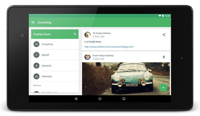
Pushbullet received another huge update this morning, this time with a fresh coat of Material Design paint. That’s right, the app has been completely made over to adhere to Google’s new design guidelines. As one would expect, it looks beautiful. But that’s not all, Pushbullet also introduces easier filters of previous pushes, searching, clearer language settings, streamlined push screens, and all sorts of little design highlights that you will notice as you scroll around the app.
Here are some of the changes, explained by the Pushbullet team:
- At-a-glance look at pushes from yourself, your contacts, or your favorite channels. Whether you want to see all of your recent channel pushes, or you are looking for that tiger selfie one of your friends sent you. We got you covered. Oh, and the tiger selfie was from Bob. It’s always from Bob.
- Convenient search for devices, friends, or channels. If you are a Pushbullet user you are probably incredibly good looking and have hundreds of close friends. With your schedule so jam-packed with awesomeness, you don’t have time to find things by scrolling. We’ve made this easier by baking search right in.
- Clearer language for settings. Language is clearer so you know exactly what you are enabling or disabling. We also made some of it more accessible so you can find what you’re looking for.
- One screen. All the options. We get emails from users day in and day out asking how to find certain settings. It shouldn’t be that hard. We’ve made it simple with this update by putting them all in one place. We also reorganized them so things are where you expect them to be.
- We streamlined pushing to just one screen. When you share something from another app we will keep you in that app just like before, disrupting you as little as possible. If you are in our app, you can push full-screen, to use every pixel of your 6 inch “phone”. And if you make a mistake and select the wrong photo, you can change it easily.
- There are dozens of other tiny details all throughout the app. We added floating action buttons, subtle scaling effects, dynamic color theming, status bar dimming, a complete revamping of our iconography, and more to bring a level of polish and care we are extremely proud of.
- Our new drawer enables quick access to channels, settings, and more. Another common request has been the ability to easily turn our awesome notification mirroring on or off which is now possible right from the drawer.


Collapse Show Comments10 Comments