After reading Kellen’s iPhone 6 review and discussing the lack of an app gap on the Droid Life Show, I thought I should revisit my conviction that there were still some apps that could not be found or matched on Android.
It had been about a year since I last checked for certain kinds of apps and my tastes have changed some, so I figured I should take a look.
To my delight, I discovered that eight of the apps that I love to use that I thought were iOS only are now either available on Android or have comparable counterparts from another developer.
1. Tweetbot – Talon and Fenix
Tweetbot is my favorite Twitter app that I’ve ever used (and I’ve used a lot of Twitter apps). Tweetbot has timeline sync, user and keyword muting (way before the official app even conceived of the idea), drafts, translation, streaming, etc. It’s a fantastic app that values the little touches. For example, Tweetbot has featured a “Use last photo taken” option for years and inlcudes swipe gestures to quickly favorite or retweet a tweet.
There have been Twitter apps on Android that have had some of these features in the past, but it wasn’t until recently that developers stepped up their game with features and design. Falcon Pro was the first app to really feel native to Android and include a plethora of features, but it wasn’t long for this world.
Talon and Fenix have been my favorite Twitter apps to use on Android. Both have extremely similar UIs and feature sets. I prefer reading Twitter in Talon because it has the option to jump to the top of your timeline towards the bottom of the screen whereas Fenix jumps to the top by tapping the top of a column, which is far less usable on 4.x” devices. For composition, however, Fenix has the edge between a swipe gesture to compose and faster access to quoting tweets with a comment. Talon also supports themes, which means you can customize the look of the app (although I ended up sticking with a stock view).
Note: Talon is no longer available for purchase on the Play Store because they recently reached their token limit. If you already purchased Talon then the link will still work, but otherwise take a look at Fenix.
2. Fantastical – Today Calendar
There have always been plenty of third party calendar options on iOS, but Fantastical has always been my default. While it isn’t quite as flashy as Calendars 5 or Sunrise or x, it has the full month view with events underneath view that I loved about iOS 6’s calendar app. In my opinion, any calendar app that doesn’t have that view as a default option just doesn’t work for me. Fantastical not only has that view as its default (it also has a week view for you monsters out there that prefer that view), but it has Reminders integration (which would be more helpful if Reminders actually, you know, reminded you about things consistently) and, most importantly, it parses text as you type (so ‘Lunch from 1pm to 2pm at Corky’s” creates an event titled ‘Lunch’ with those start and ending times as well as Corky’s as the location).
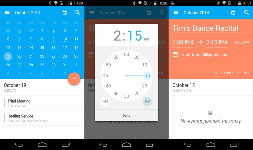
Today Calendar doesn’t have integration with a reminder app or text parsing, but it does have a month view with details below and a gorgeous Material design. The app has beautiful animations, a translucent widget, and color options. With a text parser it would be perfect, but for my usage it’s functional and beautiful.
3. Mailbox (iOS)
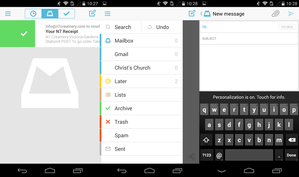
I still use the stock Mail app for my work email, but when I want to feel like I’m getting things done (Copyright DavidCo, 2001) I use Mailbox. There are plenty of other competitors out there now with their swiping gestures and their cutesie Inbox Zero euphemisms, but Mailbox has always felt right to me. It’s the first email app on iOS that made archiving fast and easy (although the lack of archive actions from the lockscreen and notifications is taxing) and that made me ask a really important question: when should I deal with this email? By treating my email as a to do list I’ve been able to reach Inbox Zero (the original version that Merlin aspired to) every day and shoot emails into the future. Do I sometimes just delay the inevitable when I do that? Of course, but I also often shoot an email into a time and date when I want to deal with something, and when that happens I feel like I was able to get something… accomplished.
Mailbox works great on Android. I especially love when something comes in that I can archive straight from the notification shade. If you’re still using the Gmail app and haven’t given Mailbox a try, I’d encourage you to take a look. Gmail has swipe to archive, but you haven’t really lived until you schedule to see your Verizon bill the day after pay day.
4. Safari – Firefox
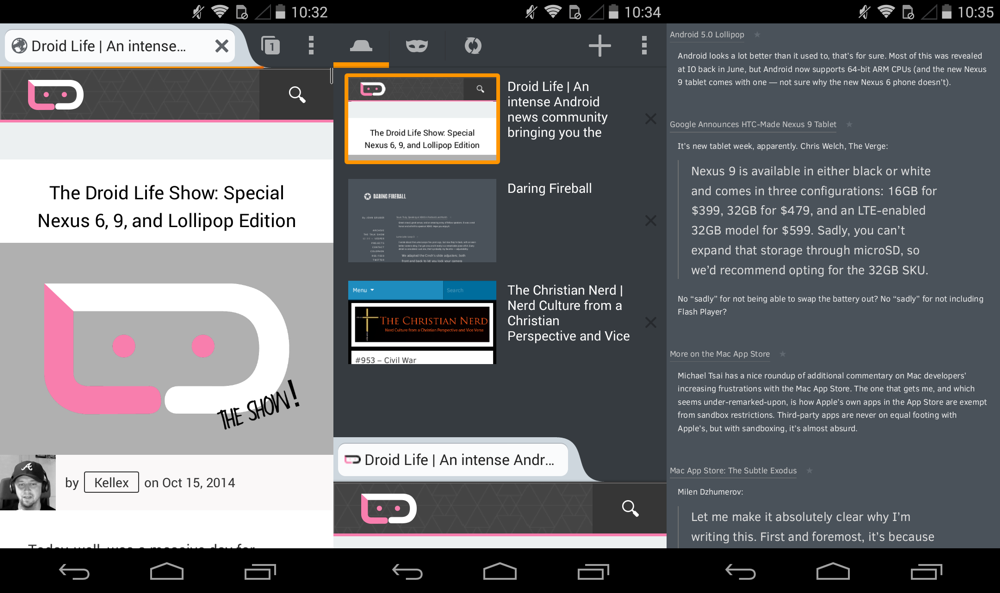
I love Safari on iOS. There, I said it. Sure, I could use Chrome and sync my tabs and favorites, but I really don’t use those on my phone. Most importantly, Chrome has never performed well for me (on iOS or Android). Firefox, on the other hand, works well. I’m not a huge fan on Firefox’s open tab view, but I do love that it renders pages quickly, scrolls responsively, and most importantly, knows how to double tap to zoom over text properly. If you haven’t tried Firefox in a while, give it a shot (I wrote up a lengthier review of its last major overhall here).
5. Vesper – Evernote
There are a million note taking apps for iOS (No, I’m not exaggerating. Just do a search on the App Store so you can see all the apps that are tangentially related to text input.), but my favorite is Vesper. It doesn’t have a Mac, iPad, or web app (yet, at least in the case of the Mac), but it does let me type out my notes, write articles, scribble down band names, append images to my notes, and organize notes by tags with Emoji. There are note taking apps out there that do more, but Vesper works for me and my taste.
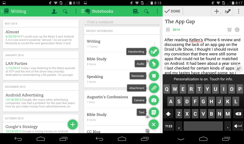
Android has seen an increase in note taking apps as well. This was one category that seemed to be ignored by developers even a year ago. That being said, the only app I would consider recommending is Evernote. Not only does Evernote have pretty much every feature that someone could want in a note taking app, but it has a beautiful design. There are cleaner, simpler note taking apps out there, but Evernote takes the cake for features and design in my opinion.
6. Over (iOS)
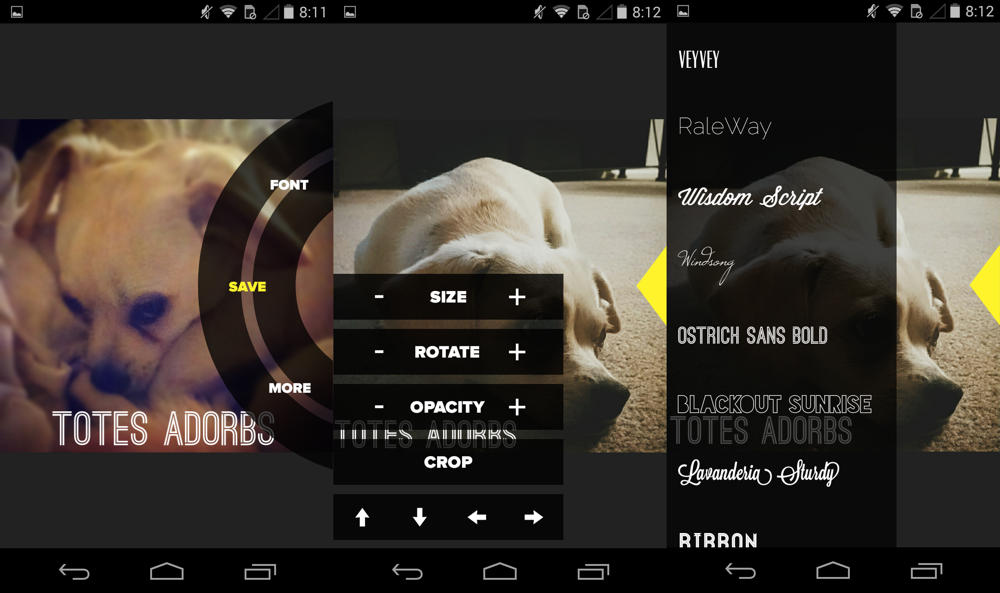
There are plenty of image editing apps that are still iOS-only, but my favorite app, Over, is cross-platform. Over lets you add text in a multiplicity of fonts over an image (get it?). I love the font choices and the app is as easy to use as it is beautiful. If you ever have a need to add text over an image, take a serious look at Over.
7. Day One – Flava (iOS)
Day One is one of my absolute favorite apps for iOS and OS X. It’s a journaling app from Bloom. The app features Dropbox and iCloud sync, photo integration, reminders, calendar views, weather detils, Markdown support, passcode lock, location details, inspirational quotes, and the option to publish journal entires (which require a link for privacy).
Journey, an app made by 2appstudio, is a complete rip off of Day One. Don’t believe me? View both websites. Day One was originally released in 2011 on iOS and OS X, while Journey was only released in July of this year. Journey not only ripped off the features of Day One, it copied the design of the app and even the website. DayJournal, an app by The Apps Pod is an equally shameful ripoff, although the developer was lazy enough to not copy Day One’s website.
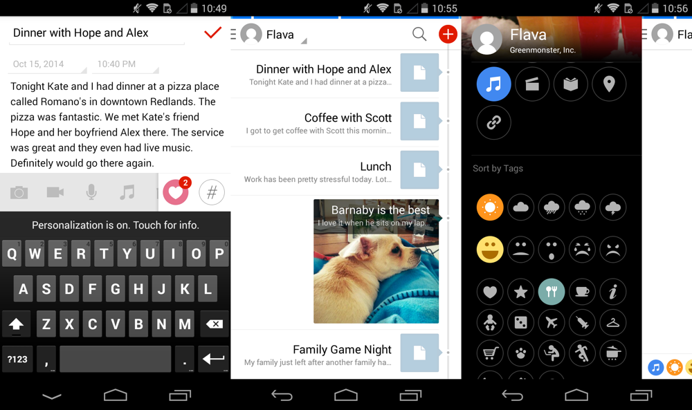
If you’re looking for a full featured journaling app on Android (and iOS and Chrome) that isn’t from a developer with blatantly compromised morals, consider Flava by Greenmonster. Flava identifies itself as a journaling/note taking app, but it feels more like a social network for yourself (Path specifically). Entries can be something as simple as text, a picture, a location, what you’re listening to, how you’re feeling, or all of the above. It has a modern, clean design and it’s free to try. If you hit the 250 MB cap, want to add multiple photos, or x then you’ll need to pay through an in app purchase.
8. Overcast – Pocket Casts (iOS)
I listen to a lot of podcasts, so it’s important to me that my podcast player looks nice and works well. I used Downcast for a couple years because it was a flawed best, but Marco Arment’s Overcast blew Downcast out of the water for me. The app has a creamsicle color palette, smart playlists, podcast recommendations (powered by Twitter), sync, a web app, background downloads, and most importantly, Smart Speed and Voice Boost. Voice Boost equalizes the EQ and maximizes the volume, which is especially helpful on low-quality shows. Smart speed reduces the length of silences, making shows run faster without sacrificing voice quality.
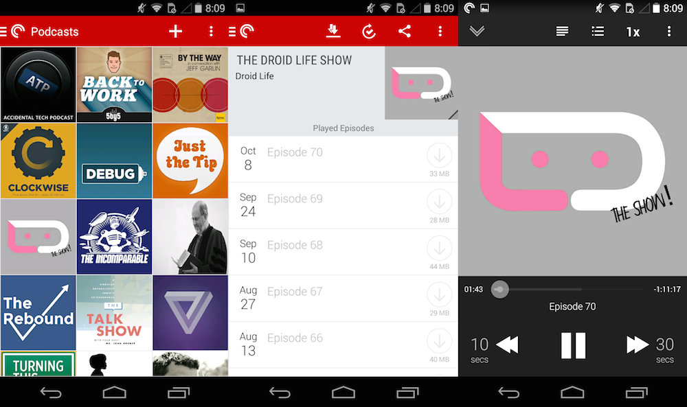
While there isn’t an app with all of those features on Android, Pocket Casts comes close with a beautiful design and plenty of controls to ensure you’re able to listen to podcasts the way you want to. Pocket Casts also has an iOS app, so if you’re one of the many Android phone/iPad people out there, you can keep up with your shows on both devices. Pocket Casts supports Chromecast on the Android app and AirPlay on the iOS app so you can shoot your shows to a TV if you’re so inclined. My favorite thing about Pocket Casts, though, is definitely the clean, album-art-centered design. It reminds me of a wall of LPs that I always wanted.
Are there still apps that release first on iOS or stay exclusive to iOS? Yes, but that is becoming more and more rare every year. While I don’t expect Android first development to become a thing any time soon for mainstream apps, I also don’t expect iOS-only to continue outside of niche apps and developers.

Collapse Show Comments184 Comments