Last year’s Moto X earned “Top Android Phone of 2013” honors from our staff even though it had some pretty major flaws. With its below-average 720p display and mostly-terrible camera, the overall package still bested the rest of smartphones in the game, thanks to its perfect size, Moto Maker customizations, and incredible software add-ons from Motorola. So what happens when Motorola takes what it created from last year’s best Android phone and tries to improve it in all areas, especially those two we just mentioned? You get the Moto X (2nd generation).
With generation two, Motorola has gone with a bigger 1080p display, because that’s what their research showed that people want. They also tossed in a 13MP camera, premium metal frame, and added options like Leather to Moto Maker, but managed to keep a phone that looks and acts very similar to last year’s model. So did Motorola get it right again? Let’s find out.
This is our Moto X (2nd generation) review.
The Good
Design
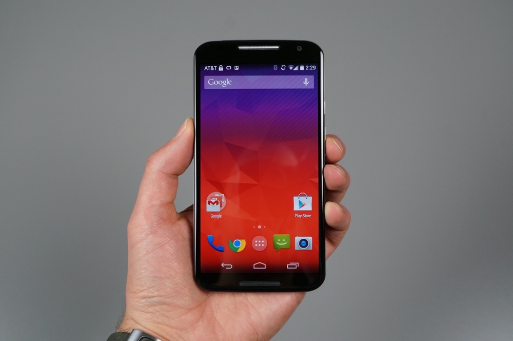
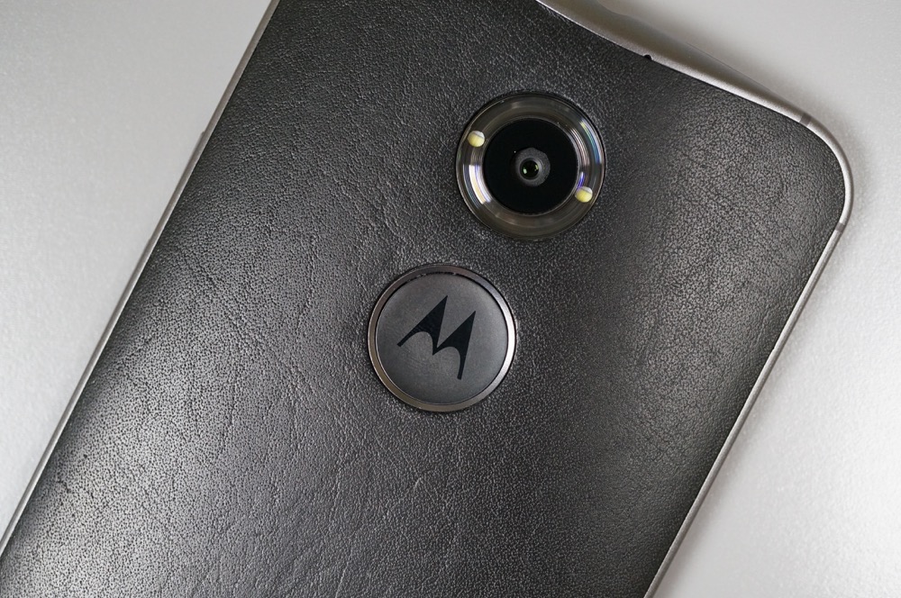
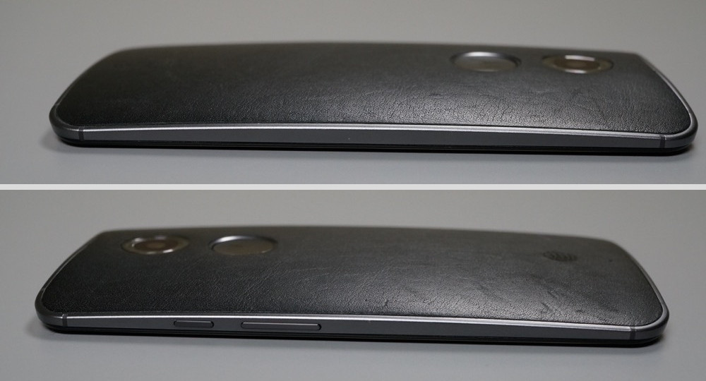
I absolutely love the design of the new Moto X. Aside from it growing in size because of its 5.2-inch display and Motorola tossing in a really awkward-looking “M” logo on the back that looks like a button or a token for an arcade game, there is nothing I would change about the appearance. It fits perfectly in your hand, just like last year’s model did, thanks to special care taken by Motorola. If you go with a leather back, it feels soft and pillowy in hand. The metal frame makes the device both look and feel very high-end, something that couldn’t be said on the original. Even the massive, clear camera ring and housing is growing on me at this point. The glass on the front of the device cascades around all edges, so as you swipe across it, your finger feels nothing but smooth bliss. The buttons on the side of the device are perfectly placed, with the power button now having texture to help you separate it from the volume rocker. The speakers looked a bit awkward at first, but now I see that they are extensions of the design used in the side buttons and actually fit the whole scheme very well, especially with their slight sparkle.
Last year, I told everyone to give the Moto X a shot because it felt so amazing in hand. If you read nothing else in the review after this, then please, at least listen to me again and get this phone in hand for a couple of minutes. It truly feels better than any other phone released this year.
Moto Maker
When Motorola released Moto Maker for the original Moto X as a service that would let you customize the entire look of your phone without any additional cost, our minds were a little blown. The fact that they were shipping those custom made phones out to customers in under a week’s time, was off the charts awesome. But when news spread that Motorola would be closing the plant that gave Moto Maker its start, we were worried that our days of customizing phones had come to an end. And then Motorola assured us that nothing was changing, because they had opened a new plant in China to help take over the process. Moto Maker lives on and it’s better than ever.
The new Moto Maker offers 25 different back finishes, including four all-new Leather options sourced from Horween, a tannery based out of Chicago. Four Natural backs return, along with another 17 colors that were systematically chosen by Motorola based on a number of factors. They actually have a special team member that’s job is to pick the perfect colors for things like Moto Maker.
Moto Maker also brings back storage options of 16GB or 32GB, along with black or white front panels which are surrounded by either dark grey metal or lighter silver metal, respectively. There are 10 trim colors, specially made cases to help show off your design, boot-up messages, engraving, pre-set matching wallpapers, and an option to choose which color charger is included. It was the coolest smartphone tool last year, yet only managed to get even cooler this year.
I don’t know how well the Leather backs will hold up over a 2-year contract, but I would strongly recommend considering one. The review unit I have features a black leather back panel and it is phenomenal feeling. It seems to get prettier by the day, with the little nicks and scuffs that day-to-day wear brings. Again, two years with a phone made of soft leather could be a disaster, yet I can say that I went ahead and pulled the trigger on one as a personal daily device because I’m that excited about it.
Hardware
Motorola really had to deal with backlash from vocal tech enthusiasts last year when they put out the Moto X at $199 on-contract with a 720p display and a two-year old Snapdragon S4 dual-core processor that they claimed to have customized. You see, by the time the new Moto X launched, we had already seen a number of phones with 1080p displays and next-gen quad-core processors. But Motorola stood by their decision to go with a customized chipset and lower-resolution display, which we later confirmed performed as good as the rest of the phones in its category.
So what was their move this time around? Well, they listened to those vocal tech enthusiasts and mostly beefed up the new Moto X to current standards. They included a bigger 5.2-inch 1080p AMOLED display, a current-gen quad-core Snapdragon 801 processor, and bumped up the camera to a 13MP Sony sensor. Motorola then ditched the plastics for a metal frame around the phone, added premium Leather as an option for the back, moved the speaker around to the front, and tossed in some extra infrared sensors to help add to its Moto Display experience.
Unfortunately, Motorola left out a micro SD slot, so you are stuck with either 16GB or 32GB of storage with no option to expand upon that. The speaker setup on the front is also a bit deceiving, as it appears to be a dual-speaker setup, when in reality is only a single speaker located at the bottom. The top speaker is only used during calls rather than to make a stereo sound experience come to life on the device. One could argue that the 2,300mAh battery is a little small as well.
Overall, Motorola mostly got it all right this time around. We have a high-resolution 1080p display that grew to 5.2-inches, a potentially better camera, faster processor, and premium materials.
Performance
Performance on the new Moto X is as good as it gets for an Android phone. The touch responsiveness is excellent, the camera fires up instantly when you need it to, there isn’t a stutter to be found when cruising through the UI, the app switcher works quickly, the display lights up before you even realize you need it to, and jumping in and out of apps or games happens as fast as you would hope from a phone in 2014.
Motorola didn’t put a 2-year old processor in this year’s phone, instead opting for a current Snapdragon 801, the same processor found in the One (M8), Galaxy S5, and G3. But when you take a Snapdragon 801 and let it shine without suffocating it through custom Android skins like all of those other manufacturers have done, you get the best performance of any Android phone this year.
Software
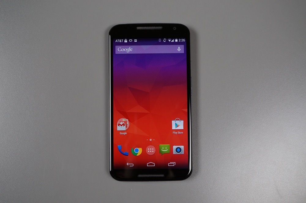
We love Motorola’s approach to software. They give you stock Android first (with the Google Now Launcher this time), but then add-on a bunch of really useful software features that complement the experience. Motorola’s mindset behind software is to not ruin the good thing that stock Android has going – they just want to include features that you can use alongside it that no one else is doing.
The Moto X’s best features are back again this year as a rebranded Moto app. Touchless Control is now Moto Voice, Active Display is now Moto Display, Assist is still Assist, and then we have a new player in the group called Moto Actions.
Moto Voice has been given so many new features that I’m not sure I can list them all. First, it will now let you customize its launch phrase. “OK, Google Now” is out, in is almost anything you can think of. Mine has changed every couple of days, but currently, in order to interact with my phone, I simply say, “Wake up Moto X.” From there, a whole bunch of new commands are at my disposal, from being able to post to Facebook to taking a selfie to saying “Goodnight” to put your phone into sleep mode. You can ask for your data usage, ask “What’s up?” to hear your current notification situation, or pull up the YouTube app and your favorite artist. With the first Moto X, I didn’t use Touchless Control all that much, but with this new version, I find myself using Moto Voice several times per day.
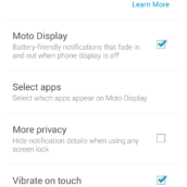
Moto Display is still without a doubt my favorite software feature on any phone, ever. Getting rid of the useless notification light in favor of lighting up a minimal amount of pixels on your display to show you real information has been an incredible game changer. This time around, Motorola improved Moto Display by allowing you to interact with up to three notifications at once instead of just one. You can swipe into individual apps or swipe to the left or right to quiet the screen again, plus you have more control over what’s displayed this year as well.
Moto Assist hasn’t improved all that much in terms of new features, but you will find new settings in Driving and Meeting modes. As someone who works out of a home office, I don’t find all that many uses for Assist outside of the Sleeping function, but I could see how this could be a powerful tool for those on the go or in and out of meetings. For those new to Assist, think of it as an automated service that changes settings on your phone depending on if you are driving, sleeping, in a meeting, or at home. It can talk to you or play music if it senses you are driving, turn off all interruptions when in a meeting, or completely silence your phone when it knows you are sleeping. This is all done automatically, by the way.
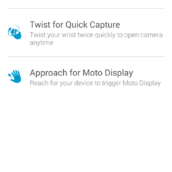
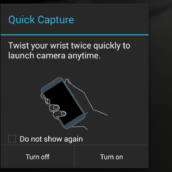
Moto Actions are the new option to the group and use the new infrared sensors housed in the front of the display. With Moto Actions you can wave over the top of your phone during an incoming call to silence it and also watch as Moto Display lights up when your hand approaches the device. Last year’s Quick Capture twisting motion is technically a part of Moto Actions as well.
Software Updates should come often and quick if last year’s Motorola line-up is anything to go by. Motorola was one of the fastest in the industry to update to the latest versions of Android throughout last year, something we doubt will change in 2014. Don’t be surprised that when Android L goes public, if Motorola is ready to update the new Moto X within a couple of weeks. Also, all of the Moto suite of apps that we just talked about have been added/updated on Google Play and will only continue to get better throughout the Moto X’s life.
Display
As I mentioned in the “Hardware” section, Motorola’s decision to go with a 720p AMOLED panel in last year’s Moto X wasn’t exactly praised. But this year, they have corrected their mistake by putting in a 1080p AMOLED panel that measures 5.2-inches. This is a solid display. The colors are extra punchy, the contrast is probably over-the-top, and viewing angles are excellent. It is also very responsive to touch, something that Android devices have struggled with for years as they attempt to get on par with Apple’s touch mojo.
After looking at a macro of the display (see below), it appears as if Motorola is using a diamond pixel arrangement, similar to what Samsung has used for the last couple of years in its Galaxy lines. Technically, you could call it PenTile, but we gave up complaining about PenTile displays a couple of years ago when the pixel-per-inch count went through the roof.
The display may not be quite as crystal clear and color correct as Samsung’s panel, but it gets the job done without fuss. As you scroll, the display reacts swiftly to your touch and text renders perfectly and without blur. Keep in mind that Motorola has also specifically chosen an AMOLED panel in the device to use with Moto Display, so that they can select which pixels light up without having to light up the entire display, a move that should help with battery consumption.
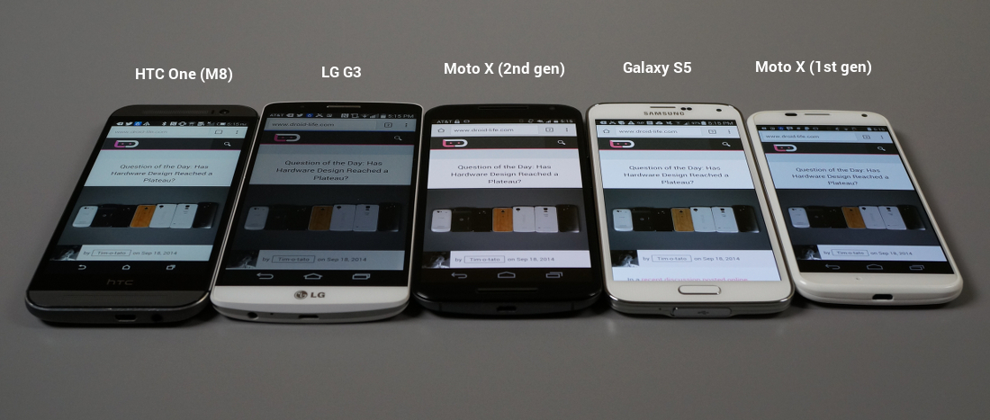
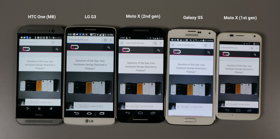
As you can see in our comparisons above, the new Moto X panel comes off quite warm when you compare it to the LCDs used in the LG G3 and HTC One (M8), along with the Super AMOLED used in the Galaxy S5. It’s actually about as warm as the original Moto X (that slightly orange-ish/yellow-ish tint), which if I’m being honest, bothered me after a while last year. So far, though, the AMOLED panel on the new Moto X is pretty great. I didn’t actually notice how warm it was until I took these pictures.
Macros for fun.
Price
Motorola is pricing the new Moto X to try and undercut the rest of the players in the game. This is their flagship phone, however, they are pricing it at $99 with a 2-year contract or $499 at full retail for the 16GB model. Other flagship smartphones typically retail for $199 and $599, even with similar specs. For example, the Galaxy S5 still lists for $199 on-contract, but is similar to the Moto X with its 5.1-inch 1080p AMOLED display, 2GB RAM, Snapdragon 801 processor, and 16MP camera. Plus, the new Moto X looks and feels a hell of a lot better in hand than Samsung’s latest.
Will the lower price move the Moto X in 2014? That’s tough to say. Most tech reviewers fell in love with last year’s model, but Motorola still couldn’t sell very many. Maybe the initial price cut will help. Then again, does Motorola even have a marketing budget anymore now that Google is trying to send them off to Lenovo? I guess we’ll find out soon enough.
Accessories
Motorola is one of the few companies trying to not only innovate through their phones, but also through the accessories they sell alongside them. With the Moto X, Motorola is introducing the Hint, a discreet Bluetooth ear piece that allows you to completely control your phone without having to touch it. For example, you could leave your phone in your purse or bag, but still talk to and interact with it through the Hint. The Hint is an interesting accessory because it can barely be seen when worn. This isn’t one of those terrifyingly silly Bluetooth headsets that Barry Watkins wears with his suit as he stops off at the sandwich shop for lunch.
The Hint isn’t the only accessory that Motorola is bringing along for the ride. They are also introducing the Turbo Charger, which can give the Moto X up to 8 hours of battery life within 15 minutes. The charger takes advantage of Qualcomm’s Quick Charge 2.0. It works the fastest when your phone is almost completely depleted, by offering up a bunch of juice initially before slowing down as your battery fills up.
Finally, Motorola is already selling the Power Pack Micro, a power bank that gives you juice while on the go, but also acts as a key fob of sorts when paired to your phone.
Somewhere-in-the-Middle
Camera
Is it safe to say that the “camera” section of every single Moto X (2nd gen) review has been the most anticipated of the year? After last year’s disaster of a camera in the original Moto X, Motorola had no choice but to do something completely different this time around. They have done that in some form by at least going with a Sony sensor in favor of the Omnivision sensors they have used for years. They also tossed in a dual-LED ring flash that is supposed to bring in much softer, more natural light when taking photos with the flash on (wait, people use the flash?).
So, what’s the verdict? Well, the camera is capable. It isn’t terrible. That’s an improvement, right? In fact, unlike with last year’s Moto X, I am actually not ashamed to post pictures to Instagram that were taken with the new model, if that means anything to anyone. With great lighting, it can take pretty solid pictures, just like most smartphone cameras. In low light, it’s not the best – again, like most smartphone cameras. With that said, the low light performance on the new Moto X is probably closer to “bad” than “good,” especially when you compare it to the G3 or Galaxy S5. In daylight, though, I would put its photos up against photos taken from most of today’s top tier phones.
Here are our sample photos that have only been resized to fit this post better. You will find the full resolution photos linked below that, for those who really want to dive in.
Full resolution: 1 | 2 | 3 | 4 | 5 | 6 | 7 | 8 | 9 | 10 | 11
While testing, mostly in Chicago, I took a bunch of cityscape and building photos that turned out really well when looked at on a smaller screen (like a phone) or on a social network. Blow up the photos and you will most definitely notice the noise and the less-than-sharp lines, probably due to too much processing. The colors captured seem to be quite accurate to my eye, but every so often come off a little muted. It’s kind of a mixed bag with the camera, which is why we placed it here. Some photos I really like, others I would re-shoot if I had the chance.
Like last year, your photos will look just fine with great lighting or in an outdoor situation (where most of your photos are likely taken). Come inside or find poorly lit areas and you may not love the results. It is definitely a step up, both in speed and picture quality, but I wouldn’t say that it is all that close to the total package you are getting with the Galaxy S5 or LG G3.
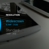
As for the camera UI, the experience mimics last year’s model, but adds the option to choose between 4:3 (13MP) and 16:9 (9.7MP) resolutions. Motorola also tossed in 4K video recording. They kept the super minimal UI, though, along with the double-wrist-twist Quick Capture camera gesture. Focusing can be a bit finicky at times, so I would recommend going with the drag-to-focus option.
Overall, the camera on the new Moto X is perfectly fine for most shooting situations, it just isn’t stellar. I would have loved to see stellar, but then again, an improvement over last year’s camera experience is at least that, an improvement.
Battery Life
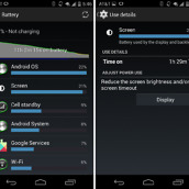
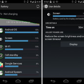
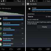
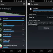
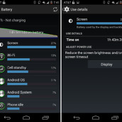
Earlier in the week, I told you that battery life on the new Moto X wasn’t great. I advised that you buy a Turbo Charger just in case, because there is a good chance you will need some extra juice before you go to bed each night. After factory resetting my phone and testing the device for another three days leading up to this review, I still feel the same way. The Moto X battery clocks in at 2,300mAh, which is by all means pretty small for a 2014 flagship and it shows in my results.
The new Moto X is quite capable of pushing through 14-16 hours of use each day, but maybe not much more than that. I have been through at least a half-dozen other flagship phones this year that all provide much more life out of a single charge than the Moto X. It will get you from the moment you wake up in the morning until you arrive home from work in the evening, but don’t expect it to have much left as you sit back and relax on your couch before heading off to bed or out on the town for a nightcap.
Motorola decided that it would rather make a phone that remained slim and felt great in your hand instead of tossing in an all-day battery. While I love the feel of this device in hand, it really would have been fun to see Motorola construct a great feeling phone that also killed it in the battery department. I guess we’ll have to wait for that kind of battery life in the new DROID that they are making in partnership with Verizon.
Availability
The new Moto X will launch around September 26 here in the US. AT&T and Verizon will both carry the phone at that time, but it appears that T-Mobile and Sprint have decided against it. Motorola confirmed via Twitter that there won’t be a Sprint model, and if you want a T-Mobile version, you have to fork out the full $499 asking price for the “Pure Edition” since there isn’t a T-Mo edition available on contract. AT&T also seems to have nabbed early Moto Maker exclusivity again, at least up until the official launch day.
These moves are all pretty unfortunate unless you are on AT&T. If you aren’t, then you may not be able to buy the phone for your carrier at all or you may have to wait before you can customize the phone with Moto Maker. I know that Motorola is selling millions of Moto Gs and Es, while the X hasn’t moved as well as they would have hoped, but limiting the availability of your flagship phone is never a good thing.
“Pure Edition” or Developer Editions
With last year’s Moto X, Motorola gave us two Developer Editions, one built for Verizon’s CDMA network and another that was unlocked for GSM fans. This year, they ditched the Verizon model and are instead only offering one developer-friendly phone, the “Pure Edition.” This phone comes SIM unlocked with support on both AT&T and T-Mobile, won’t contain any carrier bloatware or branding, will receive software updates before any other Moto X, and also has an unlockable bootloader for those who like to tinker a bit with their phones. This is the Moto X to get if you aren’t on Verizon and don’t mind paying full retail.
But we are dinging Motorola a bit here because of the decision to go away from a Verizon model. While we understand that they likely only sold them in limited quantities and probably found that getting the phone approved for Verizon’s network wasn’t worth the cost or hassle, the choice would have been nice. Hacker-friendly phones on Verizon are hard to come by these days.
No SD Card / Wireless Charging
There aren’t any things wrong with the new Moto X that I would call “deal breakers,” but there are a couple of items missing that I certainly wish it had. For one, the Moto X needs a micro SD card slot. All other manufacturers put SD card slots in their flagships this year (Galaxy S5, One (M8), G3, and Xperia Z3 all have them) except Motorola. Motorola even put one in the Moto G because that’s what their research showed that people want, yet they left it out of the X. Since Motorola is starting the Moto X with 16GB of storage, I would advise that you fork out the extra cash for the extra storage bump to 32GB. 16GB of storage in 2014 is just not enough, even with cloud storage.
Second, wireless charging would be a great addition. Again, not a deal breaker, but since many of us have already invested in wireless chargers because we own devices like the Nexus 5, it would have been a welcomed feature.
The Not-so-Good
No Sprint
I don’t have Sprint service, and I wouldn’t advise anyone switch from their current wireless provider to it, but even I can admit that it’s unfortunate that Motorola is not releasing a Moto X on the Now Network. This is a great phone that Sprint customers will never have the option of choosing. That’s too bad.
Videos
Unboxing
[responsive_vid vid_url=”EyEnhfgu7K8″]
Software Tour
[responsive_vid vid_url=”-aMLbBwJhUA”]
vs. Moto X (1st generation)
[responsive_vid vid_url=”7mMrANKM2H4″]
Gallery
The Verdict
Is the new Moto X the best Android phone of 2014? That depends on what you need from a phone. If you want the best feeling phone of any 2014 flagship, one that can be customized to your liking, that still sports a 1080p display and powerful Snapdragon 801 processor, receives updates to new versions of Android faster than any other phone outside of a Nexus, and performs flawlessly through stock Android while managing to perform tasks no other Android phone is capable of thanks to a Moto suite of apps, then yes, it might be the best Android phone of the year.
If the best phone of 2014 needs to have the best smartphone camera, a 20+ hour battery life, and availability on Sprint, then no, this is not the phone of the year.
For me, the new Moto X could be the phone that replaces the LG G3 in my pocket on a daily basis. The performance, feel of the phone, and Moto suite are as good as ever. The camera is improved over last year’s phone, as is the display. The only real issue I personally have, is that the battery life isn’t as good as I would like. Hopefully, a Turbo Charger can fix that concern. If it can, then this is the Android phone I’ll be sticking with.















Collapse Show Comments285 Comments