Motorola’s Android Wear watch, the Moto 360, is without a doubt the most anticipated wearable of 2014. There is good reason for that, of course. Thanks to its classic, round design, stainless steel body, and leather accessories, there aren’t any other smartwatches that can come close to the overall package promised.
Motorola took their sweet time getting it ready for retail after initially unveiling it in March, but the device is now available for purchase. Early reviews showed concern over battery life, limited quantities have been available for purchase, and Apple just got done unveiling their own watch, so we can imagine that you want our thoughts. Trust me when I say that there are plenty to share.
This is our Moto 360 review.
Design and Materials
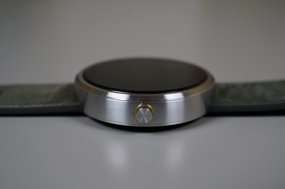
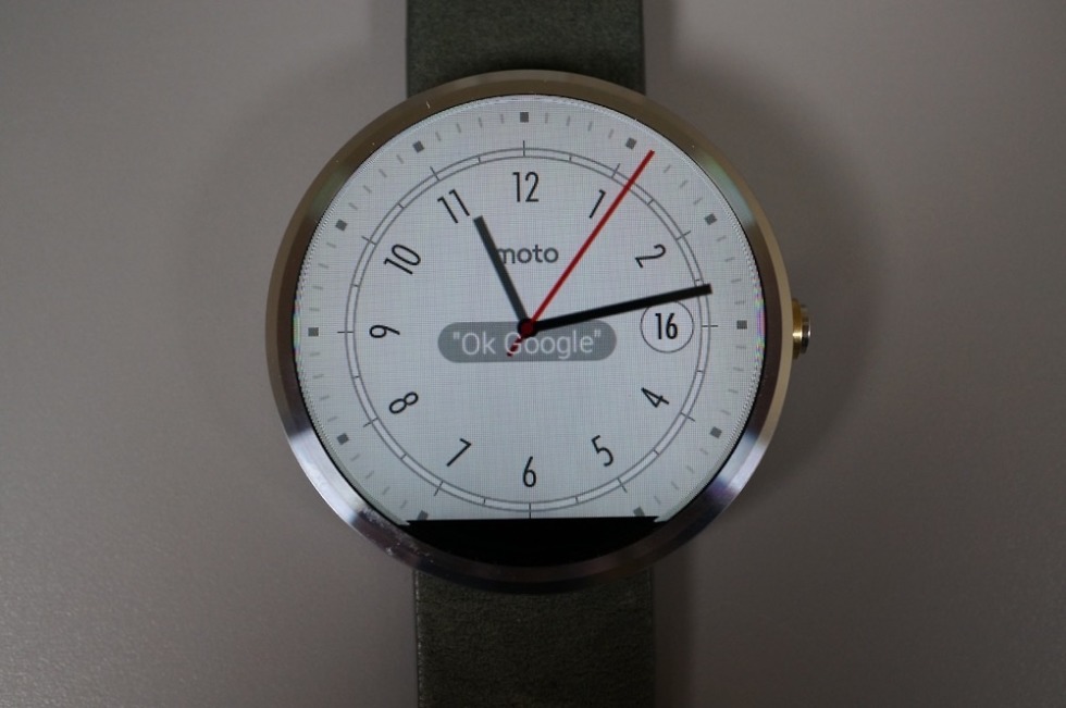
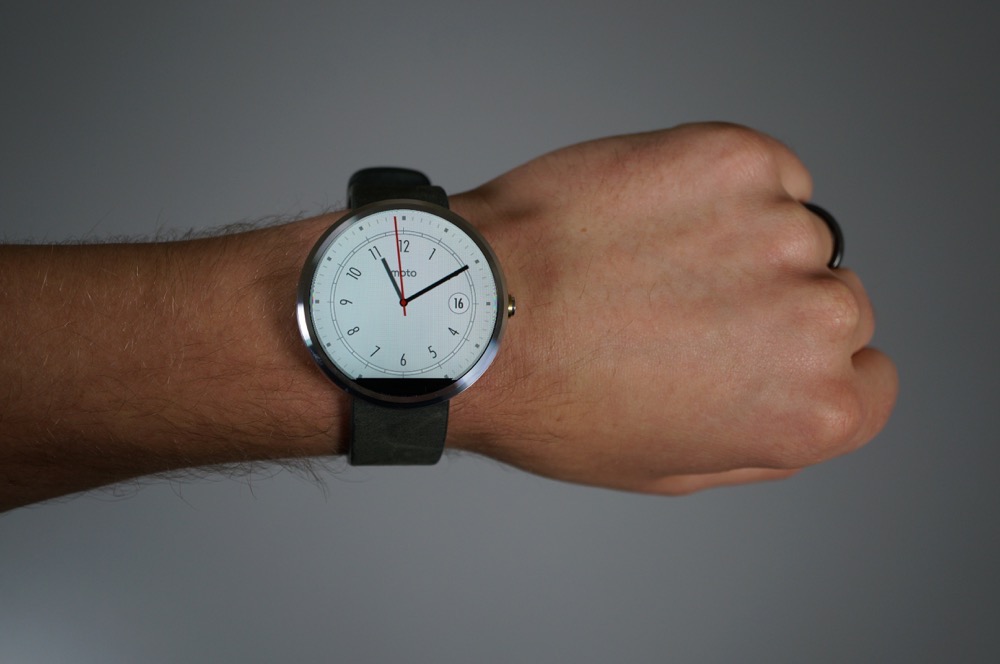
The Moto 360 is without a doubt the most beautiful smartwatch on the planet. Actually, there isn’t even a close second in my opinion, and that’s with both the newly unveiled Apple Watch and LG G Watch R included in the conversation. Motorola tried to create a classic-looking timepiece that you would be proud to wear on your wrist as a watch, but that also manages to perform tasks as a smart device. They have succeeded and then some.
The round display, along with premium build quality and materials combine to make a device that most probably wouldn’t believe is a smartwatch unless you told them. Smartwatches haven’t ever looked this good. Pebble tried and failed to create a normal-looking watch with the Steel. Samsung has made…things. Others too. This is the first – and so far from what I have seen, only – smartwatch I would consider wearing on a daily basis.
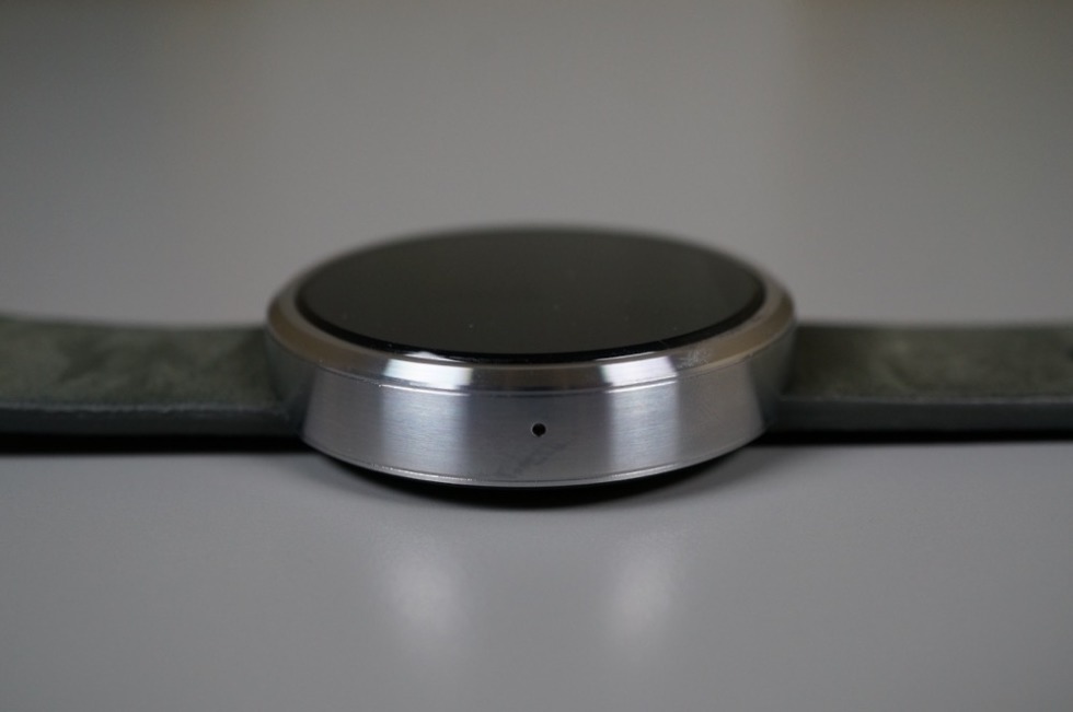
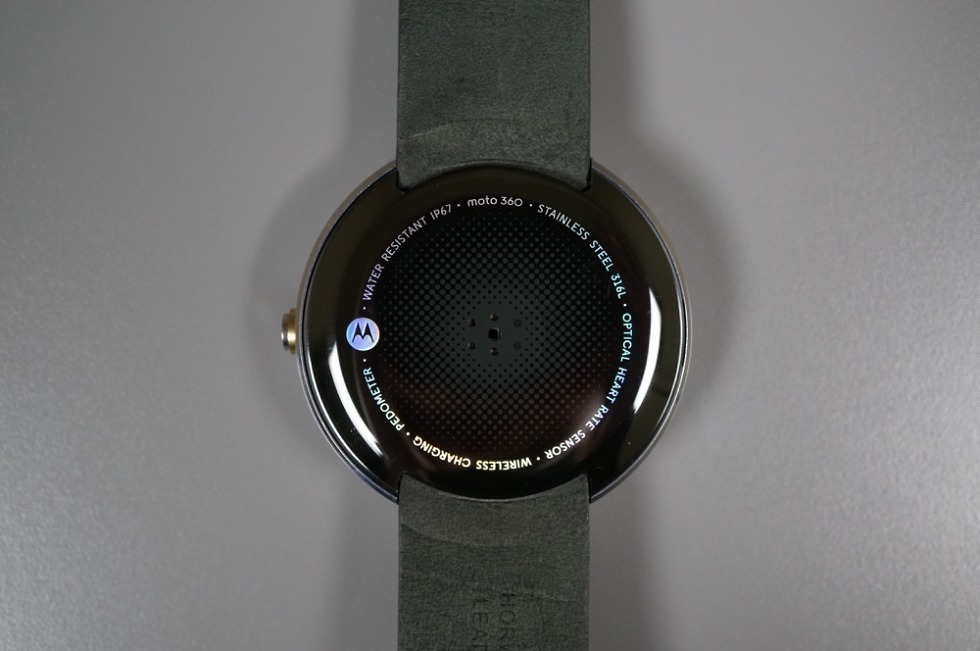
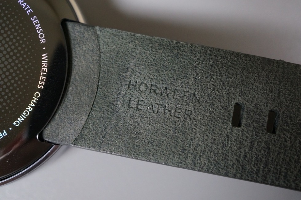
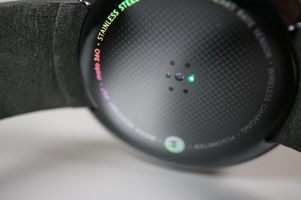
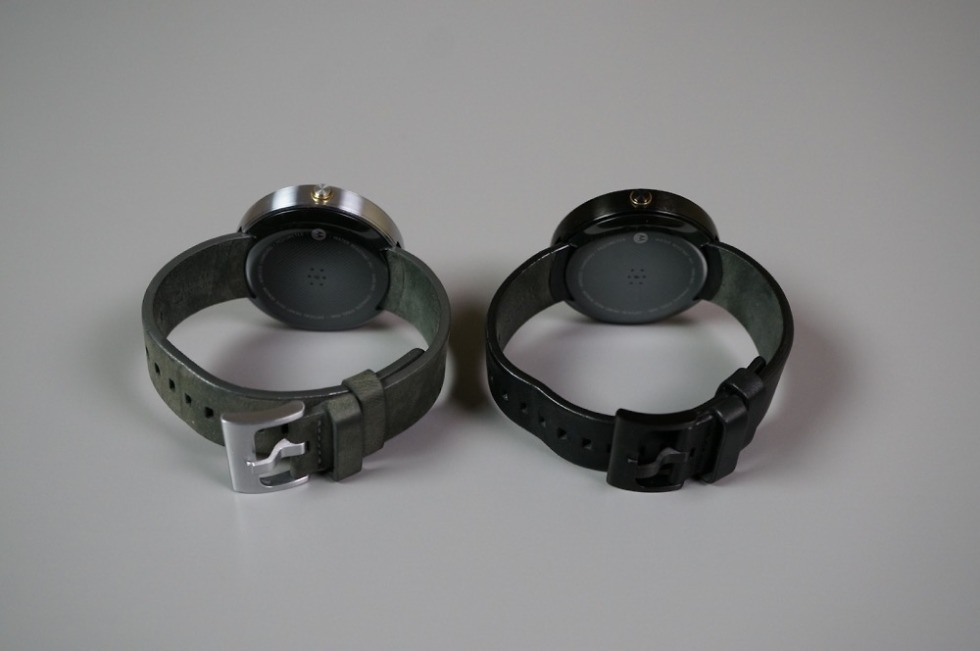
Motorola is using stainless steel in the watch’s case and clasp, along with leather watch bands made by Horween, a company based out of Chicago that also makes NFL footballs. The face is glass, but protected by Corning Gorilla Glass and shouldn’t scratch. There is a bit of plastic on the under side, yet you wouldn’t notice, especially since that’s the portion of the device that sits on your wrist.
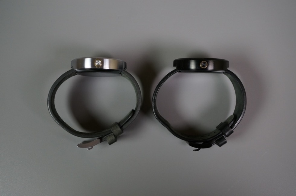
Speaking of the watch on your wrist – it’s actually a really nice size. There were worries early on that the device would be far too big for most, but on my slim wrists, I do not feel like this watch is too big. It’s not small by any means, but it’s also not huge. Motorola worked really hard to create a watch that sits perfectly on a human’s wrist, along with one that also uses proper materials to conform to it without showcasing gaps. When wearing the 360, it feels like you are wearing a premium watch, not a heavy or clunky smartwatch.
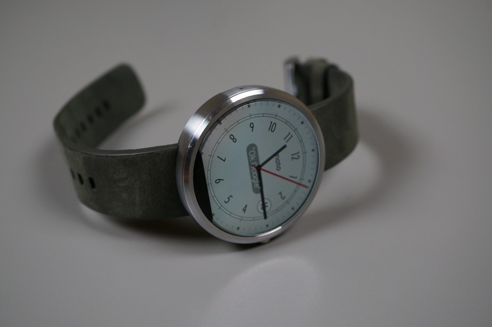
If there is one blemish on the 360’s design, you could argue that it’s the black area (known as the dreaded “black bar”) located at the bottom of the round display that sort of makes it not fully round when lit up. As we have mentioned on a number of occasions, this area houses the ambient light sensor, and was needed in order for the device to have such little bezel. If Motorola decided to make the display fully round without this area, the device would have had a sizable bezel around the entire display (like this), something I’m glad they chose not to do. We have heard people claim that they can’t “unsee” it, but I can tell you that in the almost-two-weeks I have spent with the watch on my wrist, not once has it bothered me.
When you hear Motorola talk about the 360, you can’t help but sense the amount of time and careful thought that was put into its exterior and interior to get it right. I think it’s safe to say that they did.
Display
Motorola chose to put a 1.56-inch round LCD display in the Moto 360 that is protected by Gorilla Glass, a bold move that really took engineering expertise in order to achieve. Thanks to that previously mentioned “black bar,” the display runs edge-to-edge without bezel, with a slight chamfer to blend it into the stainless steel body. Depending on how you look at the 360, the display almost appears as if it floats. It’s very cool. The round display is indeed the star of this show.
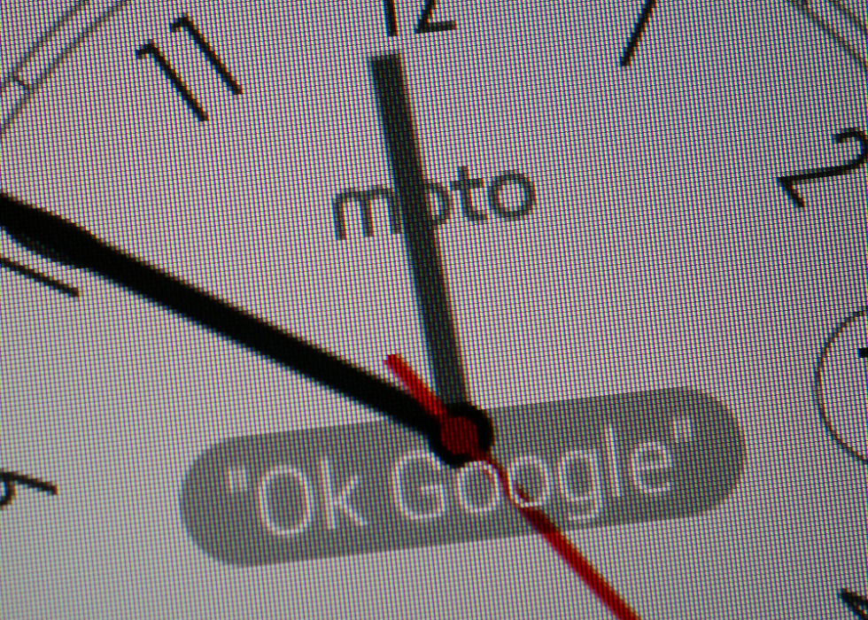
The display resolution is somewhat low at 320×290 (205ppi), but no different than other watches of today. Pixels can be seen in text here or there, plus there is this rainbow-like effect towards the chamfer when you have a white screen up that is not exactly pretty or a “feature.” Colors are bright and clear, and the display overall gets the job done. This is a round 320×290, first-of-its-kind type of display we are talking about here. You aren’t supposed to be analyzing pixels in photos or looking for precise lines and image detail – it’s a 1.56-inch display on a watch.
In sunlight, I found the Moto 360 to perform quite well, as long as you have a white watch face showing. You may recall our frustration with the G Watch, in that it was completely unusable when outdoors. That is not the case with the 360.
I would call it a good first effort, but will hope that future round smartwatch displays can improve, assuming they won’t destroy battery life.
Battery Life
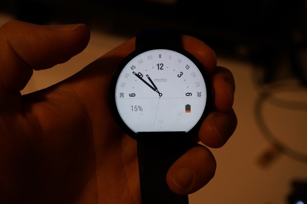
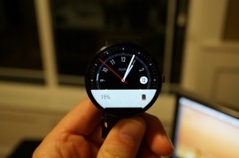
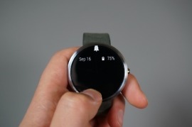
What about battery life, though? I shared some thoughts on battery life a week ago, and those thoughts have not changed. The Moto 360 has two display modes – Ambient Screen on or off. If you keep Ambient Screen on, your device will stay awake, dimly lit, all day long, so that you can quickly glance at it from any angle to check the time, just like a normal watch. The battery (320mAh) and processor (an ancient TI OMAP 3) together are not good enough for the device to last for more than 10-12 hours with this mode on. I would advise you leave it off. If you leave Ambient Screen off, your watch will last you all day, from the moment you wake up and take it off the charger until you take it off at night and go to bed. With Ambient Screen off, not once has the Moto 360 died on me in a day and left me stranded with a dead device on my wrist. On most days, I take the watch off, check the battery percentage remaining and typically see at least 15%.
So here is the deal. As with any smartwatch, you need to learn how to optimize it. A smartwatch isn’t supposed to replace your smartphone. It’s supposed to be an extension of it, to help you quickly view information before deciding if it needs more attention (which would mean pulling your phone out). A smartwatch is there for quick voice replies to texts or messages, seeing calendar appointments or new emails as they roll in, navigation here or there, and some fitness tracking. It is supposed to help you efficiently manage your time with your phone, to help you decide if items need action now or later. If you approach your smartwatch in that manner, you will get all-day battery.
Other Android Wear watches currently have better battery life than the Moto 360, there is no denying that. But in the end, they aren’t seeing 2-3 day battery life either. While the 360 may see 20-25 hours of use and need charging at night, others need nightly charges as well if you want to see them last throughout the next day. So in the end, all Android Wear watches need nightly charges.
Is battery life on the Moto 360 bad? No. Is it great? No. It really is somewhere in the middle, but again, it will last you a full day without worry.
Performance
The Moto 360 is powered by a TI OMAP 3 processor, which is the same processor used in 2010’s DROID 2 and Motorola’s previous smartwatch, the MOTOACTV. It’s old, slow, and power hungry. We still aren’t sure why Motorola decided to use this tired old processor to power their beautiful smartwatch when everyone else in the game is using a modern day Qualcomm Snapdragon 400, but I can’t help but mention how disappointing that fact is. The Moto 360 doesn’t need to do much, yet you will often find stuttering in the UI when swiping or scrolling between cards and activating voice actions. It doesn’t lag all of the time, but the lag is real. The “jank,” as Tim would put it, is real.
If you were rating performance on the 360, you could probably put it somewhere in the middle, bordering on semi-bad. That’s not to say that the 360 is ever unusable, because again, it doesn’t need to do much other than show cards, allow you to swipe between them, and be prepared for voice actions. The 360 just isn’t as fluid as one would like from a smart device in 2014. I guess chipsets from 2010 aren’t ready to leave 2010 behind.
Android Wear
The Moto 360 runs Android Wear, Google’s platform for wearable devices. At this stage in the game, Android Wear is still very young and needs time to grow. The idea behind Android Wear is this – your watch can provide you with important information just when you need it. The information isn’t supposed to include great detail, it’s supposed to be glance-able. It can take voice actions and give you feedback or complete actions through them, track fitness goals, and will eventually include added functionality when your favorite app developers build out compatibility. This is one of those software platforms that should get better over time, assuming developers can figure out the best ways to take advantage of a screen on your wrist.
Google claims there are over 1,000 apps that have already added in Android Wear compatibility. You can see many of them here. Apps like Runkeeper show current fitness activities on your watch, you can request car rides through services like Lyft, send messages through Whatsapp, get notifications from Trello, automate ideas with IFTTT, get boarding passes from Delta and American Airlines on your wrist, manage your golf round, and even remotely snap photos.
This is a new area for the tech world, one we still don’t full have a grasp on, if you ask me. But as we start to decide how we want to use our smartwatches, Android Wear should follow along and become incredibly powerful. At least I hope that’s how it works.
If you want to see Android Wear in action, be sure to check out our LG G Watch review.
Wireless Charging
I can’t thank Motorola enough for making the Moto 360 Qi compatible. Previous smartwatch attempts from others typically use awkward attachments or charging PINs with docks in order to re-charge, but Motorola went super simple. All you need to do is set your device into the Qi wireless charging cradle that is included with purchase to charge it. That’s it. There are no cords, no ports, and no attachments that you will lose. All you have to do is drop the device into the cradle and it will charge, fully within an hour. Oh, and since it’s Qi compatible, you can set the watch on almost any other Qi wireless charger that you may already own. It is glorious.
Heartrate Monitor
Motorola included an optical heart rate monitor in the Moto 360. It attempts to take check your heart rate, probably better than other watches. I still couldn’t tell you how accurate it is. For example, I ran 6 miles on Sunday, yet the 360 clocked my heart rate at around 60bpm when I was finished, then 120, then 60, then who knows. The Moto 360 wants to help you stay active throughout a day by telling the percentage you are active in a day, which it should be given credit for. At this time, though, I’m not sure you should rely on it. Expect it to get better over time as Motorola issues updates to it.
Price and Availability
The Moto 360 is $249.99 and available at Motorola’s store, Best Buy stores and online, and Google Play. So far – at least at the time of this review – the device is hard to come by. It sold out immediately when the first batch went up for sale and has stopped off at Best Buy and Google Play sparingly over the last couple of weeks. Motorola is going to re-stock today in limited quantities, but we have yet to hear when they expect to stabilize inventory and make the watch easily accessible.
At $250, I would call the Moto 360 priced about right. Motorola is pricing the device slightly above the LG G Watch and Samsung Gear Live, but you could see their reasoning when you think about the premium materials (stainless steel and leather) being used.
Black or Silver, Leather and Metal Bands
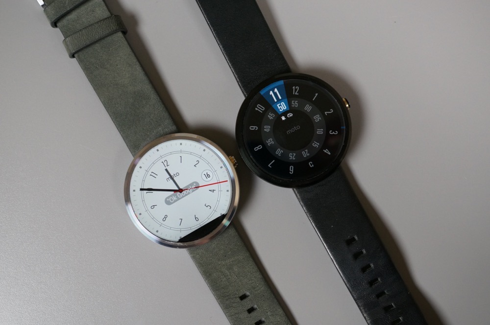
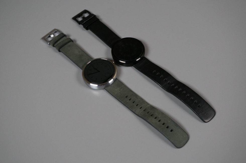
The Moto 360 comes in two colors – black with a black leather watch band or silver with a grey suede leather watch band. Color preferences are obviously a personal thing, but if you ask me, the silver with grey suede leather is the best of the two. The silver stainless steel in the device casing and clasp offers a subtle contrast to the grey leather that really allows the device to have some personality and act as a fashion item. The black version is just that – all black. It’s not ugly, it’s just the more un-assuming model. I would also add that the grey suede leather band on the silver model is a much thicker cut of leather that will likely last longer than the flimsy black leather band included with the black model.
In the coming months, Motorola will release new leather band options, along with stainless steel bands. The stainless steel bands will run $79.99; the leather bands will run $29.99. The metal bands will be available in either black or silver, whereas the leather options should grow over time.
Compatibility
The Moto 360, like all Android Wear devices, works with Android phones running 4.3 or higher. Approximately one third of all Android devices run Android 4.3, including almost every device released within the last year. If you have a modern smartphone, you should be covered.
Video
Unboxing
[responsive_vid vid_url=”IxVrLgP2iNw”]
Software Tour
[responsive_vid vid_url=”NOHWdesr54U”]
Final Thoughts
I have worn a lot of smartwatches over the last couple of years, none of them get this kind of positive attention. I was at a wedding reception this last weekend and at least three people said, “That’s a really cool watch.” Never once did that happen with the G Watch or Pebble or Galaxy Gear or Qualcomm Toq or Sony’s Smartwatch 2. Most people see those glowing, wrinkle their forward with confusion, and then move on. With the Moto 360, they actually find themselves interested. They want to know what that beautiful device is on my wrist. Motorola tried to create a classic timepiece with style and class, and they have done that. As a watch alone, the Moto 360 wins.
On a smartwatch front, the Moto 360 is still in its infancy, like all smartwatches powered by Google’s Android Wear. For now, it handles notifications well, showing them better than any other smartwatch, thanks to its round display. More apps will build in functionality and the platform will evolve. Battery life could be better, but it will get you through a day. Performance could be better too, but it’s not bad enough that it will frustrate you. Overall, this is a smartwatch that should only get smarter and more efficient.
The Moto 360 is the smartwatch to buy if you have decided that you need a smartwatch in your life at this moment.

Collapse Show Comments246 Comments