The parade of Material Design updates continues with Evernote, which just received a major revision on Google Play. Version 6 of the venerable note-taking app includes a bevy of new features, a few of which the Evernote team highlighted in a blog post this morning.
A majority of the UI has been refreshed. The search screen has been redesigned – terms are can be refined by notebook, tag, and location – the note editor simplified, a new camera mode implemented, and handwriting support enhanced.
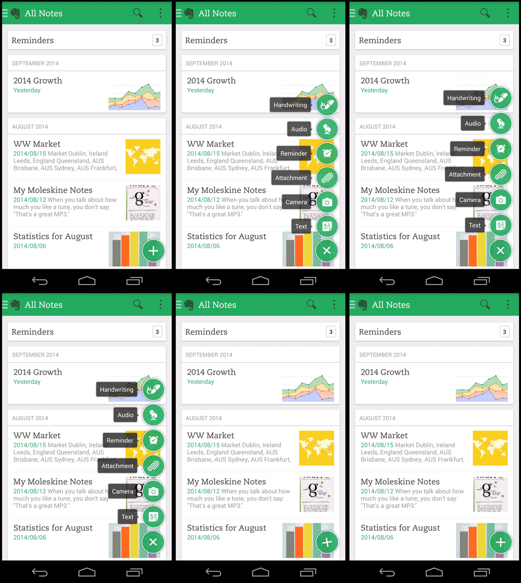
Adopting one of the paradigms of Material Design, a floating New Note button has been added to the lower right-hand corner, from which you can create a text, photo, audio, or handwriting clip, to name a few. Tapping it triggers a delightful “sprint out” animation that I could watch for hours. Seriously, it’s that awesome.
Navigation has been simplified – tabs for your notebooks, tags, and shortcuts have been added the sliding drawer, plus a button for switching between work and personal notebooks for Evernote Business users. Sharing is also easier, too – when you’re in a notebook, you need only tap the person button and select the folks you wish to grant access.
New functionality, web clipping, makes its debut on Android in the update. Leveraging it requires navigating to the page you want to save, accessing the share menu, and choosing Evernote from the list of apps.
Itching to try out the new Evernote? It’s live in the Play Store now.


Collapse Show Comments21 Comments