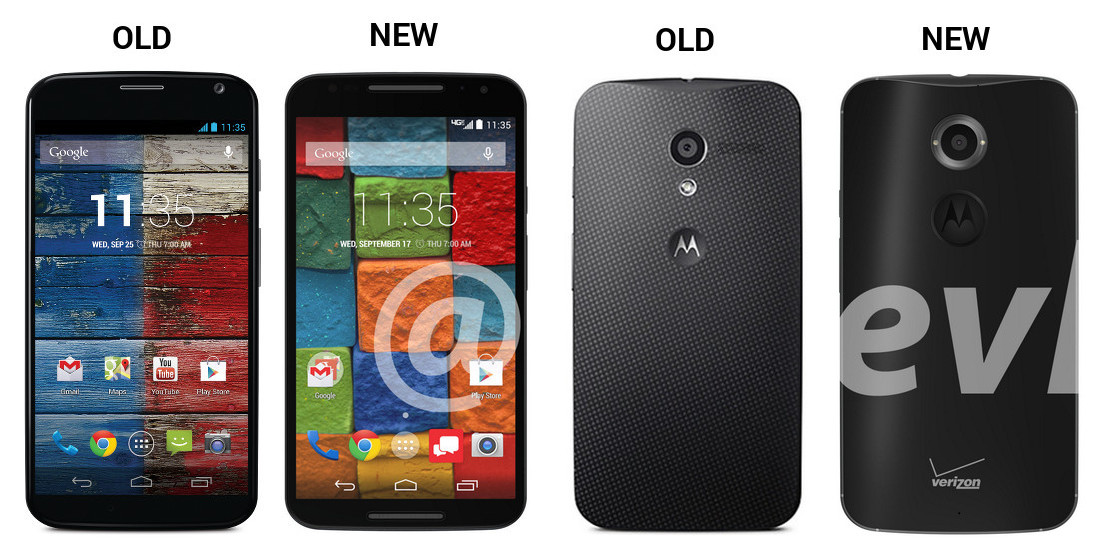
Thanks to a parting gift from @evleaks, we may have the cleanest look yet at the new Moto X (aka Moto X+1). The image he shared shows the Moto X on its way to Verizon in both black and white/wood variants, with big camera sensors and a possible button/sensor that also houses a Motorola logo on the back. The images also show a screen that may have even less bezel than last year’s model, at least on the top and bottom of the device, even with dual front-facing speakers.
Since we have such clean images that appear to be official press renders, we decided to match them up next to last year’s Moto X.
We took both black and white press images from the 2013 model, scaled them to be the same height as the new one, and then set them side-by-side on canvasses. Now, we don’t know the exact dimensions of the new Moto X, so take these for what they are – a simple comparison for the sake of comparison (Edit: No, they are not to scale.). The new model could be taller and wider for all we know.
Overall, the design hasn’t changed much, but there are some differences. Here are some thoughts:
- You can certainly see the obvious – dual front-facing speakers on the new model. What’s interesting, is that the new model almost seems to have less top and bottom bezel even with those speakers.
- Speaking of speakers, with the dual front-facing speakers now featured, you won’t find a speaker on the rear.
- On the back, at least for the black model, Motorola has gone with a change in texture for the new Moto X (smooth matte), though we could still see the dimply texture as a MotoMaker option.
- The camera setup is obviously different as well, with the new model housing a dual-flash in a ring around the sensor, whereas the old model has a single LED flash located below.
- The front of the white Moto X+1 is showing us what appear to be added sensors in all four corners. Are those there for some sort of gesture or are they decorative? I have a feeling Motorola may have a trick up its sleeve there. For those thinking one is an LED notification light, keep in mind that Motorola uses Active Display, so they don’t need a notification light.
- Finally, the Motorola logo dimple is completely different, in a way that I don’t think any of us can explain.
Thoughts?


Collapse Show Comments311 Comments