Tim and I were seated in the press section during Google I/O’s keynote last week as director of Android engineering David Singleton announced to all attendees that the first Android Wear smartwatches would be available later in the day. He started with the LG G Watch. A small golf clap followed. He then thought he was surprising us all by announcing that Samsung had created the Gear Live, which would also be available within a few hours. Another small golf clap followed. You could then feel the building about to explode with joy as he moved on to the Moto 360, a watch that is without a doubt the most anticipated smartwatch of all time on Android. And then came the news – it wouldn’t be available until “later this summer.” The entire crowd of around 6,000 booed and moaned and sighed simultaneously. While I’m a member of the press and technically not allowed to join in on that outcry, deep inside, I did. The Moto 360 is the only Android Wear smartwatch I want.
Why is it the only smartwatch I want, you ask? For one major reason – it doesn’t look like a smartwatch. When I wear a watch, I do so because it’s a fashion item that is also useful. Actually, to tell you the truth, at this point, it is really all about the fashion. I have a phone that can tell me the time if I really need it to. A watch has become an accessory first that also happens to tell the time. And since the Moto 360 has been beautifully crafted with stainless steel and leather to look like a watch first, smartwatch second, it wins in my book.
I don’t want people to ask “What is that blocky, glowing, robotic thing on your wrist that resembles a watch?” I want a smartwatch that shocks people when they realize that the classic timepiece on my wrist is more than they initially realized.
Keep in mind that I own almost all of the major smartwatches that were released within the last couple of years. I have both Pebble models, Qualcomm Toq, some random Kickstarter thing called Omate that I haven’t opened because it’s 4 inches thick, Galaxy Gears, Gear Fits, you name it. Because all of them look like futuristic square-faced wannabe watches, I don’t use any of them, even the cheaply built Pebble Steel can’t make the cut. They look cool for a minute, but the size or appearance or lack of functionality eventually becomes a turn-off.
I even have the LG G Watch now, thanks to Google. It runs Android Wear just like the 360, yet I find myself completely bored by it. It is by all means the most uninspired smartwatch design I have ever seen. I will be reviewing it shortly, but the general feel for the G Watch I have is this – since Android Wear is still in its infancy, the watch design better at least blow my mind or this thing isn’t going to stay on my wrist.
Normal watches, at least the good ones, carry a classic, round look for a reason – because it’s a beautiful design. Big, bulky square watches come and go, the classics stick around. I think it is clear that Motorola realized this. They didn’t want their watch to be a fad – they wanted it to be a timeless design that wasn’t going to be boxed into the futuristic design trend of today’s smartwatches. With the 360, they absolutely nailed it.
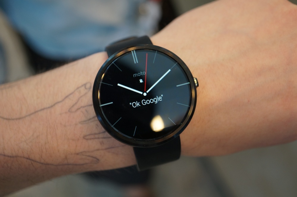
We were able to spend some quality time with the Moto 360 last week and came away in love. While the watch isn’t small by any means, it looks like a gorgeous watch on anyone’s wrist. The combination of the brown leather strap matched with the stainless steel exterior makes for one classy, almost retro, very subtle, but “holy sh*t that thing is beautiful” watch. The black version with black strap isn’t bad either, I just prefer the stainless/brown leather combo. The display, at least in our time with it, is so good that analog watch faces look like real analog watch faces. You almost can’t tell that this is a smartwatch until a notification pops up or you see someone interact with it. It has this beautiful chamfered edge that leaves the display looking almost infinity pool-like. Finally, it has a single button on the side, just like a typical round watch would, which helps the overall theme here – a smartwatch that looks like a watch first.
To wrap up, I’ll come back to my point above about the G Watch and say this – the Moto 360 has the design that will allow it to hang around as I watch Android Wear turn into (what we can only hope becomes) the best vision for a smartwatch UI to date. It should be exciting, especially knowing that if Android Wear and app developers take their sweet time, at least I will have a beautiful new accessory on my wrist.


Collapse Show Comments323 Comments