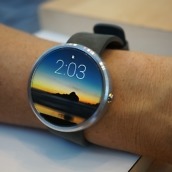
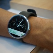
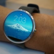
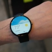
To say the Moto 360 is in a league of its own, with regard to just smartwatches, is an understatement. Pictures don’t do Motorola’s hardware justice, and after finally spending time with the device at this year’s Google I/O, it’s safe to say that this is the smartwatch we have all been waiting for.
Powered by Google’s Android Wear, which was showcased heavily at Google I/O in yesterday’s keynote, the Moto 360 is the first of its kind with a completely circular display. All other Android Wear-powered devices, like the G Watch and Gear Live, feature your typical rectangular and square displays.
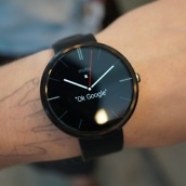
Since we were able to hold the smartwatch and put it on our wrists, all doubt about its weight and feel have flown out the window. The Moto 360 is light, built with premium materials, and whatever price Motorola decides to place on the watch will more than likely be justified.
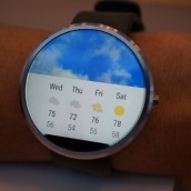
After having the G Watch and Gear Live watches on our wrists for the day, it was clear that Motorola has put a ton of time into the 360’s display and design. One word they continue to throw around is “authentic.” They want the device to look like a premium watch. They want you to want to wear it. In person, the display gives off an Infinity Pool effect. The glass is raised on the edges, which somehow makes every shot of the display look somewhat fake and photoshopped. When we say the display looks good, believe us.
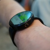
Many in our community have been scared of the size, but from our time, we think it’s a good size. It’s right around the size of the G Watch, but since the display is circular, it doesn’t take up as much space on your arm. Without going into too much detail about the size, our previous worries over its apparent size have been dismissed.
After viewing the results of our poll, we think everyone waiting for the Moto 360 won’t be disappointed at all.
Got questions? Shoot them below in the comments section.
Gallery




Collapse Show Comments262 Comments