Pushbullet, an app that continues to be one of our favorites of all time, received a massive update today that not only introduces an updated UI, but new features as well.
As you can see from the screenshots above, the UI is now much more card-like, with a new slideout menu that allows you to quickly filter pushes by device or friend. If you are at all like me, and push things to your devices regularly, this is an incredibly handy feature. All you have to do is swipe out the slider and tap on a device or friend and the stream of pushes will be filtered. The new UI also looks less cluttered and seems to separate items much better than before.
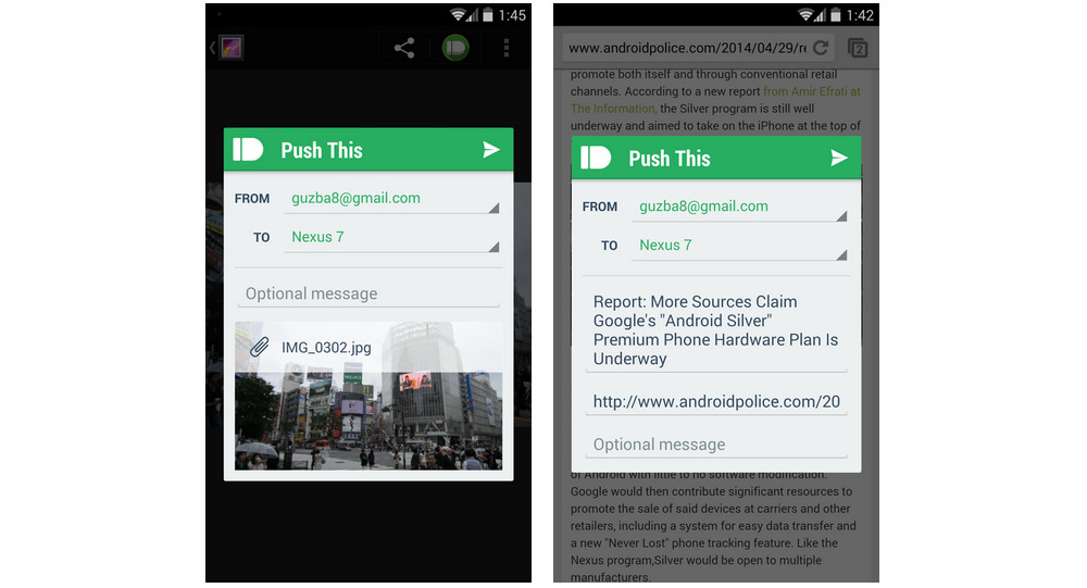
Next up, Pushbullet will now leave you in your current place when pushing an item. In the screenshot below, you’ll see how pushes open a pop-up window rather than take you all of the way into the Pushbullet app and out of whatever you were doing. With this change, you can push something and then get right back to your task at hand.
Finally, Tasker integration got “more love” too. The pushes that trigger Tasker events can now be automatically dismissed or deleted, since there is a pretty good chance that you don’t want those automated tasks hanging around. You can easily choose what will happen to those pushes with a new selector.
Even those big enhancements weren’t enough, the Pushbullet team gave us this list too:
- Want to get something over to another one of your devices quick? Now you can broadcast a push to all of your devices. For those with a lot of devices this makes life a lot easier. Once you dismiss the push on any of your devices, we take care of dismissing it everywhere else too!
- Easily add and switch between multiple Pushbullet accounts. You can add and switch accounts right from the slide-out.
- Turning Notification Mirroring on or off for specific apps is now a lot easier.Instead of being a giant list of everything on your phone, there’s now a simple list of the apps that have either been muted before or have actually shown a notification. Makes finding the app you want to turn off a Lot simpler!
- Finding and adding friends in the app is now much simpler. Instead of a huge list of everyone Google thinks you know, it’s now a smaller list of your real contacts. Makes finding the friends you want to share things with a lot less difficult.
- Improved home and lock screen widget design. Our widget now takes it’s design cue from Google’s updated Email/Gmail widgets. Looks great!
- Tablet optimization improved with the new design.


Collapse Show Comments12 Comments