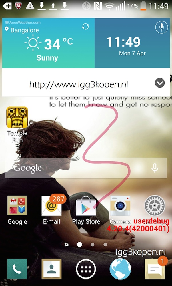
A screenshot is making the rounds today, reportedly taken from a device said to be running a new UI which will be featured on the upcoming G3 from LG. Since both HTC and Samsung have opted for flatter designs, it makes sense that LG would also find this look appealing. Not to say that they are copying anybody, as the “flat” look has been taking over the entire tech world as of late.
We don’t have much to take from the screenshot, as all we can really see is that LG decided to flatten a few icons. With that move, any thirds party apps you install from Google Play will undoubtedly throw off the look of your app drawer, but that’s just nitpicking.
One thing we would like to stress is that this screenshot was probably not taken from a G3. If it was taken on a G3, we would most certainly see on-screen buttons at the bottom. Instead, this was probably taken from a test device running the new software, which the source later stated in the comments section of the article.
As for our personal opinion, it looks rather messy. There seems to be quite a lot going on in this screenshot, and anyone with OCD would probably ask this person to please check their 287 emails.
What do you think? Can LG pull off a flat UI with the G3?


Collapse Show Comments74 Comments