We know a few folks around these parts that would go so far as to say Android is somehow the step child to Google. With their apparent love for iOS, showering of Apple’s users with gifts of gorgeous UIs, and Hangouts with Google Voice built-in, it’s easy to see that in no way does Google discriminate against people who don’t rock Android as their daily driver.
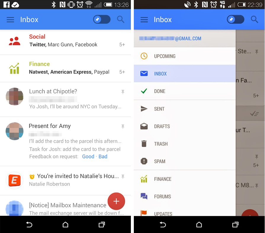
If you use Google services, whether on Android or not, you best believe their teams will attempt to deliver a good user experience. For quite some time now, iOS users of Gmail have been treated to a fancy UI, with Android still rocking a mildly-ugly interface for the email service. According to Geek, who posted up screenshots of an upcoming Gmail build, it looks like Android users are in for the same UI treat, finally.
The overall look is rather flat, going along with every other interface that has been seeing updates. 2013-14 has been all about the flatness. From what we can take away in the screenshots, it pretty much looks like the same Gmail, just a new appearance. As for new features, it appears we have a new “pinned” feature, which allows users to pin emails to the top of their inbox. In addition, it is reported that there is also a “snooze” feature, allowing users to snooze email notifications – much like we see with Google Hangouts.
No word as to when we can expect to see this UI roll out, but the source states it could still be quite some time away.
Take a look at the screenshots below, then let us know your thoughts below.


Collapse Show Comments82 Comments