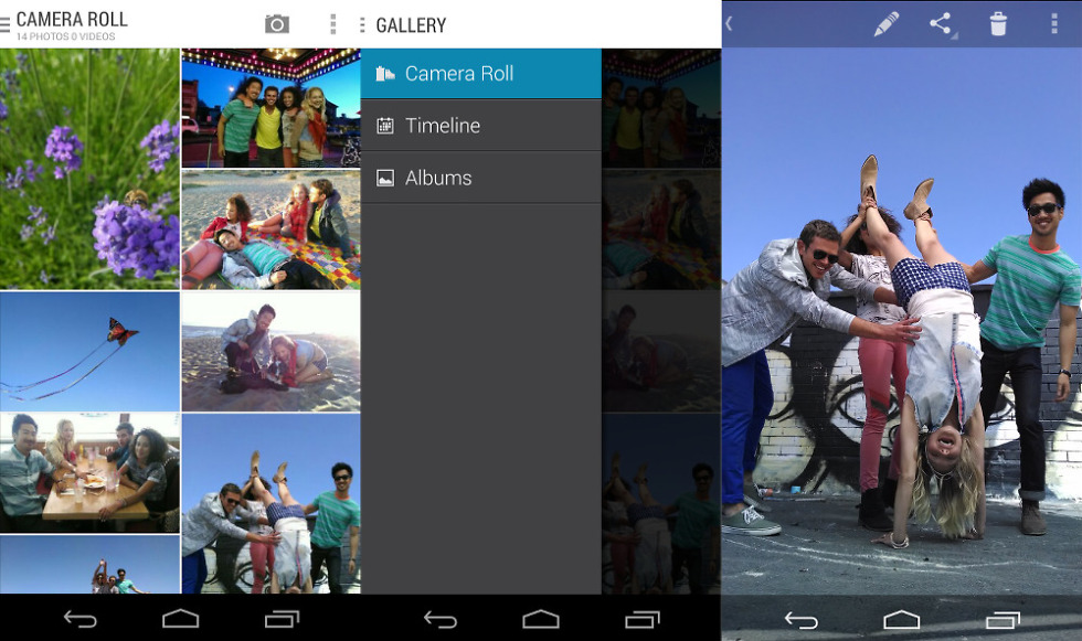
One of the subtle tweaks Motorola added to stock Android for its 2013 flagships was a different Gallery application. This is appreciable, considering stock Android’s implementation isn’t the greatest looking app we’ve seen these days. Motorola has made an effort to fix that with their rendition, with a hamburger style menu and better looking image thumbnails. Today’s update brings an updated design and a couple under-the-hood improvements.
First of all, you can now drag the scroll bar to run through your photos and videos more quickly — photogs rejoice, you can finally now find those snaps from ages ago. You can also now see more pictures on one screen, making for a better experience as well.
Those of you on a new DROID device who lost your notification bar now finally have it back, so checking your QuizUp challenges while taking in your beautiful photos shouldn’t be an issue anymore.
Rounding out the update is new behavior when you select the Albums view — it will become the default view until you switch things back.
Gallery version “200008” is now rolling out to all of Motorola’s 2013 phones through Google Play, so sit tight as it makes its way to you.

