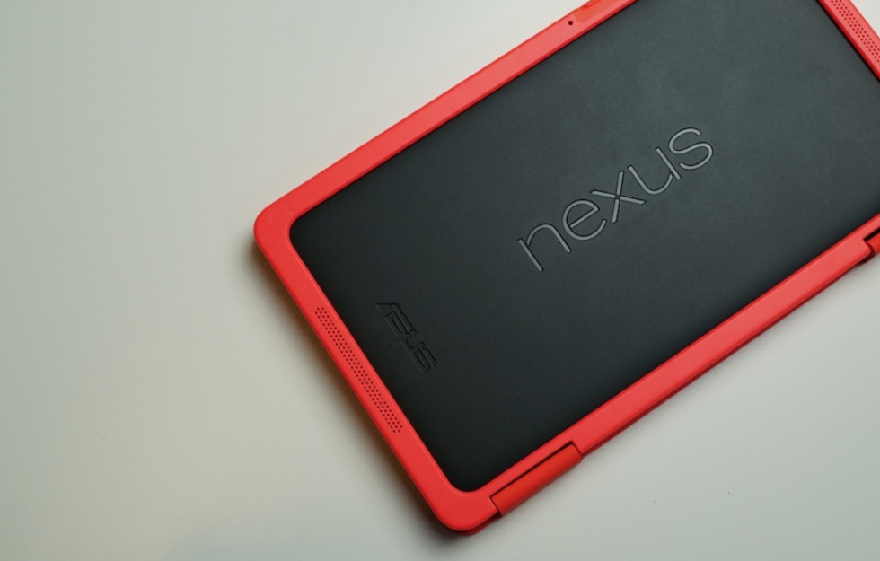
On the day that Google introduced two new Google Play Edition devices, we also were treated to the arrival of an official Folio case for the 2013 Nexus 7. At $49.99, it’s not exactly cheap, though we wouldn’t expect official Nexus accessories to be cheap these days. After seeing the official (and poorly designed) Nexus 5 Bumper drop in at $34.99, the price of this Folio is right about where one would envision it to be. But as always, we like to pick-up all official Nexus accessories to give them some run and see if Google has created the perfectly designed compliment for their device lineup.
The N7 Folio comes in both bright red and black – we are featuring the red version here. The case includes a tri-fold top piece that attaches to a bumper, leaving an exposed back. It feels premium in hand, with its soft touch front, felt under-covering, and premium plastic bumper. There are cutouts where you need cutouts (microUSB port, headphone jack, and speakers) and button coverings over the volume and power, though these actually work unlike the coverings on the Nexus 5 Bumper. With the exposed back, you also leave open the possibility of wirelessly charging your device.
Unfortunately for this Folio, there isn’t much to like outside of the premium materials used. As detailed in the video below, I noticed all sorts of little issues that shouldn’t exist in a product that was “custom designed” by Google to fit their own tablet. The cover doesn’t sit flush, it doesn’t have magnets to help keep it closed, the hinge for the cover can be finicky, the cover overlaps the tablet when tucked behind, and the fit of the bumper is not tight or secure enough to leave me feeling comfortable using this case for long. With the number of issues I detail in the clip, plus with its $49.99 price tag, I wouldn’t exactly recommend that anyone pick one of these up.
I wonder when Google is going to get one of these right?
Video
[responsive_vid]

Collapse Show Comments26 Comments