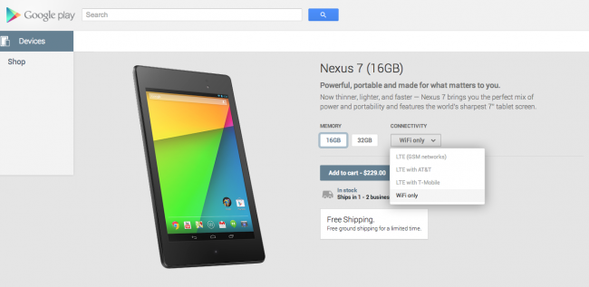
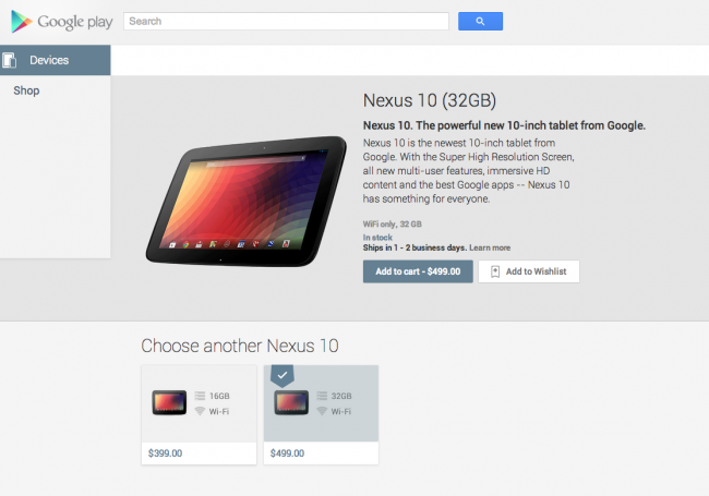
It may not be the arrival of the Nexus 5, but Google is indeed putting in work on Google Play store device pages. The Nexus 7 (2013) pages have been completely redone in terms of a model selection process. Previously, you had to choose from cards for each model of the Nexus 7 in a sub-section just below the device description, but now, Google is letting you choose the storage size via button, and then LTE (carriers separated) or WiFi from a drop down menu.
I don’t know that we should necessarily jump to this as meaning the Nexus 5 is going to be here any minute, but we like to see Google make moves in the Play store, especially when we know something is on the horizon. And as htowngtr already mentioned in the comments, this layout would make it really easy for Google to list both white and black models of the N5.
Here is the Nexus 10 page for reference on the old design:
It’s a change no doubt, and changes are good. Now, Google, just add in our Nexus 5 pages.


Collapse Show Comments52 Comments