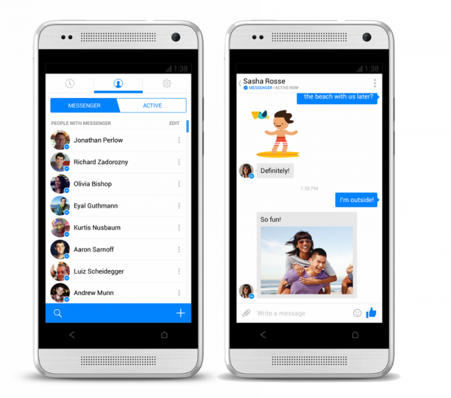
This morning, Facebook is pushing out a newly-designed Messenger app to select Android users, one that is chock-full of butter and improvements. You will notice a new look, one that strongly reminds us of iOS 7 and a few of the leaked Kit Kat screenshots we have seen; we like the way it looks so far.
The app also received a few new ways to reach your friends faster. When you see the blue Messenger badge by a friend’s picture, that means they are on Messenger and can be reached instantly. In addition, you can also text your friends if they are not signed into Messenger, but just make sure to have your own phone number confirmed so they can text you back through the app.
To top it off, an entirely new menu system has been set in place. There are now three columns that the app functions around. There is the contacts column, where you find all of your friends to chat with, including the ones synced on your device, there is your recent messages column, and a Settings column where you handle all of your enabled or disabled settings such as location sharing. You can swipe through each column, which is actually a pretty nifty user experience.
And of course, Chat Heads is still there.
Facebook has been recently investing a lot of time into its Android offerings, and we say it is about time.
Update: If you want to sideload the app before it rolls out to everyone, you can download it here. You may have to uninstall your current version, though. (via)
Via: Facebook

Collapse Show Comments55 Comments