In an apparent leak out of ZDnet, we may have new Android 4.4 “Kit Kat” screenshots to study for the rest of the day. The leak shows an older build of Kit Kat running on a Nexus 7 (2013) tablet, along with a variety of screenshots from different areas inside the new build of our favorite mobile OS compared to Android 4.3. We have a look at the Easter Egg, more icons in the app drawer, the slightly tweaked Clock app, Settings menu, and the new Downloads app. There is a lot to take in, so we’ll continue to update this post as we have more.
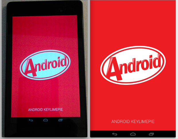
In the first screenshot, you are looking at the Android 4.4 Easter Egg, though it still says “ANDROID KEYLIMEPIE.” According to this leak, you get to this the same way you do other Easter Eggs, by pressing multiple times on the Android version. What’s a little odd, is that we are seeing the Kit Kat-style Android logo, but yet the version of the OS still says “KeyLimePie.” I’d imagine Google is going to wait until the very last minute or a release build to change that over. All other signs at this point show that we are ready for Kit Kat. In earlier builds of Android 4.4, we saw a giant K with a slice of key lime pie in the background, so again, it seems like we are getting much closer to a release.
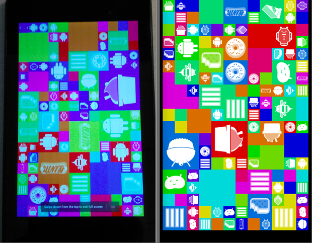
Once you are there, a long-press on the Android logo takes you deeper into the Easter Egg, which shows a moving mosaic of previous Android versions. It’s ugly, yet still somehow pretty and fun. Cupcake, Honeycomb, Gingerbread, and Jelly Bean logos are all present.
Update: A couple of readers have noted that there is a message of “swipe down from the top to exit full-screen mode” on the Easter Egg page. It’s tough to tell if that’s a system wide full-screen mode or just something that relates to viewing the mosaic in the Easter Egg.
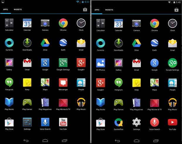
Here we have a look at the old app drawer in 4.3 vs. the new app drawer in 4.4. The biggest change we are seeing is an introduction of new icons. We have rounded icons for the Google, Google Settings, Settings and Voice Search apps, all of which were square in 4.3. Nothing else has really changed, but QuickOffice does appear to be a part of the stock experience in 4.4, plus you have G+ photos there as well. In a recent leak from last week, we saw the removal of Gallery, however, it’s still present in this build.
One thing to note, is the fact that this screenshot still shows “Apps” and “Widgets” at the top of the app drawer, yet we saw both gone in the latest leak of 4.4 running on a Nexus 5. The app drawer also isn’t transparent like the other leak. At this point, the leak from last week appears to be the newest build of Kit Kat to date and again, this is an older one.
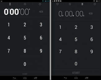
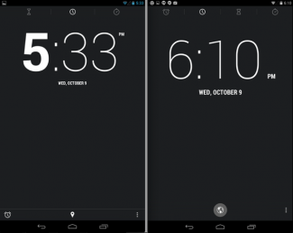
Here is a look at how the Clock app has changed, including the removal of the half-bold-half-thing Roboto style of text. They also took the Alarm button and moved it up top next to the timer and stopwatch icons.
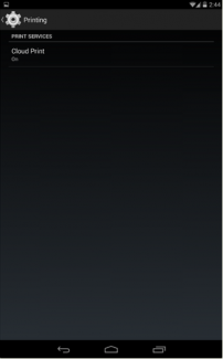
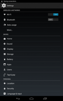
In the Settings screen, we’re seeing global Print settings, along with the previously leaked Tap & pay menu and a Home section. It’s looking more and more like 4.4 is going to build mobile payment systems into the OS, for Nexus devices if nothing else.
But what is “Home”? Is there an area to configure your home screen setup more intensely? Is this a part of the new rumored Google Experience Launcher?
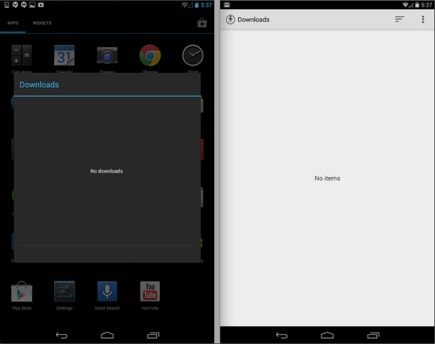
In this last screenshot comparison, you can see the current Downloads app compared to the overhauled Downloads app for Android 4.4. Talk about a nice change. Rather than the pop-up black and blue menu that offered little, we have a full-blown app that takes on the recent Android design change to grey, along with an action overflow button.
Unfortunately, no pictures of Google Now integration or the home screen were included.
Anything else standing out?
Via: ZDnet
Cheers open1your1eyes0h!



Collapse Show Comments162 Comments