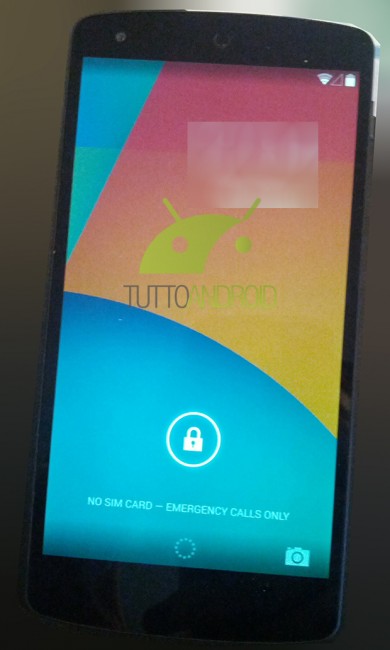

Thanks to a series of “hands-on” photos posted this morning by the folks over at Tutto Android, we now have one of the cleanest and most significant leaks of the new Nexus 5 and Android 4.4. The images just went up this morning, so you can imagine that we are still digging through them. As we stumble across bits and pieces of info, we’ll be updating this post. For now, get to looking.


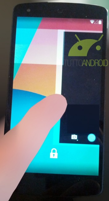
As can be seen in the very top image, a new camera icon has been placed on the lock screen in the lower right corner. It still appears as if a swipe over from the right edge will access it, but this camera icon is also actionable. If you grab the camera icon and drag it to the left, it will open the camera as well.
In these images, we get a first look at the UI changes to Android 4.4, which will be known as “Kit Kat.” The navigation buttons now have a transparent background, similar to what we have seen on devices like the Moto X and G2. The launcher button has been changed to a semi-transparent circle with the typical 6 dots inside of it. We’re seeing a new Dialer icon, series of dots to show which home screen you are on, and a transparent app drawer (has previously been black). The frequently leaked new notification bar with white icons is also visible and appears to be semi-transparent as well.
We’re a little confused at how you access Widgets, as they do not appear to be listed in a separate tab up top like they have been for the last few releases of Android. Maybe the long-press to add widgets is returning?
New beautiful wallpapers? I think so.
Update 1: Where is the Messaging app? Will Hangouts finally become the full-time all-in-one messaging application? Also, Google+ Photos is now just called Google Photos, plus the Gallery app is gone. The Google Settings and Search icons are now round icons, when they used to be square.
The folks at Tutto Android mentioned in their post that you can add more than 5 home screens if you’d like, but the phone will ship with only a select few. They also mentioned that Google Now can be accessed with the swipe-up from Home, but you can get there once you are on the far left home screen, and then swipe from the left edge. I imagine this action is similar to what Motorola was doing with their quick toggles menu on devices like the RAZR HD. A source of theirs also claimed that you can launch Google Search from the home screen, simple by saying “OK, Google.”
In this series of shots, we get a look at some of the internal settings menu which features a “Tap & pay” section that we had previously seen leaked as “Payments” button. We have a more robust location history section as well, that features different accuracy levels, recent location requests, and a better look at history.
In terms of the phone itself, it’s exactly what we have seen leaked time and time again over the last few weeks. We can see the front camera placed in the top left corner, along with the circular speaker grill in the center. You have on-screen navigation buttons, but that’s no surprise with a Nexus device.
This phone is reportedly running Android 4.4 build KRS92B.
Update 2: We put together a comparison post of Android 4.3 vs. the 4.4 in these photos.
Via: Tutto Android [2]
This post was last modified on October 11, 2013 9:24 am
