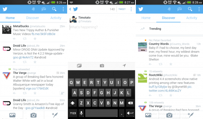
Twitter has gone and updated the Android app’s user interface again. Real quickly though, we wanted to point out that the last UI was really nice, and so far, we aren’t the biggest fans of the new look. In an update that is now live for beta testers, Twitter has removed the hamburger menu, and instead, navigation now relies on three top tabs, as well as three floating icons along the bottom. One for your gallery, one to access your camera app for quick uploading, and one to compose a new tweet.
It will take some time to really see if there was a reason Twitter opted to go against Android’s design guidelines, but let’s hope it was for a somewhat good reason. If you are part of the beta program, go grab the update through Google Play.
Cheers Chris and J!


Collapse Show Comments26 Comments