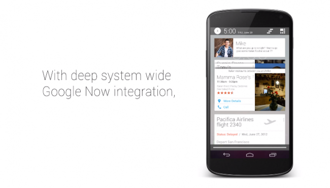

One of the fun things about having such a talented Android community is that we can imagine what future versions of Android will look and feel like, way before it hits the streets. Sure, it may end up looking nothing like it, but it’s a great way to hear ideas of what people might like to see inside the OS. The most recent idea to hit the web is an Android 5.0 concept video, created by designer Craig Tuttle.
In Craig’s mind, the next version of Android following 4.4 “Kit Kat,” will feature extremely deep system wide integration with Google Now. Instead of a regular notification pulldown, you will be greeted by things that would usually be seen inside the Google Now app, but only at times when you need them. This is already the idea behind Google Now, so it isn’t the furthest stretch of the imagination to assume this could even happen.
In addition, Craig changed up the color scheme of Android a bit, going for a more whited out look, instead of the now well-known Android blue that first stuck in our minds with Ice Cream Sandwich. Some would argue that the blue color came with Honeycomb, but does that really count?
Take a look at the video and let us know what you think of the concept. We think it’s pretty slick, especially the new multitasking windows. Those are hot.
This post was last modified on January 13, 2020 11:28 am
