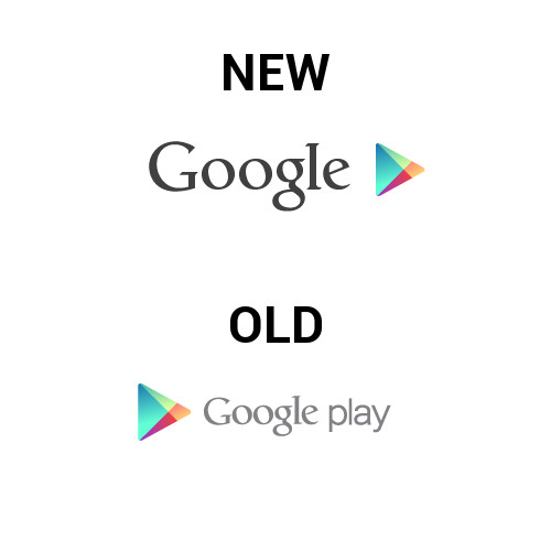
Google updated the Google Play logo moments ago across the Play store, so we thought we’d share in case you didn’t notice. It’s a subtle change, but no longer says “Play” in it and is also much darker with a bigger “Google” font. Who knows if the removal of “Play” means anything or if they just want the triangle icon to mean “play,” but this is what we’re looking at.
Update: They switched it back to the old logo at some point in the night.
Just sharing.

Collapse Show Comments78 Comments