Two weeks ago, we posted our review of the Moto X. We raved about its features, build quality, design, mostly stock Android, and customizable exterior. It’s probably safe to say that it’s our favorite phone of the moment, just for the overall package that it delivers, even with a set of specs that most would look at on paper and second-guess. So when I got my hands on the DROID ULTRA early last week, a phone that sports almost identical specs to the Moto X, I expected to go in and receive a similar experience. And sure enough, you do get a similar experience in terms of software, but the hardware design is so drastically different that I’m struggling to fall in love here. Let’s talk about it.
*Note – The review is going to seem shorter than most, but that’s because the software experience here is almost identical to what you’d see on the Moto X. So if you haven’t read our Moto X review, I strongly suggest that you do. We’ll reference it a lot rather than re-writing everything again here.
The Good
Performance
Performance on the DROID ULTRA is as snappy and fluid as you’ll find on any phone. With Motorola’s X8 Mobile Computing System (combination of a Snapdragon S4 Pro, two low-power cores, and a quad-core GPU), you’ll cruise through games with maxed out frame rates and jump between apps or tasks without a stutter. There has been a mostly negative response to Motorola’s decision to go with a dual-core processor over the competition’s choice of quad-core beasts, but trust me when I say that you won’t ever be able to tell in any situation that I can think of with the ULTRA.
I’ve now gone through a Moto X and ULTRA, and never once have I said, “Man, I wish they would have gone Snapdragon 600 or 800.” The chipset setup here really does give you all the performance you could ask for. Is it going to win every single benchmark war? No. But then again, it’ll probably win most of the gaming or GPU tests, thanks to the 720p display.
Active Display, Touchless Control, and Quick Capture
If you haven’t yet, go watch our video tour of Active Display, Touchless Control, and Quick Capture Camera on the Moto X. All of these three features act the exact same way on the DROID ULTRA.
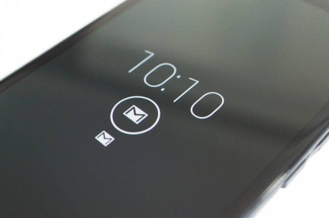
Active Display, as you know, is our favorite feature by a long shot on any phone of the last couple of years. It eliminates the need for a notification light by putting real information on your screen without killing your battery life. It’s also smart enough to know when you pull your phone out of your pocket, pick it up off a desk, or flip it over after being face down. Active Display gives you information before you have even asked your phone (by pressing a button) to provide it. Simple, yet groundbreaking stuff, if you ask us.
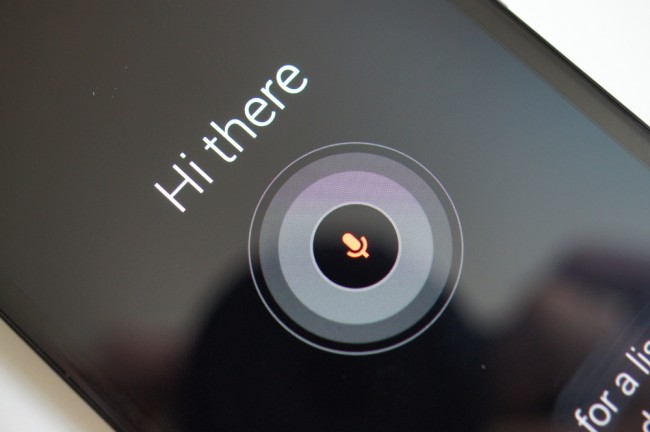
Touchless Control uses one of Motorola’s natural language, low-power processors in the X8 system to be ready for your voice commands at all times. This feature allows you to wake your phone and then have it complete tasks by saying “OK, Google Now” followed by your command. It works well, especially since Motorola uses your own voice to train it to not activate for anyone else. It’s incredibly clever, and should only get better over time as Google updates its search powers and Motorola fine tunes the service in future updates.
Motorola claims that no other company could do either of these with current processor and display combos without needing double or 3x the battery life. We aren’t sure how we can prove that point, but we know that both of these features work mostly flawlessly and we’re still seeing full-day battery life.
Last, and we’ll get to this later in camera, but Motorola is making picture taking even faster with the ULTRA, just like it did on the Moto X. Using a quick double-wrist twist, you can launch your camera and then snap a picture in 2 seconds (according to Moto). Tough to tell if it’s that fast, but it certainly beats having to press an unlock switch, find a camera icon, and then worry about pressing a shutter button. Again, more coming.
Battery Life
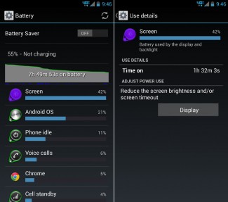
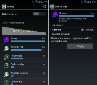
Battery life on the DROID ULTRA was similar to what I saw on the Moto X, if not a little better (though I don’t know how that’s possible). On average, I’d say I was getting anywhere from 14-18 hours before I had to start worrying about finding a charger. On a light use day, we’re talking no WiFi, but no calls or much handling, I was easily pushing 24 hours of life. On a typical day that involves a few calls, no WiFi, lots of Gmail, Instagram, Scorecenter, some YouTube, and other apps, I was never worried. I don’t know that I had one of those days where I really hammered on the ULTRA, but I just never felt like I needed to to prove that the battery life was stellar.
The reason I said that I can’t figure out how the ULTRA has better battery life than the Moto X is because it has a slightly smaller battery than the X (2130mAh vs. 2200mAh) and a bigger display (5-inch vs. 4.7-inch). Here is the spec comparison to prove it. Typically, when you see a bigger display and lesser capacity in a battery, you would get worried. But again, in over a week with the ULTRA, I’d say I have yet to worry about running out of juice in a 14-18 hour period.
Mostly Stock Android
Once Google bought Motorola, the new executive team decided to ditch the old MotoBlur skin that most of the consumer industry despised and replaced it with mostly stock Android. On the DROID ULTRA, like the Moto X, you get that same experience along with a couple of tweaks here and there not seen on the X. For one, you get an add-on feature called DROID Zap that shares photos from your ULTRA to any other Android device with a 2-finger swipe. We have a video demo of it below. The Zap feature is not game-changing, but I could see where it has its uses, assuming you can talk everyone into installing the receiver Zap application.
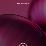
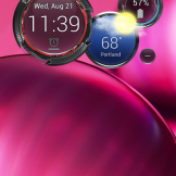
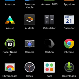
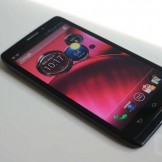
Motorola also tossed in things like notification counters on icons (pictured above) and changed the color of an icon or two. The rest, is stock Android with add-ons done by Motorola. You’ll find Moto Assist, the previously mentioned suite of awesome stuff (Touchless Control, Quick Capture, and Active Display), and a 3-circle clock widget called the Command Center (pictured above).
The ULTRA runs Android 4.2.2 and will likely see updates to the newest versions of Android on a regular basis, likely pretty close to when Google releases them. Motorola claims that there is a firewall between them and Google, but they committed last year to providing timely updates.
Somewhere in the Middle
Display
The 5-inch 720p AMOLED display on the ULTRA is neither great nor bad – it really does fit somewhere in the middle. Its competitors are using 1080p displays at 5-inches, but Motorola has decided that your naked eye can’t tell the different between 720p and 1080p, plus the jump from one to the other isn’t worth the battery drain. So they’ve gone 720p, with a pixel density somewhere just under 300ppi.
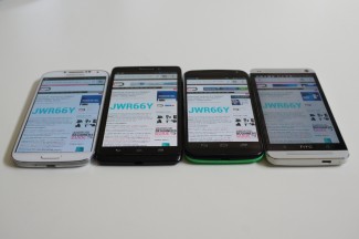
The panel used by Motorola in the ULTRA (and the Moto X) displays slightly warmer than I think most would like to see. In the pictures below, you can see how cool both the HTC One (LCD) and Galaxy S4 (Super AMOLED) are when sitting next to the Moto X and ULTRA. Now, without them sitting right next to each other like this, I can’t say that I’ve found myself complaining about the reddish-yellowish tint that the others do not show, but it’s there. For display purists, even though this is an RGB panel, you’ll probably notice it right away, especially when viewing whites.
The viewing angles, though, are great on the ULTRA. Take a look at the shot to the right to see how much cleaner both Motorola devices look at a semi-steep angle when compared to the other two flagships on the market. Now, the ULTRA does sit at a slight angle thanks to its rear hump, so it’s not 100% accurate in that picture. However, the Moto X sits mostly flat and provides the same clarity as this angle.
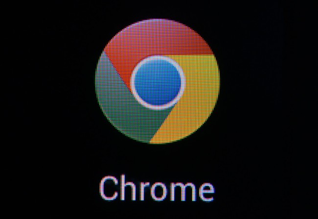
With all that said, I did spend some time doing a simple test of watching YouTube videos on both the Galaxy S4 and ULTRA. The results give the Galaxy S4 an immense lead in terms of video quality. If you want to see the difference in pixel density, look no further than the Chrome logo in this screenshot.
Again, the display isn’t bad, and is for the most part very sharp. I definitely think the decision to push out to 720p on a 5-inch display wasn’t the best Motorola has made, though. It looks great in terms of clarity on the Moto X at 4.7-inches, but that extra .3 inches coupled with capacitive touch buttons gives you a full 5-inch experience that feels a bit blown up.
Camera
Cameras, cameras – such a pain point in smartphone reviews. Sooooo, the 10MP RBGC sensor in the DROID ULTRA is identical to that found in the Moto X. And since it also uses the exact same camera software, you get similar results in pictures. At times, it’s a rockstar. This camera is capable of taking some really sharp macro shots. Look at the little green terrarium picture below. Not bad, right?
But outside of close-ups of plants, it was so hit and miss with this camera just like it was on the Moto X. The clear pixel addition to the sensor was supposed to help the camera in low-light and to erase motion blur, but my low-light shots always look like overprocessed blurred messes. Take for example the kitty picture below – could have been the cutest napping cat picture on Earth, but instead it’s an oil-painted, noisy disaster. I also feel at times like this camera really drops down any bright color or vibrance and often times leaves photos that look, well, dead instead of alive.
Here are a handful of sample shots taken in a variety of situations. Again, you’ll see that some are quite good while others you’d wish Motorola had given us something better.
Full resolutions: 1 | 2 | 3 | 4 | 5 | 6 | 7 | 8
In terms of camera features and software, the ULTRA’s camera also sits somewhere in the middle. Motorola tried to dummy-proof the camera experience, and for the most part has done a good job of that. For example, you have Quick Capture Camera which allows you to launch and shoot photos in a couple of seconds. You can also tap anywhere on the screen to snap photos, rather than having to worry about a shutter button. But if you were looking for any advanced or manual setting like aperture, shutter priority, or white balance, you won’t find them. The settings in the camera are as follows: HDR auto toggle, flash, tap-to-focus, slow-motion video, panorama, location tagging, shutter sound, and Quick Capture toggle. That’s it.
So just like we said with the Moto X, we feel as if the camera on the ULTRA can greatly be improved by Motorola with some software tweaks, assuming they are working on them.
The Not-so-Good
Design
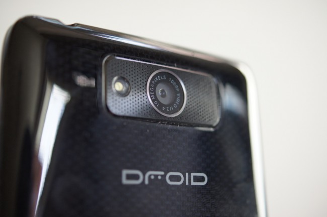
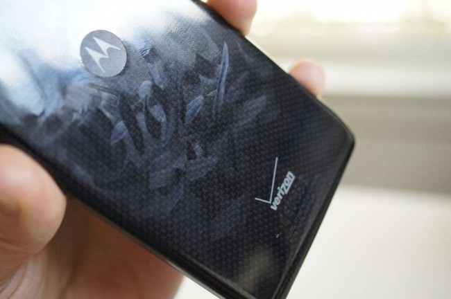
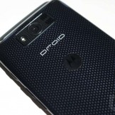
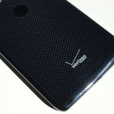
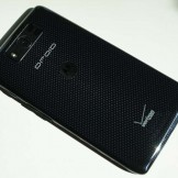
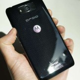
I’ll be perfectly honest here in saying that I’m not at all a fan of the design of the DROID ULTRA. That doesn’t necessarily mean it’s bad – it just means that it doesn’t fit my needs or style. If you like a futuristic, robotic design in phones, you’ll probably be right at home here. Motorola used a 2 layer kevlar with a special epoxy topcoat to give it strength and that glossy exterior. If you look at certain angles on the backside, it actually looks a bit 3Dish, which is kind of cool. But for me, that’s where the cool ends.
We complain about fingerprints on glossy-backed devices from time to time, but the ULTRA takes the crown as the absolute worst. I’ve already admitted that I’m not the biggest fan of the design, and this problem is probably reason no. 1. As I’ve written this review, and taken pictures of the device along the way, I’ve had to wipe the phone down at least a half dozen times after holding it for only a few seconds at a time. It’s such a mess. Now, I’m a pretty anal smartphone user, meaning I like to keep my phones extra clean, but with the ULTRA I just found myself giving up after a while as it was a battle no human could win.
I’m also not a fan of the size. After using a Moto X and Galaxy S4 before it, the ULTRA feels like it was made for the hands of a transformer. It feels far bigger and boxier than it should, doesn’t sit comfortably in hand, and I hate to say it, but the ULTRA comes off a bit slimy thanks to that glossy backside. You’ll see red, white, and black versions of the phone at launch, with the black probably being the prettiest of all. If you want to see the atrocity that is the red version, go look at our original hands-on gallery of the phone.
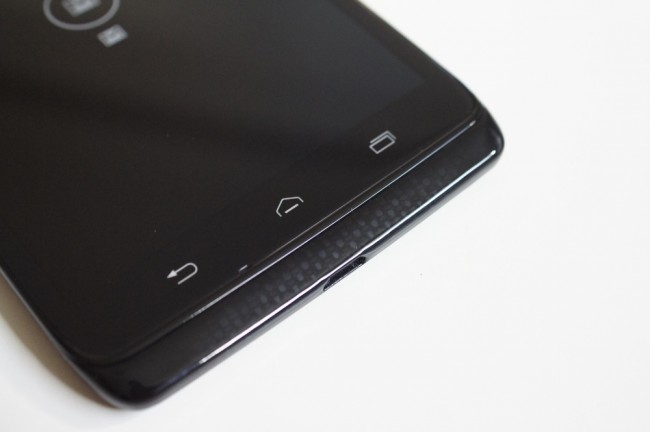
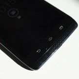
Last, I cannot stand the capacitive navigation buttons that Motorola chose for its DROID line, when the Moto X went with the Google experience of using on-screen navigation buttons. They add bulk to the chin and make accessing Google now awkward at times (good luck accessing it at all from the lock screen). I know that there is a group of users who prefer capacitive buttons as they don’t eat up screen real estate, but I’m not one of them. On-screen buttons feel so natural to me after using every Nexus phone from the last two years, along with a couple of Motorola’s offerings.
I know that all sounds harsh, but when you go from a minimally designed Moto X that was crafted with great care to a glossy, overblown, robotic slab, there is no holding back.
Price and Specs
The DROID ULTRA is now available on Verizon for $199 on 2-year contract or $599 at full retail. Those aren’t crazy prices for a flagship smartphone, but like the Moto X, it’s tough to swallow that pill knowing that phones like the HTC One and Galaxy S4 (at least on paper) 1-up the ULTRA in every category. Both of those phones have 1080p displays and next-gen quad-core processors, while the ULTRA is running a dual-core processor and 720p display. While I told you not to worry about any of that spec talk with this phone because it runs just fine, it still needs to be pointed out. If you had two perfectly cooked artisan burgers sitting next to each other, but one used an aged cheese and hormone-free ground sirloin, while the other went with store bought cheddar and ground chuck, yet were price-matched, which would you go with? Sure, they will both satisfy, but the value seems better in the hormone-free burger. Hungry now?
Bootloader
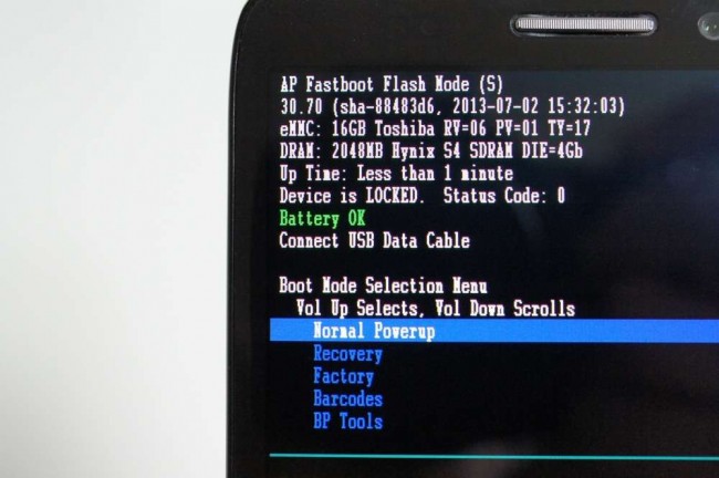
Verizon hates smartphone freedom – they always have. So since the DROID ULTRA is running on their network, with their exclusive “DROID” brand, this is not a phone for hackers and tinkerers. The bootloader is locked and there isn’t even much hope of it getting unlocked. We’ve seen exactly one set of Motorola phones cracked open over the last three or four years, so if you buy this phone (or the MAXX), don’t go in with the “Oh, it’ll get unlocked eventually” mantra. We’ll likely it see it rooted (hopefully), but that could be it. If you want to tinker, leave Verizon and go buy a Nexus.
Bloatware Count!
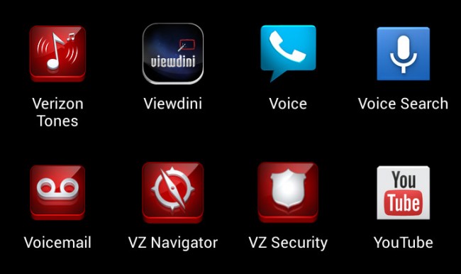
We counted 18 pre-installed bloatware apps. Thanks, Verizon!
Other Notes:
- Calls and Speaker: Call quality is good, didn’t notice any issues. The speaker on the back is also exceptionally loud, but that has been the case with Motorola phones for some time.
- Wife Test: The phone definitely failed the wife test. She thought it was too big and not quite as pretty as the Moto X. Yes, she wants a Moto X.
- Freebies: You get an instant invite to Ingress along with some special perks. You also get a free 6-month months of Google Play All Access service.
Gallery
Video
Unboxing
vs. Moto X
DROID Zap Feature
The Verdict
In the end, I’d rate the DROID ULTRA at somewhere in the “good” range. It’s not great, it’s not terrible, and it probably wouldn’t make my top 5 list of phones. As I mentioned in the intro, I went into this review expecting a similar software experience to the Moto X and got that. My worries were in the hardware, which only worsened as I spent an extended period of time with it. And don’t take that to mean that this phone feels cheap or won’t last a 2-year contract. The ULTRA is certainly a well built piece of technology. It’s just that I prefer to go without the high-gloss coating, capacitive buttons, kevlar designs, and extra-large hardware footprint that isn’t pleasant to hold in hand.
In terms of software, the DROID ULTRA is on par with Motorola’s non-DROID flagship and is refreshing when compared to phones like the Galaxy S4 or HTC One. I just don’t think it comes anywhere close to the any of those phones in terms of design.
Decent phone, just not for me.






Collapse Show Comments252 Comments