Now that the Moto X is official, priced, and ready to arrive on the five major U.S. wireless carriers, it’s our job to try and figure out if this “mid-range” device with its premium price tag and handful of tricks is worth every penny that Motorola thinks it is. We know that you have all seen the spec sheet – it tells a story of a device that certainly can’t compete on paper with the Galaxy S4 and HTC One. But that’s not what Motorola cares about. They want to win you over with a customized phone assembled in the U.S. that runs as smooth as butter, has a simple approach to Android, and carries a set of features that should make your life easier without confusing or overwhelming anyone.
After dedicating my life to the phone since it was handed to me at Motorola’s press festivities on August 1, I think I have plenty of thoughts to share on all of that. It’s time to talk Clear Pixel camera. It’s time to talk 720p vs. 1080p display. It’s time to talk performance. And most importantly, it’s time to talk about that damn price. Let’s do this.
The Good
Design
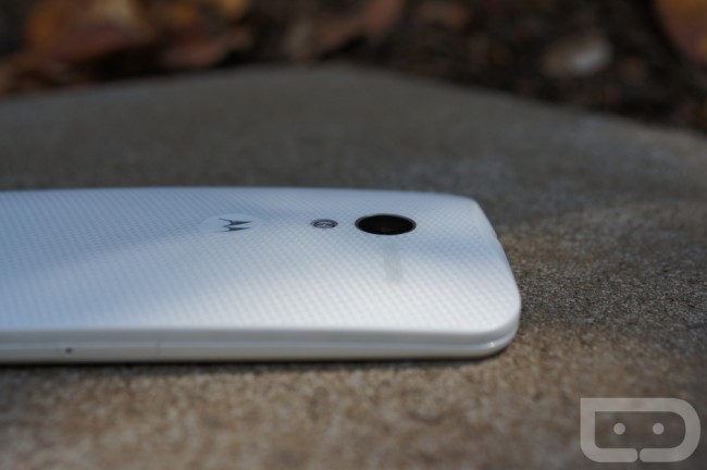
With the Moto X, Motorola tried to create a product that “skips the gimmicks and gloss” to instead focus on “comfort, approachability, and warmth.” Have they done that? I’d like to think so. The Moto X is a beautiful little handset. With its curved backside that tapers towards its bottom to match the contours of your palm, it feels amazing in hand. It’s a two-part design, with both top and bottom casings, but thanks to an incredibly well-molded fit, it feels as premium as any unibody design. There is a soft texture applied to the back that is neither slippery nor sticky – it’s perfect. The lack of logos on the device is also welcome, something Motorola claims was done because the overuse of branding is “irrelevant” to the end user.
On the front you have an edge-to-edge 4.7″ display with as little side bezel as you’ll find on any smartphone. Even the top and bottom sections, sometimes referred to as the forehead and chin, are smaller than any phone I can recall. Part of the lack of bezel can be attributed to the lack of hardware navigation buttons. Motorola chose on-screen navigation buttons for the Moto X, so instead of taking up space at the bottom of the phone with Home, Back, and Multi-task, the display is used. But not only is this a space saver, it also matches up to Google’s approach to Android. If you were looking for a phone that is all display without the extra fuss, this would be it.
Accompanying the front panel, you also have a front facing camera, sensors, speaker grill, and a microphone. You’ll notice them on the white version because they are black against white, but since there is no carrier or manufacturer branding on the front, you won’t mind. On the black version, you get a 100% clean, almost infinite black appearance.
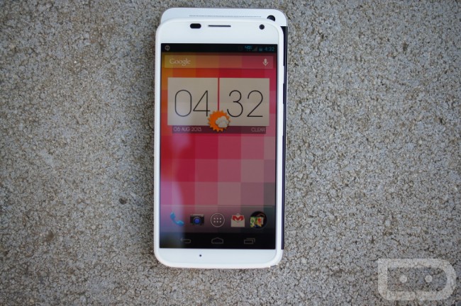
What amazes me the most about this design, is that when you hold it in hand, it feels like you are using a phone from years past when 4″ displays were popular and phones were smaller. But that shows you how amazing of a job Motorola did at making this phone really compact. For example, look at the picture above, with the Moto X sitting on top of the HTC One. The One is clearly quite larger when compared to the Moto X, however, they use the exact same size display. So, the Moto X meets the demand of users today by giving you an oversized screen, but manages to include it in a package that allows you to easily manage use of the phone. In most situations, you can use the Moto X with one hand, a note we can’t say we have said for many phones over the last year.
Last, the Moto X is made of plastic, yet somehow manages to feel like it’s a high-end device. This isn’t your glossy, slippery, fingerprint-heavy, Samsung plastic. This is a thoughtfully designed smartphone that emits class.
MotoMaker
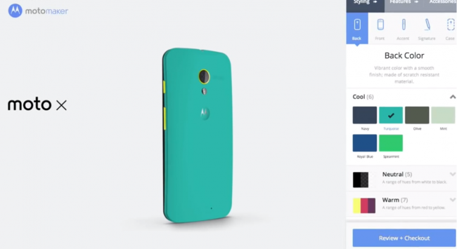
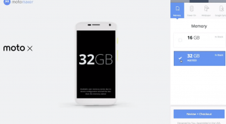
Motorola is trying to do something that no other smartphone manufacturer has ever done by allowing customers to custom order a phone online through a service called MotoMaker. The best example of a current service like this is Nike ID, which allows shoe fanatics to custom design their own shoe. With MotoMaker, you get to choose from 22 different colors or materials for the back panel, another two for the front, and a handful for the accents around the camera lens and physical side buttons. You can also choose the storage amount (16GB or 32GB), custom engraving on the back, optional case, boot-up message, and eventually which carrier you’d like the phone to work on. Motorola will pair matching color accessories to your phone, let you pre-sign-in with a Google account, and choose from a set of wallpapers that fit with your color choices. It’s a great idea, especially if Motorola can deliver on their promise to deliver your phone in 4 days or less.
When you think about phones, you have to understand that phones have long been a way for consumers to show off their personality or make a statement. With MotoMaker, you no longer need a bejeweled case, set of protective stickers, or a mountain of cash to pay for something like ColorWare coloring. MotoMaker is free as a part of your phone purchase. I personally cannot wait to make a custom Moto X.
At some point, MotoMaker will be available for more than AT&T, but unfortunately at launch, AT&T models are your only option. More on that in a bit.
We went on an entire tour of MotoMaker that I suggest you check out.
Software Features (Active Display, Touchless Control, Quick Capture Camera, and Assist)
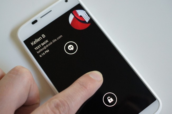
Active Display is easily my favorite feature on the Moto X. What is it, you ask? Active Display is Motorola’s new take on how notifications should be handled when your phone is in a locked state or say, in your pocket. With Active Display, your phone automatically turns a portion of its display on when you pull it out of your pants, a bag, or simply flip the device over (and sometimes even by picking it up). But don’t worry, only portions of the display are active, so this doesn’t drain your battery like you may think that it would. Instead, Motorola shows you the time and icons for any notifications you may have with a minimal white text on black background. To quickly access these notifications, a single touch on your display will then give you a shortcut to your most recent or a quick peak at older ones. From there, you can decide to access your most recent or unlock your entire phone so that the rest of your notifications can be checked (pictured above).
It’s easily my favorite feature because I grab my phone probably 100 times throughout a day. With Active Display, I no longer have to reach for the lock switch or swipe down from a notification bar. All I have to do is pick up my phone and it’ll show me the time and if I have notifications. Thanks to the single-press option for quick viewing, I can also see if any of them are important or if I’d like to ignore them with a swipe to the right or left. You can imagine the amount of time this saves. But not only that, it also eliminates blinking LED notification lights that provide you with little information.
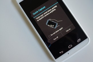
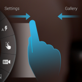
Quick Capture is another of Motorola’s highlighted features for the Moto X that you’ll probably see in commercials and as talking points any time someone from the company is showing off the phone. Motorola realized how often users pick up their phones to take pictures, so Quick Capture allows them to do this much faster. Like Active Display, Motorola is eliminating steps to make a regular action much simpler. Instead of unlocking your phone, searching for a way to access your camera, and them fumbling over a shutter button, all you have to do is perform a double-twisting action with your wrist, so that the sensors in the phone know to fire up the camera. Once the camera UI loads, a tap anywhere on the display will auto-focus and snap a picture. While it’s not exactly perfect, and often times takes a couple of twists to get it right, it can be an incredibly quick way to launch your camera once you get the hang of it.
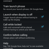
Touchless Control is the Moto X’s third biggest software feature. Think of it as Google Now or Voice Search but with an added level of power. Through a series of spoken “OK, Google Now” commands, the Moto X learns your voice and then sits in an always-on state, waiting for your voice commands whether your phone is awake or asleep. Your phone could be sitting in a cup holder or on your desk, but would only require that you say “OK, Google Now” to have it fire up and complete a command. You could say, “OK, Google Now, remind me to do the laundry this afternoon,” and your phone would set a reminder. You could be driving down the highway and say, “OK, Google Now, give me directions to the nearest brewery,” to find a local watering hole without having to touch your phone. It can call people, text friends, and perform trivia dominating Google searches.
The voice detection works well, especially once you get your recorded voice the way you like it. It took me a couple of re-records before I found one that would activate easily, so you may need to play with your volume and pitch a bit. It’s one of those services too, that will only get better as Google continues to update Google Now with new actions.
Assist is probably the least talked about of the bunch, but is equally as important for those who travel a lot, regularly fill up calendars and need quiet time, or simply like to sleep at night without getting bothered. Assist is an app that when activated, gives you three categories to choose from: Sleeping, Driving, and Meeting. In a way, they are like profiles that set your phone to a certain state depending upon your needs. If you are driving and you have Assist turned on, the phone will recognize that you are in a car and automatically start reading text messages and incoming calls aloud. If you set it to Sleeping, you won’t be bothered by notifications between the hours you select, unless you want to set an exemption for important people. In Meeting mode, your phone will silence itself based upon your calendar status, and even auto-respond to calls with a pre-set text message.
All of these features can be found in action below in one of our videos. Be sure to check it out.
Mostly Stock Android
The Moto X runs Android 4.2.2 at an almost stock level. There really is no skin on top of it all, only a few software additions like Active Display, Assist, the Camera UI and Touchless Control. Motorola decided that Android has matured enough that it can stand on its own, and really only needs select additions like I just mentioned. So if you want a close-to-stock Android experience on a device, the Moto X delivers it as good as anyone.
Performance
Look, we got away from the benchmark game long ago, so we’re not going to bore you with screenshots of GFXBench or Vellamo. I’ll simply say this – the Moto X has zero performance issues. With Motorola’s X8 Mobile Computing System paired up with the dual-core Snapdragon S4 Pro processor, it’s clear that the entire system has been fine-tuned to be smooth as butter. It’s a bit of a downer that Motorola didn’t use the quad-core Snapdragon 600 that the rest of the world has taken too this year, but this is where we sit. I think the takeaway here, is that mobile processors are probably not being fully taken advantage of if a dual-core chipset can run this good. In fact, (and not to bring up benchmarks again), if you run any of the GPU tests, you’ll find that the Moto X outperforms its biggest competitors. Part of that has to do with the lower resolution display, but some credit should also be given to Motorola.
Things like accessing Google Now with a swipe up from Home happen instantly, multi-tasking between apps doesn’t hiccup, the camera launches quickly, and the phone never seems to get hot.
Again, we may be looking at a dual-core processor in a time when the rest of the world is looking for the biggest and baddest quad-core, but you won’t walk away from the Moto X disappointed.
Availability
Motorola accomplished something that few phone manufacturers have done in smartphone history – they produced a phone and convinced every single carrier that matters in the U.S. to sell it. The Moto X will be available on the 5 major U.S. wireless carriers: Verizon, AT&T, T-Mobile (not in store though), Sprint, and US Cellular. At a price of $199 on-contract, you shouldn’t have any trouble purchasing this phone by the time we hit early September. At the time of this review, no carrier has released specific dates for release, but Motorola insists that we’ll start seeing it on store shelves by late August or early September.
Bootloader and Developer Editions
Motorola was only minutes into their announcement of the Moto X when they confirmed to us that the bootloader on the phone was “not unlocked.” They weren’t specific at the time, but you could bet that they were referring to AT&T and Verizon’s versions of the phone. Thankfully, within a day, they clarified their stance by listing out the options of phone models for those who choose to tinker with their technology. Motorola will release the T-Mobile, Sprint, and US Cellular Moto X variants with unlockable bootloaders out of the box. For those on AT&T and Verizon, you will have the option to pick up Developer Editions that will also have unlockable bootloaders. The only issue here is that the T-Mobile, Sprint, and US Cellular variants will likely be available at reasonable on-contract prices, while the Developer Editions can be had at full retail.
Somewhere in the Middle
Camera
The camera on the Moto X is not an award winner, but it’s also not a bottom feeder – it’s somewhere above average, with times where it can be a rockstar. The Moto X houses a f/2.4 lens and 10MP RGBC sensor with Clear Pixel technology. It’s supposed to let in 75% more light than a typical RGB sensor, meaning it should produce great results in low-light situations and also in shots that have a lot of movement. My results were a mixed bag, though there were times when I couldn’t help but be impressed by the amount of detail that the camera was able to capture.
You’ll see in the few sample shots below that you’ll go from an extremely noisy shot (cat picture) to one that could be framed on a wall (flower picture). I don’t know if the Moto X’s camera is doing some wild overprocessing or what’s happening, but you’ll see this jump in quality regularly between shots. It’s almost as if you need to pull the camera app up, let it hang out for a 10 seconds to adjust to its surroundings, and then snap your picture.
I ran through a series of test photos today with the Moto X on a tripod (hope to post them soon), comparing it to shots taken with the Galaxy S4 and HTC One, and it came away as a success. I would say that the Galaxy S4 slightly bests the Moto X in terms of detail and overall image quality in good light, but the Moto X crushed it in low-light performance and was step-for-step with it in other situations. Well, aside from some weird discoloration that showed up every couple of low-light shots (see below). I also found that the Moto X outperformed the HTC One camera in almost every situation, but that could be due to the One’s low-resolution camera.
I should point out that the camera UI is beyond minimal. There are no filters. There are no special action shot modes or GIF creators. You tap anywhere you want to take a picture. There are settings for touch-to-focus, Slow Motion video, Panorama, location tagging, flash toggles, and HDR. That’s it.
Overall, I’d say that the Moto X camera is a success, but that it needs some fine-tuning from Motorola over the coming weeks as we approach launch.
Full resolutions: 1 | 2 | 3 | 4 | 5 | 6
Battery Life
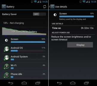
Like the camera, battery life has been mostly average for me, but had some highlights along the way to make it overall a positive experience. With Motorola choosing to go with a 720p display, paired up with a dual-core chipset that uses a couple of companion cores to help conserve power, I was expecting to hit 20 hours of battery life without having to worry about looking for my charger. That hasn’t been the case at all with the 2200mAh battery tucked inside. On four separate charges, I put the Moto X through a variety of situations, some that were begging for juice in under 6 hours, others that could have gone another 5-6 hours.
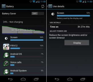
On my first charge out of the box, with an hour or so of setup and general tinkering since it was still a fresh new toy, I was able to get through over 10 hours with some room to spare. My screen on time was 3.5 hours. The second full charge I put the Moto X through, I hammered on it as hard as I could. We’re talking 3.5 hours of screen on time in a 5 hour period that saw me drain the phone to 24%. I was testing it all from Touchless Control, to gaming performance for an hour with a heavy title like FIFA 2012.
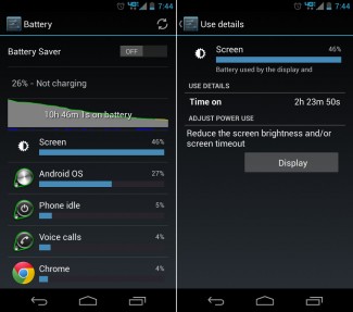
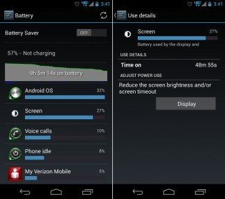
On my next two charges, I backed off a bit. I took an entire day with what I would consider to be heavier than a normal day’s use, and saw almost 11 hours off the charger while still ending up with around 26% battery left. And then today, I went even lighter – 9 hours, with less than an hour of screen on time, leaving me with 57% left.
So again, the battery life on the Moto X is neither bad nor great. It’s really somewhere in the middle. I wouldn’t complain about it, but I also wouldn’t be bragging about it. It’ll get you through a day, which is about what any other phone outside of the new DROID MAXX can say.
Display
No, the display is not a full 1080p like you will find on the Galaxy S4 and HTC One. It’s a RGB 720p AMOLED with 316ppi, that Motorola claims to have chosen because it is battery efficient. With our so-so battery tests, I’m actually glad that they chose the 720p panel or this phone may not have made it through half a day. But aside from the resolution, the Moto X display is absolutely fine. We have been critical of Motorola’s display choices over the last few years, but find very few things wrong with this one in particular unless we really start nit-picking.
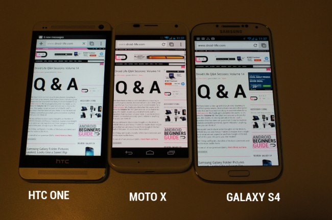
It’s an AMOLED, so yes, you’ll get the crazy pops of color and what some consider to be over-saturation. I personally like AMOLEDs because of the vivid colors they produce, however, this isn’t one of those AMOLEDs that is so over the top that you are begging for an LCD. You do get a warmer tone than I would typically like (pictured above), so you do have to be careful with overly white objects looking slightly yellowish. In situations where I did find excessively white pages being displayed (like above), the contrast to the fully-white front of the phone didn’t help with that yellowish or warm tint. The black version of the Moto X may help with this.
Outside of the regular downsides to an AMOLED, I did actually enjoy this display. Text is sharp, video and games all looked great, viewing angles are fine, and since it’s not a PenTile pixel arrangement, there is no blurring as you jump in and out of apps or scroll down articles. With the lower resolution than what you find on the GS4 or One, you also may find yourself zooming less as objects will naturally appear larger.
The Not-so-Good
Price and Specs
After spending the last 5 days with the Moto X, I tried and tried to convince myself or least find some way to justify the $199 on-contract price that Motorola has given it. I hate to admit it, but I’ve failed to do such a thing. I cannot for the life of me figure out how Motorola came to the conclusion that this phone should be priced at the same level as the Galaxy S4 or HTC One. Look, I get that we’re trying to end the spec wars and simply provide an experience that is unmatched by any other phone. But as a techie who knows the prices of other top tier phones, seeing a 720p display and a dual-core processor in a phone, I can only think “mid-range.” But that’s not at all what Motorola is asking us to pay. And I know that Google is in a position unlike anyone else because they can make money off of content and ads, but they were able to sell the Nexus 4 with similar specs for $349 off-contract almost a year ago. At this point, you would think that 720p panels and dual-core processors would be shoved in back rooms of supply chain warehouses, with slashed prices, begging for some company to come buy them all up in bulk. But here we are with the Moto X and its premium $199 on-contract price tag.
And you know what, I’m sure that the majority of future Moto X buyers won’t care for a second what the screen resolution is or what processor is inside because they’ll be able to make it all pretty with MotoMaker (eventually). That’s great for Motorola. But tech enthusiasts like myself, who tend to be pretty damn vocal, are going to have a hard time swallowing this pill. Especially with the Snapdragon 800 arriving in a few weeks in devices like the LG G2, which will only further stress this situation.
With that said, the phone is being assembled in Texas, which will surely raise costs for Motorola. They are also allowing users to customize their phones with MotoMaker for free, something I would have guessed would have been an added cost. But speaking of added costs, why not sell the stock black and white versions for cheap and then charge an additional $50 or $100 for those who want their phone customized? No matter what, the price stings to someone who lives and dies with tech.
MotoMaker on AT&T only
Outside of price, there is one other massive disappointment. Hell, I’d even call it a failure on Motorola’s part. Yes, I’m talking about the exclusive deal they made with AT&T to be the launch partner of MotoMaker. For those not familiar, MotoMaker will only be available for AT&T customers for an undisclosed amount of time once the phone launches. Motorola has already announced that the service will come to other carriers (Verizon being one), but for the time being, only folks with AT&T service can customize a phone to their liking.
To me, MotoMaker is going to be the #1 reason that average consumers will choose to buy this phone. The price sure isn’t going to be it. The software features like Active Display are awesome, but those don’t sell a phone like giving someone the power to select a personalized set of colors and engraving will. I think I mentioned this above, but I cannot wait to customize my own phone. For years, we have moaned about the constant flood of black or white phones. Sure, Samsung has produced colors for its flagships, but never at launch. Motorola is telling us that you can customize an entire phone’s appearance for no extra charge, the minute it goes live on AT&T, and see it in 4 days or less. That’s awesome! Except that it’s only on AT&T. Ugh. I could go on and on.
Fix this problem, Motorola.
Other Notes
- Wife point of view: Every time I get a new phone to review, I always hand it over to my wife and have her give me her immediate impressions. With the Moto X, she initially thought, “This is a cool little phone. It looks nice.” But then I started feeding her the marketing spiel about Touchless Control, Active Display that would work when she pulled her phone out of her purse, and of course, MotoMaker. She thought all of the features were fun, but once she heard that she could customize her own phone, she wanted me to order her one immediately. I showed her the phone in the morning, and by the time she had come back home for the day, the first thing she said was “I want that phone. Let’s order one.” She was then crushed when I told her that it was an AT&T exclusive option, because she’s on Verizon.
- Speaker: Rear speaker gets plenty loud, but Motorola has typically been known for putting in quality speakers.
- Battery tests: During our battery tests, we always run 4G LTE only. There were a couple of moments that I had to toggle on WiFi to download a game or something, but 99% of the time the phone sits on LTE.
- Active Display: Have I said how awesome I think Active Display is?
- Wallpaper and clock: Because a number of you have asked, the clock I’m using in most screenshots is a UCCW clock widget skin called Flat Sense. The wallpaper can be downloaded here.
Video
Unboxing
Software Features
Moto X vs. Galaxy S4 vs. HTC One
Gallery
The Verdict
I really like the Moto X. In fact, I think you’ll like it a lot too. The entire package has few flaws, if any. We’re talking about an above average display, a solid camera, industry standard battery life, stock Android, buttery smooth performance, and a set of software features that will actually make your life easier. Motorola wants you to forget about specs and concentrate on the experience that a smartphone should deliver. With the Moto X, I can safely say that this is one of the first times in years that I have picked up a phone, used it for a week, and not really had anything to complain about. And keep in mind that I’ve only been using one of the stock, white models – the MotoMaker experience is still to be had!
So here are my final couple of thoughts. If specs mean little to you, you are willing to put your faith in Motorola to do you right, and you want to be able to fully customize the appearance of your phone, then you really can’t go wrong here. We’re talking about a premium experience in a smartphone package that is assembled in the U.S., something that can’t be said for any other phone on the market.
On the flip side, if you are a tech junkie on the bleeding edge, you may be somewhat let down by the 720p display and dual-core processor. Even though you may not notice a difference in performance or be able to pick out a pixel with your naked eye, it’s something that may always be in the back of your mind, especially at its $199 on-contract price. I know I’ve had trouble getting over it, but even as I wrap up this review, I have to admit that I’m looking forward to even more time with the Moto X.
Links: Moto X deals at eBay | Amazon












Collapse Show Comments583 Comments