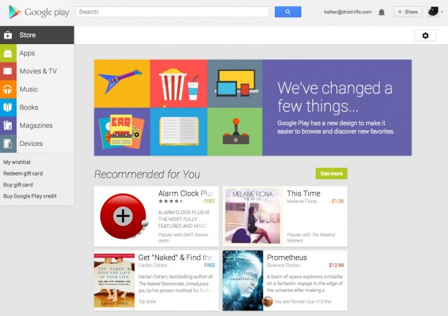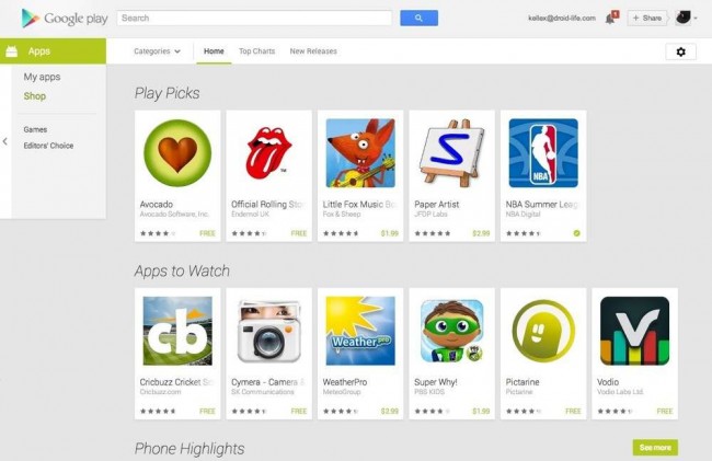

The new Google Play web store that was first announced at Google I/O back in May is now live! The update introduces the familiar card style design that we have seen in the current Google Play 4.0+ Android app, and all of its accompanying Play Movies, Music, Books, Magazines, solo apps. Most importantly, the new Play store is reactive, so it will adjust as it needs to depending on your screen size.
To navigate, you’ll now find a navigation panel on the left top corner with tabs for Apps, Movies & TV, Music, Books, Magazines, and Devices. To jump into each section, a simple click will take you there. Once in a section, that navigation area will change with specific links that pertain to that section, like “My Apps” and “Shop” in the Apps section. To quickly jump to another area, you should also see a white bar with arrow to the left that can be hovered over to show additional sections.


In app listings, you’ll see big beautiful cards for apps, along with a variety of clickable items in each card. One tip we’ll already offer, is clicking on the link that says “FREE” or a price, as it will launch directly into the install box where you can choose which device you’d like the app installed on.
In individual app pages, you’ll see massive images (depending on your screen size), cleaner sections for comments and reviews, related apps, easier to spot “What’s new” area, and more. Wishlists buttons too!
It’s incredibly good looking, to say the least.
New Stuff:
- Wishlists added to the web store!
Couple of things missing though:
- Can no longer uninstall apps from the web? I can’t seem to find the option.
- Can no longer see which apps are installed on specific devices.
If you find any secrets, have tips, or notice anything missing, be sure to share them in the comments!
(Trollololol.)
Gallery
Via: Google Play
This post was last modified on July 15, 2013 5:25 pm
