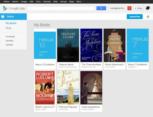
Update: At least a couple of readers mentioned that this layout has been live since I/O or at least for a few weeks, since they allowed us to upload books of our own. That shows you how much we use Google Play to read books…in fact, I don’t think I have ever entered the My Books section through the web. Moving on.
Yesterday, we showed you some additional views of the new web layout for Google Play that should arrive any day now. It was first on display at Google I/O, during the day 1 keynote, with an expected public rollout of “over the coming weeks.” We are now technically a few weeks removed since we first got a peep of it, but the new layout has failed to show it self. Well, until today in the My Books section of the Play store.
If you head directly to http://play.google.com/books or tap on the “My Books” button at the top of the main Play store page, you should be directed to the new layout for Books. You can jump between Purchases, Samples, and Uploads, all from within the new layout. Once you go shopping though, or head into a new section like Apps or Movies, you’ll revert back to the old Play store. Books is currently the only section showing off the new layout.
With one section live, are we looking at an imminent rollout of the rest of the new layout? That would be lovely.
Cheers Andrew!

Collapse Show Comments12 Comments