


Are you looking at the new UI of a redesigned Gmail app for Android? Possibly. The slide above appeared at the “Structure in Android App Design” session at Google I/O, which was focused on teaching developers how to choose which navigation techniques to use in their complex apps. This was the only look at what could potentially be the new Gmail, but if this is indeed it, there are some things worth talking about.
But before we do that, understand that this was a single slide in a 40-minute presentation that included all sorts of mock-ups for a variety of apps. In fact, shortly after this slide appeared, the presenter showed three different examples of what navigation could look like in the native Android gallery app, only one of which is actually the real deal. So this could be the new Gmail that we were supposed to have seen at I/O, or it could be a mock-up that was used as an example.

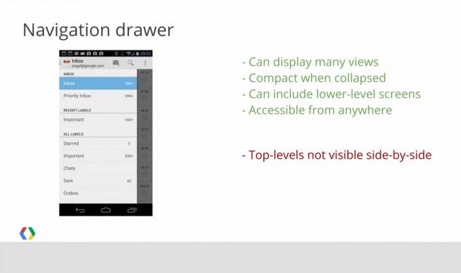
One thing I’m confused about, is that there is no way in the screenshot above to either add a new account or switch to another. See, in the iOS version of the app (pictured below), you have a navigation drawer that lists your account along with an arrow button that can be tapped to take you to a screen that allows you to add a new account or switch to another. That is clearly missing in this Gmail for Android mock-up. It also lacks any sort of new polish that we have seen from apps like Google Music and Drive and really looks like nothing more than a boring step up from the old.
I hope that is not the new Gmail. It would almost surprise me if it is the new Gmail. Seems like there should be more to it.

Gmail app on iOS
Here is the clip (jump to the 23:00 mark):
Via: YouTube | Android Police
This post was last modified on January 13, 2020 11:23 am