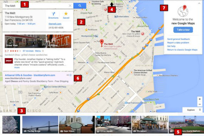
According to the folks at Google Operating System, Google Maps (the browser version) is about to get a major overhaul. The two images we have included in this post are reportedly screenshots of what the new interface will look like. As you can see, it’s a more full-screened experience, without the traditional sidebar for directions and search results. Results return on-screen and can even be tied to Google+ Circle recommendations (think friends’ restaurant recommendations). The color scheme has also been updated to match the style of the iOS Gmail app.
When first seeing this look, my mind – as it always does – ran to, “When is the mobile overhaul coming?!” But in reality, this is sort of how the mobile version of Maps works already, at least on bigger screens. You already get a full-screen experience because there is less screen real estate to work with in general on mobile devices. With that said, the look does come off as a bit more Google Now-ish, something we have seen from a number of Google apps over the last year. So in that sense, there is a chance that the mobile version is updated to at least match this look.
This new version of Google Maps isn’t live yet, but with Google I/O happening next week in San Francisco, don’t be surprised if it’s here before long.
Even though I use mobile devices constantly throughout the day, I find myself using the web version of Google Maps quite often and am definitely excited to see a UI overhaul. Anyone else?
This post was last modified on July 24, 2020 8:23 am
