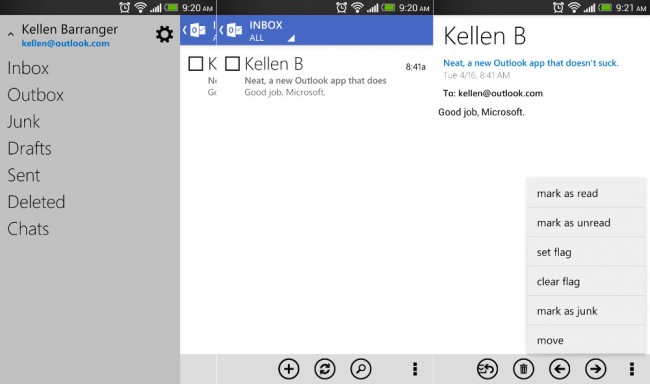
Back in November, Microsoft released an official Outlook.com app for Android that was, to put it simply, a terrible design. It brought back painful memories of Gingerbread with tabs, a dark theme, and nothing that reminded us of Microsoft’s other beautifully designed apps. No one used it – we all laughed at it. But today, a new update has been released that brings the app into line with apps like Xbox Smartglass. It also matches the design you’ll see in most of Microsoft’s current Windows products, which is a design language we have always been fans of.
There aren’t many new features, but Microsoft did add in conversation threading, filters for unread and flagged mail, and the ability to mark messages as junk. So if you are an Outlook.com user, go pick up the new goodness.
Play Link
Via: Outlook Blog

Collapse Show Comments31 Comments