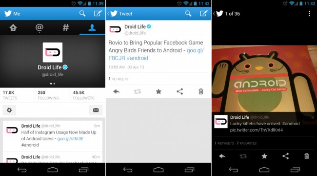
The official Twitter app for Android received a UI makeover today and now “reflects a native Android experience: wider and taller timelines that fill the screen, a flat navigation bar, tap and hold for quick actions, and more.” You can swipe between tabs to quickly navigate, view suggestions as you type user names or search terms, and see links to services whenever a Tweet is shared from another mobile app.
Here is the Play store changelog:
- We’ve got a brand new look and feel crafted for Android 4.0+. Navigate seamlessly between your favorite parts of Twitter with a simple swipe.
- It’s easier to connect with friends and join conversations with @username and #hashtag suggestions that appear as you search or compose a Tweet
- Discover, install and launch your favorite apps from Tweets
- Other bug fixes and improvements
About time, right? Thanks for introducing 2011-12 features, Twitter!
Via: Twitter
This post was last modified on April 3, 2013 11:50 am
