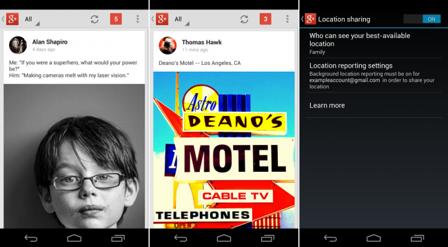
Google is pushing out an update to their Google+ application for both Android and iOS today. While the iOS update is seeing some nifty Snapseed integration, the Android version is getting more of a look refresh. It’s still your normal G+ app, but they have done some tweaks to make the experience a bit more friendly.
For example, when looking at your feed pictures are displayed better, there is more text shown from each post, and the +1 button has been moved to be more front and center. We have added a few key points of the update down below.
- Posts include more text up front—from the original message, and from comments
- Tapping video, photo or link attachments takes you directly to a watch page, lightbox or website
- Image previews are rarely cropped, so you’ll see portrait photos (for instance) in all their glory
- Key actions like +1, reshare and comment are displayed more prominently in each post
- When someone with permission visits your profile, for example, they’ll see your current whereabouts underneath your name
Update: The update is live!
Via: Google
This post was last modified on January 4, 2020 10:44 am
