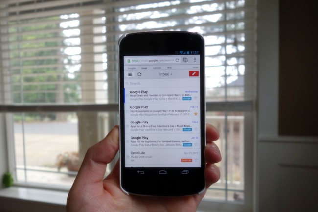
In December of last year, Google introduced a brand new version of Gmail to iOS that was simply put, beautifully designed. We talked at the time about how much more appealing this version was than the newest version for Android that had been released the day prior. This iOS version matched the design of the web interface, utilized a slideout menu bar, and in away, follows Android design guidelines more closely than the actual Android version. Thankfully, as of today, we can get a taste of this new design through our mobile browsers.
The Gmail team announced through Google+ that the mobile web version has been updated to match the iOS design because so many of you “like the redesigned UI, along with new features such as improved search and integration with Google Calendar.” It doesn’t quite have the same visual appeal in the side menu for switching accounts per se, but the functionality is much the same. You’ll also find the bright colors, compose email window, better search, calendar support and more.
I personally hate to see the Android versions of official Google apps lag behind those on other platforms, so hopefully this means we have a major update on the horizon.
Via: +Gmail | The Next Web

Collapse Show Comments53 Comments