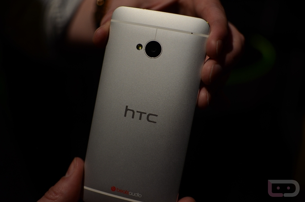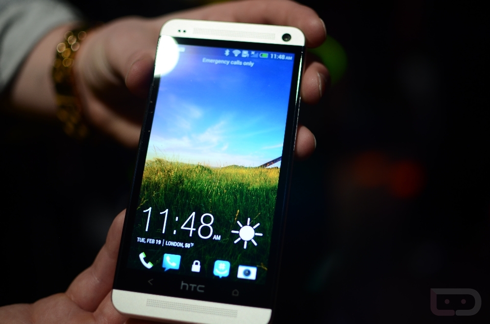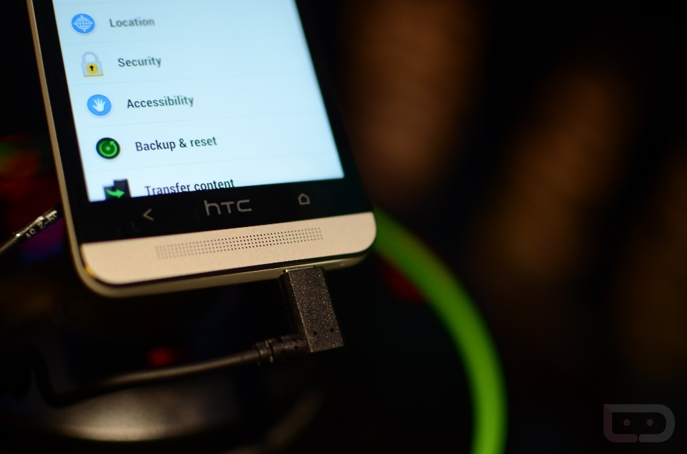
The HTC One is finally official. HTC’s flagship for 2013 was unveiled today in NYC during a press event that features all sorts of announcements. We have a new Ultrapixel camera technology, HTC Zoe mini-video recording software, intense front sound with HTC BoomSound, an aluminum unibody design, and availability everywhere in the world except on Verizon. It was a lot to take in, so now that I’ve had lunch and a 45-minute cab ride to John F. Kennedy Airport, let’s talk about what we saw.
This phone looks and feels amazing.
The zero-gap aluminum unibody casing of the One, along with subtle accents and lines, front facing speakers, and an incredibly low weight make this one of the better designed phones I have seen in a while. HTC clearly tried to make a statement when putting together the One, and I feel like they have done that successfully. When you pick up the One, you won’t believe how great it feels in hand. It’s light and curves in all the right places, but still feels like a premium device.
The 4.7″ FHD display is gorgeous to look at. The viewing angles were impressive in the short time I spent with it, video looked vibrant and crisp without looking cartoonish, and the edge-to-edge appearance fits 2013 style guidelines.
There are two versions of the One: silver/white and black. I probably prefer the black version over shiny silver.

HTC Sense 5.0 and BlinkFeed are terrible.
HTC was excited to announce the new version of their custom skin, Sense 5.0. It introduced us to a new home panel known as BlinkFeed, that really is nothing more than a clock widget stuck to a Flipboard widget on your first home screen that cannot be removed. It pulls in feeds from Twitter, Facebook, and a variety of news sources, something that a half dozen apps already do without being intrusive. Did I mention you can’t remove it? No sir. The BlinkFeed home panel is there for good and cannot be removed. If you hate social networks, sorry. If you wanted to change the weirdly minimal looking clock thats stuck to the top, you can’t. Thankfully, you can at least create other home pages that can be set as the default so that you don’t have to look at the Flipboard knock-off every time you unlock your phone or press home. Or there are always 3rd party launchers.
But speaking of that minimal clock – it’s also in the app drawer, another messy Sense 5.0 spot. The app drawer defaults to 3×4 and scrolls vertically. That can be changed…to 4×5. Thankfully, you can at least customize the way apps are sorted and even set up folders within the drawer. Otherwise, it’s quite far removed from anything previously on an Android device.
As a skin, Sense 5.0 also got a makeover that was supposed to bring some sort of genius smartphone innovation. While there are a couple of features built into it (like Zoe and BoomSound) that are bonuses, the skin is mostly the same tired old Sense that you either love or hate. For me, it’s not good. On a design front, HTC has made it much prettier and modern without all of the fancy 3D animations, shadows, and glowing surfaces, but it’s still not good from a functional standpoint thanks to an oddly setup navigation system.
Navigating around, thanks in part to a lack of standard navigations buttons (phone only has home and back), is a mess. As you probably noticed in my camera video from earlier, you never know where the back button is going to take you, or if you need to tap on the screen to see HTC Sense menu options, or if you should simply start all over due to frustrations with being lost. And this doesn’t just happen in the Gallery – it happens everywhere. For example, it takes 3 to 4 or even 5 presses just to get to a place that allows you to change wallpapers. The single long press on a home screen to quickly swap walls, an Android standard, hasn’t been in Sense for a couple of versions and remains absent in Sense 5.0.
The home and back button were selected as the only navigation buttons to help simplify the experience, we were told. Except to use the phone the way it was meant to be used, you have to either double tap them (gets to multi-tasker), single press, or long-press (gets to Google Now and search) to activate different functions. The back button is initially just a back button, but you can map it so that a long press turns it into a menu button. It’s confusing and a pain – definitely not simplified.
I could probably continue on, but I’ll stop for now until I can spend even more time with the device.

HTC Zoe and BoomSound are winners.
Two of the Sense 5.0 winners, are Zoe and BoomSound. Zoe is the future of camera software. It allows you to snap a short few-second clip that can be used to create all sorts of images later on. You can use Zoe to manipulate faces to create the perfect group shot, pull frames in and out of a still to create an action shot, remove unwanted photobombs, or put a bunch together from a party or outing to turn into a personal highlight reel. It’s nothing short of awesome.
BoomSound is HTC taking sound seriously, beyond just Beats. The One has two impressive speakers on the front of the device, which is somewhat of a first for the industry. I don’t know how many times I joked with HTC reps today about not having to cup the back of the device anymore when watching a video to project sound. But beyond great sound, BoomSound also helps with call clarity, canceling out background noise, improving audio when shooting video, and more. The sound experience on the One is like no other phone.
No Verizon, really?
HTC stood on stage today and announced that the One would be available on some 180+ carriers around the globe. That should be every major carrier on the planet, right? Nope. Verizon decided to pass on the phone. We aren’t sure why, but it could be that they just released the DNA and dropping this phone so soon would be a difficult sell. Whatever the reason is, I don’t get it nor will I ever. This is HTC’s phone of the year, one that will rival whatever Samsung puts out, and here Big Red is saying “No.” That’s embarrassing. It’s also unfortunate for consumers who deserve to have the best options available when it comes to buying a smartphone.
Wireless charging missing in action.
Not sure why, but HTC did not put wireless charging in the One. One rep told us that “wireless charging is a Verizon thing,” whatever that means. Seems odd that the DNA had it, but this one wouldn’t. Usually when you try to future-proof a phone, you toss as much into it as possible. I guess there wasn’t room for the tiny wire and pad that would allow for this feature that is in so many other phones these days.

Sense TV looks awesome.
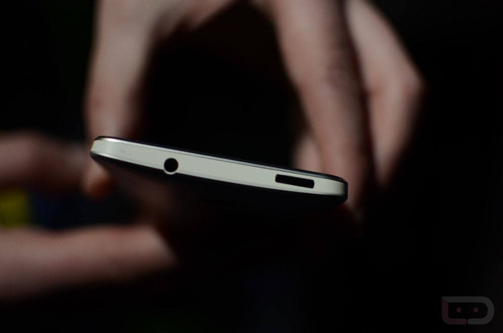
If you missed the press event, then you probably missed HTC talking about Sense TV. This is HTC turning your One phone into your home entertainment controller. The lock switch on top of the device actually doubles as an IR sensor so that you can control your TV, receiver, and cable box. The software will allow you to pull in channel information from almost any cable provider in the country as well, so that you can view favorite shows or find something interesting to watch. This seems like a feature that should have been in a phone long ago, but hey, at least it’s finally here.
HTC leaves the battle for top specs, yet still has top specs.
My favorite part of today’s event was listening to HTC talk about the ridiculous megapixel war that smartphone OEMs have created. Instead of focusing on adding more MPs to a camera, they decided to take photography to a new place with the Ultrapixel. Sure, the name sounds gimmicky, but HTC has long been one to push camera boundaries. They appear to have done that and then some with the One.
But continuing on with that idea, they also decided not to talk about specs and processors and displays and RAM and all that stuff we often drool over. No, they focused on the smartphone experience and the things this phone can do that yours can’t. This sort of marks a new time for smartphones, if you ask me. Specs are no longer that important. Everyone has awesome specs these days, including the One with its 4.7″ 1080p display (468ppi), quad-core Snapdragon 600 processor, 2GB RAM, etc., etc. But what really matters now, is how your phone can be better than everyone else’s when it comes to features, along with having top specs.
The HTC One seems to be a guaranteed winner because of HTC’s new focus. While I trashed on their new Sense skin, the rest of the package is well worth your look from what I can tell.
Collapse Show Comments194 Comments