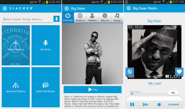
This morning, the Slacker Radio team released a major update for their Android app to version 4.0. Inside, you won’t find too many new features, but what you will find is a complete user interface redesign. It’s full of whites and blue, which is much different than the dark UI it was previously. If you ask me, it gives off a Windows phone vibe with the tiles that we see on the homepage.
Either way, it’s still a solid app, but I’m hoping we see a dark theme come out for it soon. Go grab it in Google Play and bang your head to some tunes this morning.
Cheers JBartCAPS!
This post was last modified on January 13, 2020 11:10 am
