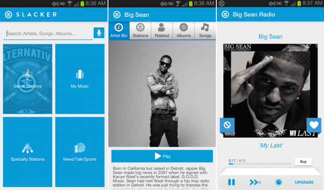
This morning, the Slacker Radio team released a major update for their Android app to version 4.0. Inside, you won’t find too many new features, but what you will find is a complete user interface redesign. It’s full of whites and blue, which is much different than the dark UI it was previously. If you ask me, it gives off a Windows phone vibe with the tiles that we see on the homepage.
Either way, it’s still a solid app, but I’m hoping we see a dark theme come out for it soon. Go grab it in Google Play and bang your head to some tunes this morning.
http://youtu.be/t9FBj1r1k-A
Cheers JBartCAPS!


Collapse Show Comments18 Comments