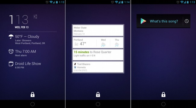
It took me a while to come around to the idea, but I’m ready to admit that I’m a fan of lock screen widgets in Android 4.2. Introduced back in October, I originally thought, “What’s the point? Can’t you just unlock your device and then get to home screen widgets? This seems redundant.” And now, I’m utilizing at least five of them, some of which I use regularly. I’m also using more widgets on lock screens than I am on home screens. Weird, right? Let’s talk about why.
The Goods
From what I can tell, at least in my opinion, lock screen widgets are all about eliminating steps so that you can access information or accomplish tasks faster. Sure, skipping the swipe-to-unlock step and letting you check the weather with 1-less swipe doesn’t seem like much, but in reality, it is. Not only can it save a ton of time in the long run, it also eliminates errors or fumbling through home screens in a pinch.
For example, I use Google’s “What’s this song?” widget regularly when driving. Since accessing your phone while driving is incredibly dangerous and not something I’d recommend, I’ve got it set as my 2nd lock screen widget. A single swipe to the left followed by a tap, gets the widget listening for the track I’m trying to find. If I had this on a home screen, it would take an unlock of the phone, followed by at least another swipe to either the right or left, assuming I remember which home screen I placed the widget on (because I keep home screen number 1 almost empty outside of a clock). With lock screen widgets, there is only one direction – left.
And with the introduction of a Google Now widget that displays your upcoming cards, I’m finding lock screen widgets even more useful. Rather than having to swipe up from the tiny circle on my lock screen to fully access Google Now, I can simply set up a card that displays everything from Now that I need to know, now. As you can see in the image above, it’s displaying four mini-cards, a task the actual Now application could never do. In the Now app, I would need to scroll with at least two flicks in order to see this much information from my phone.
I’ve even added widgets like shortcuts to flashlights, so that if I’m ever in a dark situation, I can swipe a couple of times to the left and toggle my phone’s flash on or off. Again, I understand that this can be accomplished very quickly if it were placed on a home screen as well, but this seems to eliminate another step, especially now that I’ve made it a regular occurrence.
Lock screen widgets make sense for those who use a pattern or secure form of lock screen. Rather than having to swipe your pattern or enter a pin, you can still access some information with a couple of swipes to the left from widgets. This also comes in handy in times where you need to hand your devices off to someone to check a game score or see when you need to leave for your next meeting without giving them full access to your phone.
As someone that prefers to keep his phone home screens ultra minimal, lock screen widgets also allow me to add items that I haven’t used on a home screen in years. My home screen setup includes a clock on the main page and a calendar widget to the right. That’s it. The lock screen is now my garbage area.
The Not-so-Goods
It’s not all good though. Lock screen widgets need some work from both Google and developers. For one, Google needs to allow you to resize widgets or at least place more than one on a page if it only takes up one spot or line. For example, that flashlight shortcut looks ridiculous by itself. It would make much more sense for that screen to include the Google Sound Search widget as well, so that I could eliminate an entire page and utlize the empty space better.
We need more and more developers to build in support, or even create apps specifically designed for lock screens, similar to DashClock, the app released this week by Android engineer Roman Nurik. This is a new category that Google has created, giving developers an opportunity to once again innovate.
We could also do away with the glowing bars that remind you of your lock screen widgets and camera shortcut every time your phone is awakened. Google, I’m not dumb. I know the widgets are there after a couple of reminders. There should be some sort of a counter or timer that only displays these glowing bars every so often.
And last, card adjustments, removals and the swiping action that extends lock screen widgets up or down is finicky and confusing at times. I’m not exactly sure how it can all be fixed, but it needs to work better than it does now. I don’t know how many times I’ve swiped up or down, left or right and had absolutely nothing happen.
Overall, though, I’ve come around to enjoying lock screen widgets. I was the ultimate hater at one point, so trust me when I say that this is a big step for me to admit this.
What about you? Utilizing lock screen widgets? If so, what does your setup look like?


Collapse Show Comments74 Comments