After using the Pebble E-paper Smartwatch for five days, I’d say I’ve spent enough time with it to give you all my final impressions. And when I say that I’ve used it for five days, I’m not kidding. This sucker has been attached to my wrist from the time I wake up until my face hits my pillow at night. I’ve tried to make it as much a part of my daily life as I would a smartphone to see if there are any real benefits to having a smartwatch. So far, I’m seeing a lot of potential here. But is potential enough?
Design
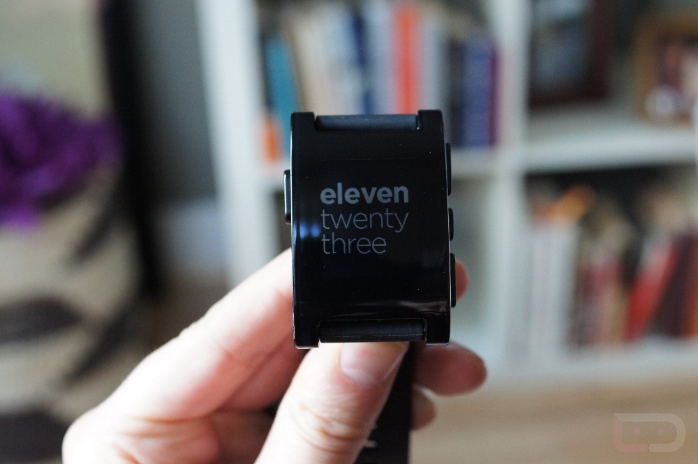
Overall, I really like the look of Pebble. It’s simple, minimal, and not obvious. I chose the all-black version, which features a semi-glossy exterior and matte-rubber watch band. It may not stand out as the flashiest watch on the planet, but sometimes that’s a good thing, especially when the point of a smartwatch is to be constantly staring at it. The face is slightly curved (outward), the buttons on each side stick out just far enough to be pressed with ease, and the entire watch fits perfectly onto my wrists, which I do not consider to be big by any means. The size matches up to many of the standard watches these days, and does not fit into the “oversized” watch category in my opinion
Build
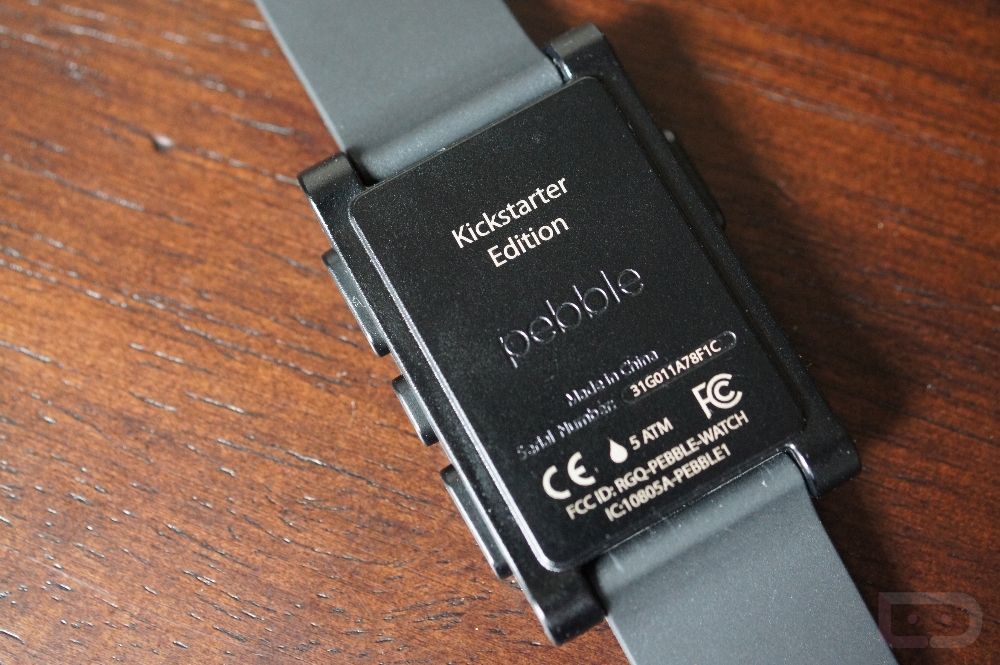
The Pebble is supposed to be waterproof and scratch-resistant. While I have yet to take it swimming, I’ll assume they aren’t lying when they added that spec to the feature list. As far it being scratch-resistant, all I can say is that I haven’t scratched mine to this point. With that said, we are hearing reports of others scratching theirs “with normal use.” I’d definitely take care of the display of this like you would a smartphone, as I do not believe it to be the most scratch resistant substance on the planet. Outside of the display, the unit itself feels solid and like it won’t die after a single drop. And actually, I just dropped it from my desk to hardwood floor while writing this and it survived.
Battery Life
The Pebble team claims that their watch with its E-paper display will last for up to 7 days on a single charge. As of writing this post, I’m at 5 days and counting on my first full charge. I don’t know if it’ll last the full 7 days, but I’m pretty happy with it at least getting me through a work week. There is a problem, though – it doesn’t have a battery meter. Unless we see an update that includes one, you have no idea how much life your Pebble has left in it before it dies.
Update: In the menu, my Pebble is now showing a low-battery icon. This is the first time this has showed up, so I’ll assume this means that I should charge the watch or it will be dying soon. At least they notify you that death is near – would still like an ongoing battery meter.
Update 2: Battery did die today, the 5th day of the first charge. Assuming the battery will get better over time, I can’t complain.
Notifications
The star feature of Pebble is its ability of it to show you notifications from your phone as they come in. It does a great job of populating your screen within seconds of a notification arriving. For now, Pebble can show notifications for incoming calls, SMS messages, calendar reminders, emails, Gmail messages (multiple accounts), Google Talk messages, Google Voice messages, Facebook messages, and WhatsApp messages. There will likely be more as developers build out support for Pebble.
While I mentioned that Pebble does a great job of notifying you immediately upon arrival, there are some limitations that I hope to see addressed before long. First, emails are limited to a certain number of lines or characters. If you are a power email user, you may find that a bit frustrating. For me, I eventually just had to use Pebble as a way to preview emails and to decide if I actually needed to pull my phone out or not. Then again, that’s sort of the point anyway, since you can’t actually reply to anything from the Pebble.
Also, notifications themselves aren’t handled well when you receive one after another. If you are looking at an email on Pebble and a Google Talk message comes in, the email disappears forever and you are left with the Google Talk message or whatever is newest. There is no way to return to the previous notification or manage say, your last five or ten notifications. At this point, Pebble can only handle one at a time.
User Interface
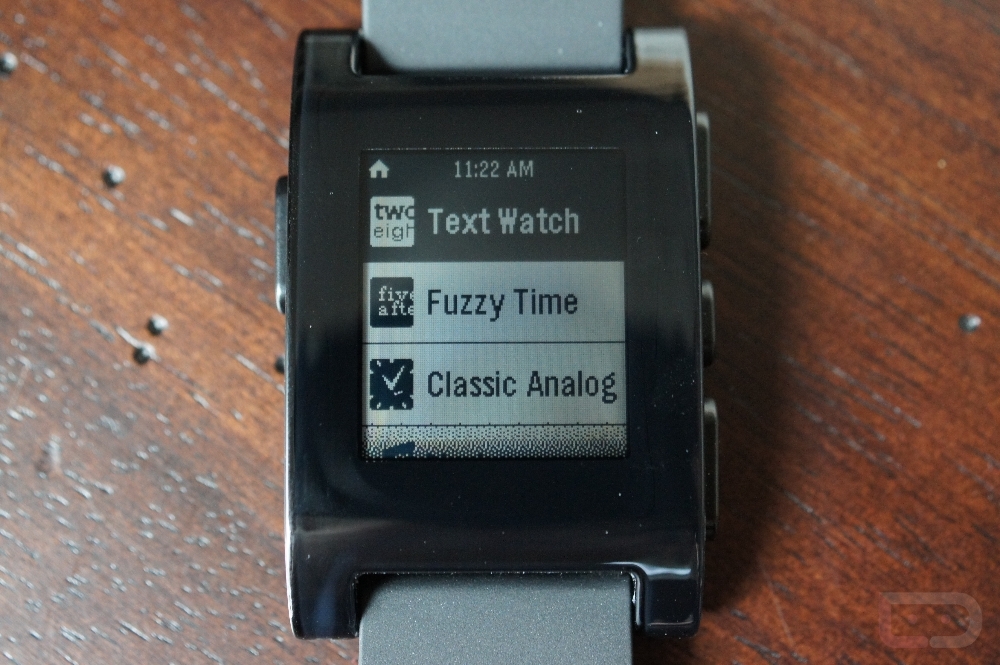
The user interface of Pebble is not incredibly advanced, and that may be a good thing. Since it doesn’t have a touchscreen, you rely on back, home/select, up and down buttons to navigate. It doesn’t take long to figure out, so for those concerned that it may be too advanced shouldn’t worry. There are a couple of simple screens – the clock face and then the menu. As you can imagine, you use the back button to get out of options, the home/select to choose them, and the up and down to navigate the menu. The UI is much better explained in the video review below, so I’ll spare you from me trying to explain it here.
What I will say, is that in world where we touch everything, it does seem like somewhat of a step backwards. Maybe this was how they kept it somewhat reasonable on the price?
Price
At $150, the Pebble is not necessarily cheap. It may carry the “smartwatch” tag, but it still needs to pack in a robust feature set in order to get people to want to commit to such a product at that price. For now, it lacks some features that we would like to see in the very near future (like pairing with workout or GPS-enabled apps). Give me Nike+ support with Pebble, and you won’t need to go out and buy a separate watch, just for exercising. The problem right now, is that we don’t know if apps like that will ever work with Pebble.
I should point out that you can buy a product like the Sony Smartwatch for as little as $100. It also handles notifications, does social media, controls music, and has a touchscreen.
Gallery
[nggallery id=51]
Video
http://www.youtube.com/watch?v=CcBF9k3wetk
The Verdict
Overall, I’ve definitely enjoyed my time with the Pebble. I love the idea of having notifications for emails or messages appear on my wrist so that I don’t have to pull out my phone all of the time. I’ve also been able to use it during the course of a normal workday, as it has allowed me to avoid having to dive into email every 30 seconds. Instead, I can look at my wrist for a second and decide if the email is important enough for me to take a deeper look at. It has a subtle design that makes it look like nothing other than a typical black watch, phenomenal battery life so far, and could turn into one heck of a product assuming developers decide to build out support for it through their apps.
On the downside, Pebble needs to fix the watch’s handling of multiple notifications and expand email output. They also need to convince those previously mentioned developers to build out support for their apps, so that this watch can be taken to the next level.
At $150, I wouldn’t necessarily say that the Pebble is overpriced, but I’m also not sure it’s priced to grab the average tech user. This is for early adopters and tech geeks, like myself that will have some patience as this eventually turns into the watch we all dream of it becoming.


Collapse Show Comments55 Comments