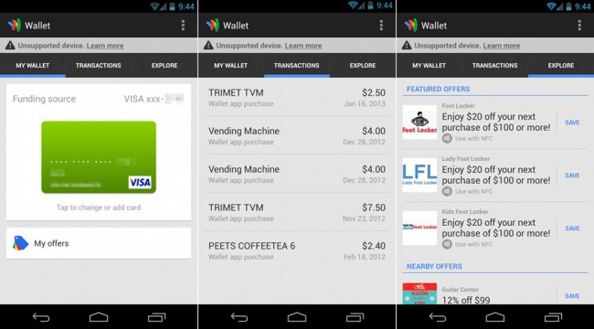

Google Wallet received its first update in some time, today on Android. The changelog mentions that it includes “improvements to the user interface, application stability, and battery life,” which I can confirm. Gone is the opening page with shortcuts to sections for payment cards, reward cards, offers, and transactions. In is a new properly themed Holo and panel UI.
After entering your PIN, you are dropped onto the “My Wallet” page which lists your current funding source, along with bottom shortcuts to your offers, rewards cards and gift cards. With a swipe from the right, you can view all of your recent transactions. Another swipe from the right gets you to featured or nearby offers that can be accessed or saved. If you want to switch funding sources, simply tap on the card showing and you will move to a separate section for adding or switching cards.
And that’s that, on a UI front. It sees much more simplified if you ask me. They also mention battery life improvements, but there isn’t really a way for me to test that.
If you aren’t running a Verizon phone, go grab the new build!
This post was last modified on January 28, 2013 12:59 pm
