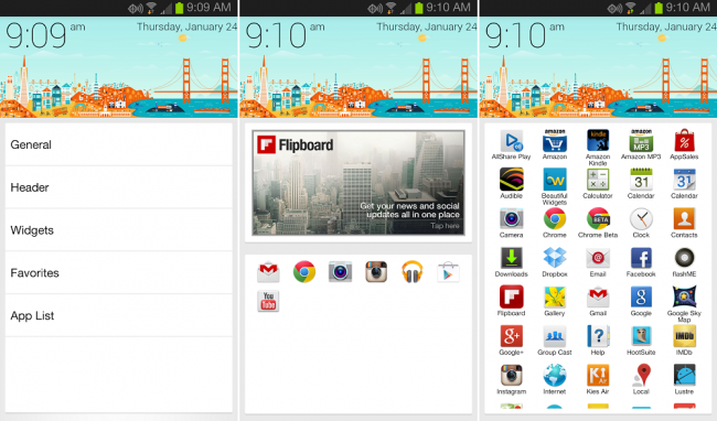
Custom launchers are a big part of Android and SF Launcher alpha looks to fit right in with Google Now-like looks. The middle image above is your “homescreen.” By swiping left you enter the settings menu and by swiping right you gain entry to the app drawer. On top of the homescreen, there are different city options (much like Google Now), with San Francisco, London, or the generic mountain range look.
Below the time, there is a “card” for widgets. By swiping either left or right on the widgets you can add or remove additional widgets, which is a neat way of doing things. Below the widgets you have your “favorite” apps. You select your favorites from your app drawer and they are permanently pinned to the homescreen for easy access.
In terms of looks, there is a light and dark theme to choose from, plus this is still an alpha. The developer intends to do a lot more to the looks and overall feel to the app from what I read in the app’s description.
If you want to try out a new launcher, then SF Launcher is a good one to start with. If I could change something, it would be the ability to resize your cards, such as the widgets and favorite apps. There is a lot of unused space on that screen, but then again, I’m not much for having a ton of apps just sitting out. It looks messy. But, to each their own.
Cheers Blaudy and Bryce!
This post was last modified on January 24, 2013 10:55 am
