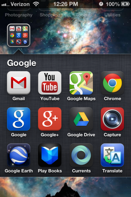
In the past few months it has become abundantly clear that Google intends to support three platforms: the web, Android, and iOS. Google’s support for the web and Android should not come as a surprise; Google has always been a web company and Google bought Android to fight Microsoft in the mobile space. Even Google’s support of iOS is not all that surprising since the iPhone was essentially the Google phone before the G1. What is surprising, however, is that Google isn’t just making apps for iOS; they’re making really good apps for iOS.
Google has more than enough apps in the App Store to fill a whole page on an iOS device (23 total). While some of these apps are garbage and others are merely remnants of failed Google projects, Google has come out swinging lately with seven apps in particular: Google Search, Google Maps, Gmail, YouTube, Google Drive, Chrome, and Google+. All of these apps are available on both iOS and Android in near identical implementations (the only real difference between the Android and iOS versions of these apps is that pull to refresh is available on the iOS iterations while the Android apps still rely on a refresh button) save Gmail and Maps.
Google’s Gmail and Maps Android apps tend to focus on utility over appearance while the iOS apps tend to hide functionality, thereby presenting a cleaner user interface. While Google Maps for iOS looks and feels inspired by the Android app, the cleaner interface is far more inviting to use. While the iOS app emphasizes search and location, the Android app emphasizes utility in general.
Doing things like a search or finding your location are easy to do on both apps, but something like adjusting layers is far less obvious on the iOS app. In fact, settings are essentially hidden on the iOS app. In the iOS app Google chose to hide traffic, public transit, and a link to Google Earth (which is a rather strange inclusion) behind an Android style menu button. The implication here is that iOS users expect a clean interface while Android users expect a heavy amount of mapping tools available as soon as the app launches.
Gmail is probably the most surprising iOS app from Google. The iOS app again brandishes a cleaner UI while the Android app emphasizes utility at the expense of beauty. In fact, with its white expanses and red highlights, the iOS app is actually more faithful to the design of Gmail in a browser than the Android app.
Both apps have multi-user support, swipe to archive, label support, mute, and neither app can create a label (still!). In every screen the iOS app hides settings and options behind buttons while the Android app shoves them in front of users. Because of these UI decisions, the Android app places a very, very heavy learning curve on users in terms of learning the Gmail app’s unique iconography while the iOS app labels everything except for archive and trash. As a result, the iOS app has a much cleaner, if less immediately useful user interface.
In my testing, I actually found Gmail, Maps, Google+ and Chrome for iOS to be more of a pleasure to use than their Android counterparts, which is a strange thing to say. Usually companies put their best work on their own apps for their own platform (see Hotmail for Android), but Google’s apps are actually in parity with the Android versions or better on iOS. Between pull to refresh, the use of playful, colorful loading animations, and the simpler UI, Google apps on iOS tended to be more responsive and easier to use. If you want to live in Google’s ecosystem Android is no longer a requirement.
While I understand why Google would want to make good apps for iOS, I don’t understand why they would make better designed apps for iOS. Maybe Google believes that Android users want UI controls exposed and iOS users want them hidden or that Android users don’t mind cluttered UIs as much as iOS users. Those are just guesses; if I were Google I would want to make sure that the Android apps performed just as well and included little touches like pull to refresh and loading animations. That kind of attention to detail can make a tremendous difference in how an app works and feels. No matter what the reason is for the discrepency, it is nice to see some really nice design coming from Mountain View. Hopefully we see Google bring some of that finess and focus to their Android apps.

Collapse Show Comments142 Comments