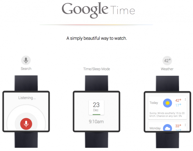
Smartwatches are all the rage these days. Everyone seems to want to feel more connected to their smartphone, a product we already can’t peel our eyes away from for two minutes. We have seen Pebble, one of the more highly regarded products, along with I’m Watch, what may be one of the worst smartwatch attempts in history. There are choices to be had, but what if one was completely Google-inspired? Take this Google Time concept for example.
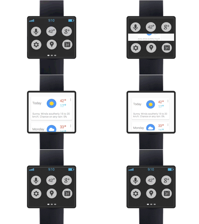
UI designer Adrian Maciburko took the idea of a smartwatch, along with Google’s current UI scheme for a variety of products, and transformed it all into this concept. He walks through notifications, responding to messages (Google Talk and Google+) via voice, weather forecasts, accessing homescreens, clock themes, and more.
It’s a product that again, is only a concept and will likely never become a reality, but it’s still pretty cool to follow along with his vision. This is definitely the type of smartwatch I’d be interested in.
Managing Notifications
Pinch-to-Zoom to Enter Homescreen
Swipe From Top to Enter Homescreen
Thoughts on the current infatuation with smartwatches? If there were to be a Google-inspired watch like this, would you be interested?


Collapse Show Comments90 Comments