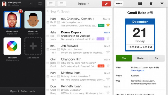

The Gmail team announced version 2.0 of their iOS app today, which is available on both the iPad and iPhone immediately. The app itself, is beautiful. It features a left panel for multi-account support with profile pictures, easy-respond calendar items, and Google Now-styled conversations. In the three screenshots above, I would argue that this new iOS app looks much more like the web version of Gmail than the Android version does. It also matches up nicely to the styling of the Android Google+ and YouTube apps, that have slideout panels from the left and color accents.
We just received version 4.2.1 of Gmail yesterday, one that included a variety of new features, so I doubt that we’ll see anything close to this any time soon. But still, Google seems set on carrying the web-styling of their apps to mobile, so I can’t imagine we won’t see it ever.
What do you guys think? I’m a huge fan of this Google Now-esque app look.
Via: Gmail Blog
This post was last modified on December 24, 2012 3:05 pm
