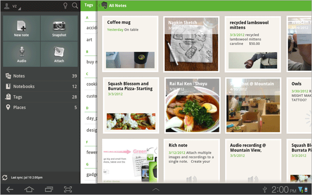
The previous tablet version of Evernote looked pretty, but the functionality wasn’t quite there. In today’s update, the tablet version now mimics that of the phone, plus it adds even more features since it has extra screen real estate to take advantage of. You now have multiple columns that can be displayed with a simple swipe, notes can be displayed as a list rather than just big thumbnails, and the design of note lists has made reading them much easier than ever.
On top of this new tablet UI, smaller screen sizes also get new goodies. Sublists have been added, which means you can add several levels to your bulleted or numbered lists. Lastly, they made slideshows faster and more reliable for those notes with multiple photos.
Cheers Tim!
This post was last modified on July 17, 2012 12:00 pm
