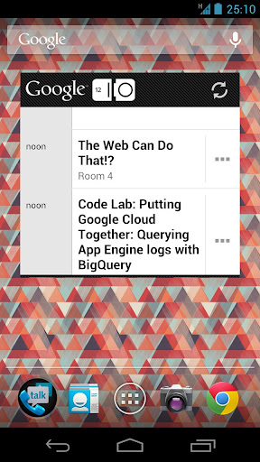
There is buzz going around this morning, all surrounding the above screenshot that Google released to show off the widget in the newly launched Google I/O application. Whether all of these people need to go take a break from their computer screens or this is what Jelly Bean could come to look like, let’s go over what has people so curious.
The first major change that we can see in this screenshot when compared to Ice Cream Sandwich, is the Google Search bar itself. Instead of being a solid and dark grey color, they look to have opted for a more transparent feel, while also incorporating a newer ‘mic’ icon. Keep in mind, this is for the official I/O app, so we would think this is a Googler’s device and not someone who is running a custom ROM or anything of that nature.
Next up, we have the Chrome for Android icon in the bottom right. Bye bye, stock browser? Again, being a Google employee’s device would mean that they would most likely use Google’s line of applications more often than not and are just taking this time to showcase Chrome more broadly. Could we see Chrome leave the Beta tag behind at I/O?
Another little fun thing to point out is the time on the device. 25:10? October 25? Could it be a launch date? Could it be something else? We love speculating, especially around this time of year! If you have any wild guesses or fun facts to throw into the pot, give it a go down in the comments section below. I/O Fever has officially taken over the Android community. Could we expect to see to Jelly Bean next week in San Francisco? Fingers crossed.
Cheers Tjhrulz!


Collapse Show Comments93 Comments